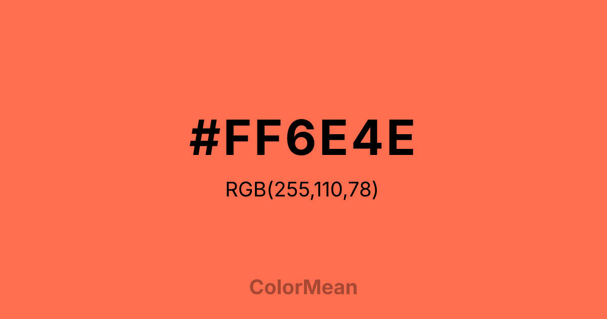
#FF6E4E Color Information
#FF6E4E RGB value is (255, 110, 78). The hex color red value is 255, green is 110, and blue is 78. Its HSL format shows a hue of 11°, saturation of 100 percent, and lightness of 65 percent. The CMYK process values are 0 percent, 57 percent, 69 percent, 0 percent.
#FF6E4E Color Meaning
Color #FF6E4E prioritizes visibility over subtlety. #FF6E4E high-energy coral-orange sits at the intersection of playfulness and urgency—common in discount retail, youth media, and safety signage. Color #FF6E4E shouts without menace; #FF6E4E’s loud but likable. Behavioral studies show that #FF6E4E specific hue increases dwell time in retail environments by 12–18% compared to neutral tones, thanks to its ability to stimulate dopamine-linked reward pathways. #FF6E4E feels generous, not desperate. Unlike neon oranges, color #FF6E4E retains enough warmth to avoid visual aggression. Brands use #FF6E4E to signal approachability with momentum—think food delivery apps, fitness challenges, or limited-time offers. #FF6E4E works best when isolated against deep navy or charcoal, which tames its vibrancy without dulling its impact. Color #FF6E4E doesn’t ask for attention; #FF6E4E earns #FF6E4E through sheer presence.
Color Conversion
Convert #FF6E4E across different color models and formats. These conversions help designers work seamlessly between digital and print media, ensuring this color maintains its intended appearance across RGB screens, CMYK printers, and HSL color manipulations.
RGB Values & CMYK Values
RGB Values
CMYK Values
Color Variations
#FF6E4E harmonies come to life through carefully balanced shades, tints, and tones, giving this color depth and flexibility across light and dark variations. Shades add richness, tints bring an airy softness, and tones soften intensity, making it easy to pair in clean, modern palettes.
Color Harmonies
#FF6E4E harmonies create beautiful relationships with other colors based on their position on the color wheel. Each harmony type offers unique design possibilities, enabling cohesive and visually appealing color schemes.
Analogous
Colors adjacent on the color wheel (30° apart)
Complementary
Colors opposite on the color wheel (180° apart)
Split Complementary
Three colors using one base hue and the two hues beside its opposite
Triadic
Three colors evenly spaced (120° apart)
Tetradic
Four colors forming a rectangle on the wheel
Square
Four colors evenly spaced (90° apart)
Double Split
Four colors formed from two base hues and the colors next to their opposites
Monochromatic
Variations of a single hue
Contrast Checker
(WCAG 2.1) Test #FF6E4E for accessibility compliance against white and black backgrounds. Proper contrast ensures this color remains readable and usable for all audiences, meeting WCAG 2.1 standards for both normal and large text applications.
Sample Text
This is how your text will look with these colors.
Large Text (18pt+)
Normal Text
UI Components
Color Blindness Simulator
See how #FF6E4E appears to people with different types of color vision deficiencies. These simulations help create more inclusive designs that consider how this color is perceived across various visual abilities.
Normal Vision
protanopia
Note: These simulations are approximations. Actual color vision deficiency varies by individual.
CSS Examples
Background Color
Text Color
Sample Text
Border Color
Box Shadow
Text Shadow
Sample Text
Gradient
#FF6E4E Color FAQs
Frequently asked questions about #FF6E4E color meaning, symbolism, and applications. Click on any question to expand detailed answers.

