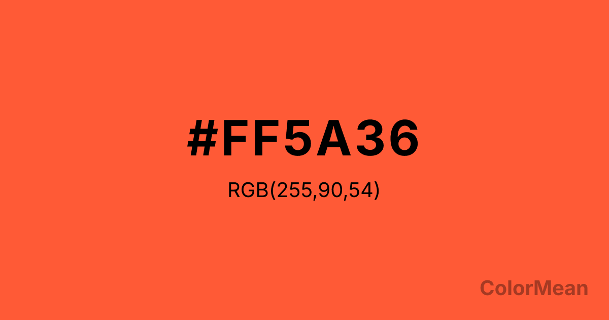
Portland Orange (#FF5A36) Color Information
Portland Orange (#FF5A36) RGB value is (255, 90, 54). The hex color red value is 255, green is 90, and blue is 54. Its HSL format shows a hue of 11°, saturation of 100 percent, and lightness of 61 percent. The CMYK process values are 0 percent, 65 percent, 79 percent, 0 percent.
Portland Orange (#FF5A36) Color Meaning
Portland Orange (#FF5A36) projects urgent vitality, friendly warning, and energetic civic pride. This bright, reddish-orange is bold and impossible to ignore, named for the city and evoking construction signage, athletic energy, and autumnal alertness. Psychologically, Portland Orange (#FF5A36) is stimulating and imperative, promoting immediate awareness, dynamic activity, and a sense of confident, forward motion. It sits at the intersection of "caution" and "enthusiasm," making it effective for safety and celebration alike. This color is a call to action in its most vibrant form. Culturally, Portland Orange (#FF5A36) is tied to the identity of Portland, Oregon, and is widely used in road safety and high-visibility gear globally. Symbolically, it represents visibility, community spirit, and a pragmatic, no-nonsense kind of energy. Therefore, Portland Orange (#FF5A36) acts as a functional and symbolic color, serving both to protect and to unite, embodying a blend of utilitarian purpose and proud, local character.
Color Conversion
Convert Portland Orange (#FF5A36) across different color models and formats. These conversions help designers work seamlessly between digital and print media, ensuring this color maintains its intended appearance across RGB screens, CMYK printers, and HSL color manipulations.
RGB Values & CMYK Values
RGB Values
CMYK Values
Color Variations
Portland Orange (#FF5A36) harmonies come to life through carefully balanced shades, tints, and tones, giving this color depth and flexibility across light and dark variations. Shades add richness, tints bring an airy softness, and tones soften intensity, making it easy to pair in clean, modern palettes.
Color Harmonies
Portland Orange (#FF5A36) harmonies create beautiful relationships with other colors based on their position on the color wheel. Each harmony type offers unique design possibilities, enabling cohesive and visually appealing color schemes.
Analogous
Colors adjacent on the color wheel (30° apart)
Complementary
Colors opposite on the color wheel (180° apart)
Split Complementary
Three colors using one base hue and the two hues beside its opposite
Triadic
Three colors evenly spaced (120° apart)
Tetradic
Four colors forming a rectangle on the wheel
Square
Four colors evenly spaced (90° apart)
Double Split
Four colors formed from two base hues and the colors next to their opposites
Monochromatic
Variations of a single hue
Contrast Checker
(WCAG 2.1) Test Portland Orange (#FF5A36) for accessibility compliance against white and black backgrounds. Proper contrast ensures this color remains readable and usable for all audiences, meeting WCAG 2.1 standards for both normal and large text applications.
Sample Text
This is how your text will look with these colors.
Large Text (18pt+)
Normal Text
UI Components
Color Blindness Simulator
See how #FF5A36 appears to people with different types of color vision deficiencies. These simulations help create more inclusive designs that consider how this color is perceived across various visual abilities.
Normal Vision
protanopia
Note: These simulations are approximations. Actual color vision deficiency varies by individual.
CSS Examples
Background Color
Text Color
Sample Text
Border Color
Box Shadow
Text Shadow
Sample Text
Gradient
Portland Orange (#FF5A36) Color FAQs
Frequently asked questions about Portland Orange (#FF5A36) color meaning, symbolism, and applications. Click on any question to expand detailed answers.
