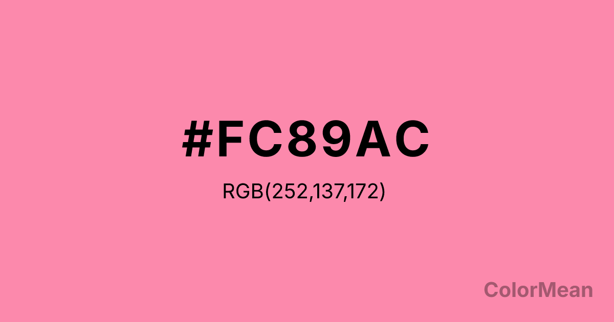
Tickle Me Pink (#FC89AC) Color Information
Tickle Me Pink (#FC89AC) RGB value is (252, 137, 172). The hex color red value is 252, green is 137, and blue is 172. Its HSL format shows a hue of 342°, saturation of 95 percent, and lightness of 76 percent. The CMYK process values are 0 percent, 46 percent, 32 percent, 1 percent.
Tickle Me Pink (#FC89AC) Color Meaning
Tickle Me Pink (#FC89AC) conveys lively affection, joyful energy, and playful optimism. This bright pink exudes warmth, social cheer, and energetic expressiveness. Tickle Me Pink (#FC89AC) psychologically encourages emotional openness, fun, and positive interaction. In Western culture, Tickle Me Pink (#FC89AC) is linked to youthful vitality, romance, and celebratory charm. Eastern traditions associate it with joyful energy, emotional openness, and nurturing connections. Fengshui interprets this bright pink as uplifting and socially energizing, ideal for communal or creative spaces. Spiritually, Tickle Me Pink (#FC89AC) aligns with the Heart Chakra, promoting empathy, compassion, and joyful expression. Designers employ this vivid, playful tone in branding, fashion, interiors, and graphics to infuse cheerfulness and approachable vibrancy. Its bright saturation makes it a visually stimulating accent.
Color Conversion
Convert Tickle Me Pink (#FC89AC) across different color models and formats. These conversions help designers work seamlessly between digital and print media, ensuring this color maintains its intended appearance across RGB screens, CMYK printers, and HSL color manipulations.
RGB Values & CMYK Values
RGB Values
CMYK Values
Color Variations
Tickle Me Pink (#FC89AC) harmonies come to life through carefully balanced shades, tints, and tones, giving this color depth and flexibility across light and dark variations. Shades add richness, tints bring an airy softness, and tones soften intensity, making it easy to pair in clean, modern palettes.
Color Harmonies
Tickle Me Pink (#FC89AC) harmonies create beautiful relationships with other colors based on their position on the color wheel. Each harmony type offers unique design possibilities, enabling cohesive and visually appealing color schemes.
Analogous
Colors adjacent on the color wheel (30° apart)
Complementary
Colors opposite on the color wheel (180° apart)
Split Complementary
Three colors using one base hue and the two hues beside its opposite
Triadic
Three colors evenly spaced (120° apart)
Tetradic
Four colors forming a rectangle on the wheel
Square
Four colors evenly spaced (90° apart)
Double Split
Four colors formed from two base hues and the colors next to their opposites
Monochromatic
Variations of a single hue
Contrast Checker
(WCAG 2.1) Test Tickle Me Pink (#FC89AC) for accessibility compliance against white and black backgrounds. Proper contrast ensures this color remains readable and usable for all audiences, meeting WCAG 2.1 standards for both normal and large text applications.
Sample Text
This is how your text will look with these colors.
Large Text (18pt+)
Normal Text
UI Components
Color Blindness Simulator
See how #FC89AC appears to people with different types of color vision deficiencies. These simulations help create more inclusive designs that consider how this color is perceived across various visual abilities.
Normal Vision
protanopia
Note: These simulations are approximations. Actual color vision deficiency varies by individual.
CSS Examples
Background Color
Text Color
Sample Text
Border Color
Box Shadow
Text Shadow
Sample Text
Gradient
Tickle Me Pink (#FC89AC) Color FAQs
Frequently asked questions about Tickle Me Pink (#FC89AC) color meaning, symbolism, and applications. Click on any question to expand detailed answers.
