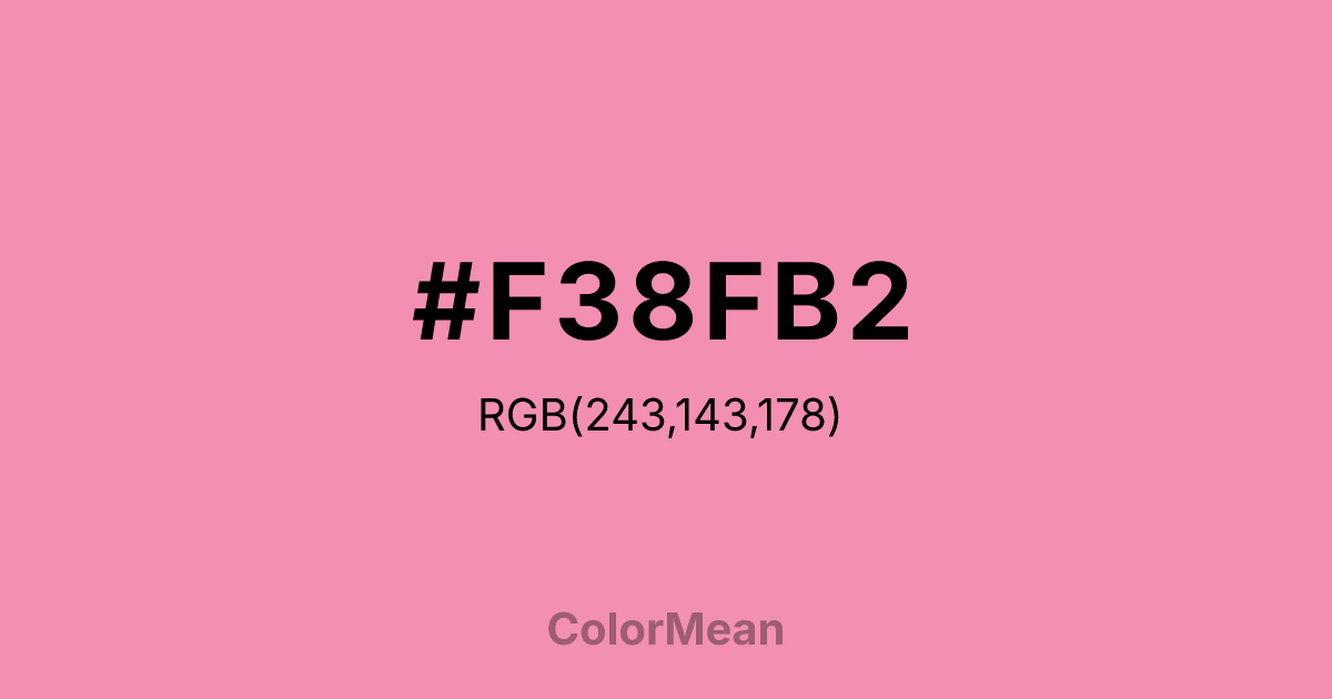
#F38FB2 Color Information
#F38FB2 RGB value is (243, 143, 178). The hex color red value is 243, green is 143, and blue is 178. Its HSL format shows a hue of 339°, saturation of 81 percent, and lightness of 76 percent. The CMYK process values are 0 percent, 41 percent, 27 percent, 5 percent.
#F38FB2 Color Meaning
Color #F38FB2 embodies playful charm, gentle passion, and romantic subtlety. #F38FB2 pastel pink hue blends warmth with softness, stimulating feelings of affection, tenderness, and emotional openness. Psychologically, color #F38FB2 encourages empathy, nurtures compassion, and balances emotional intensity without overwhelming. In cultural contexts, color #F38FB2 represents youthfulness and delicate beauty. In the West, #F38FB2 is associated with feminine elegance and lighthearted expression, while in Eastern traditions, #F38FB2 can signify love, joy, and gentle celebration. Fengshui interprets #F38FB2 soft pink as a supportive color for relationship corners, promoting harmonious connections and calm energy. Spiritually, color #F38FB2 aligns with the Heart chakra, fostering love, forgiveness, and emotional healing. #F38FB2 shade is a light variation of red with pink influences, carrying vibrant yet soft energy. Artists often use #F38FB2 for romantic compositions, accent highlights, and approachable design schemes that feel warm and inviting.
Color Conversion
Convert #F38FB2 across different color models and formats. These conversions help designers work seamlessly between digital and print media, ensuring this color maintains its intended appearance across RGB screens, CMYK printers, and HSL color manipulations.
RGB Values & CMYK Values
RGB Values
CMYK Values
Color Variations
#F38FB2 harmonies come to life through carefully balanced shades, tints, and tones, giving this color depth and flexibility across light and dark variations. Shades add richness, tints bring an airy softness, and tones soften intensity, making it easy to pair in clean, modern palettes.
Color Harmonies
#F38FB2 harmonies create beautiful relationships with other colors based on their position on the color wheel. Each harmony type offers unique design possibilities, enabling cohesive and visually appealing color schemes.
Analogous
Colors adjacent on the color wheel (30° apart)
Complementary
Colors opposite on the color wheel (180° apart)
Split Complementary
Three colors using one base hue and the two hues beside its opposite
Triadic
Three colors evenly spaced (120° apart)
Tetradic
Four colors forming a rectangle on the wheel
Square
Four colors evenly spaced (90° apart)
Double Split
Four colors formed from two base hues and the colors next to their opposites
Monochromatic
Variations of a single hue
Contrast Checker
(WCAG 2.1) Test #F38FB2 for accessibility compliance against white and black backgrounds. Proper contrast ensures this color remains readable and usable for all audiences, meeting WCAG 2.1 standards for both normal and large text applications.
Sample Text
This is how your text will look with these colors.
Large Text (18pt+)
Normal Text
UI Components
Color Blindness Simulator
See how #F38FB2 appears to people with different types of color vision deficiencies. These simulations help create more inclusive designs that consider how this color is perceived across various visual abilities.
Normal Vision
protanopia
Note: These simulations are approximations. Actual color vision deficiency varies by individual.
CSS Examples
Background Color
Text Color
Sample Text
Border Color
Box Shadow
Text Shadow
Sample Text
Gradient
#F38FB2 Color FAQs
Frequently asked questions about #F38FB2 color meaning, symbolism, and applications. Click on any question to expand detailed answers.

