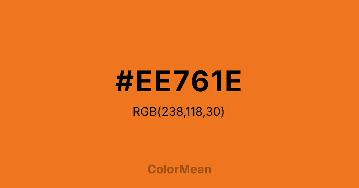
#EE761E Color Information
#EE761E RGB value is (238, 118, 30). The hex color red value is 238, green is 118, and blue is 30. Its HSL format shows a hue of 25°, saturation of 86 percent, and lightness of 53 percent. The CMYK process values are 0 percent, 50 percent, 87 percent, 7 percent.
#EE761E Color Meaning
Color #EE761E offers vibrant warmth, approachable richness, and dynamic familiarity. Color #EE761E is a slightly desaturated variant—retaining the luminosity of Chocolate1 while adding maturity. #EE761E mirrors roasted squash, spiced cider, and autumn light on stone. In consumer psychology, #EE761E hue bridges comfort and curiosity, making #EE761E ideal for food innovation, craft beverage, and lifestyle branding. #EE761E feels familiar but not tired—like a recipe remembered, then refined. In UI/UX design, color #EE761E functions as a reliable call-to-action color, especially in e-commerce and recipe platforms. #EE761E meets contrast standards against cream and deep greys, and its warmth reduces perceived transactional friction. Print consistency is high, particularly in food magazine and packaging applications. Consumer testing shows higher trust in brands using color #EE761E versus neon oranges—likely due to its organic plausibility. Culturally, color #EE761E reflects nourishment that evolves. #EE761E appears in modern interpretations of tradition—fusion cuisine, heritage grains reimagined, seasonal rituals updated. Spiritually, #EE761E aligns with the solar plexus chakra’s confident mode: self-worth expressed through sharing. Designers choose color #EE761E when they want to signal innovation with roots. Its warmth is both old and new.
Color Conversion
Convert #EE761E across different color models and formats. These conversions help designers work seamlessly between digital and print media, ensuring this color maintains its intended appearance across RGB screens, CMYK printers, and HSL color manipulations.
RGB Values & CMYK Values
RGB Values
CMYK Values
Color Variations
#EE761E harmonies come to life through carefully balanced shades, tints, and tones, giving this color depth and flexibility across light and dark variations. Shades add richness, tints bring an airy softness, and tones soften intensity, making it easy to pair in clean, modern palettes.
Color Harmonies
#EE761E harmonies create beautiful relationships with other colors based on their position on the color wheel. Each harmony type offers unique design possibilities, enabling cohesive and visually appealing color schemes.
Analogous
Colors adjacent on the color wheel (30° apart)
Complementary
Colors opposite on the color wheel (180° apart)
Split Complementary
Three colors using one base hue and the two hues beside its opposite
Triadic
Three colors evenly spaced (120° apart)
Tetradic
Four colors forming a rectangle on the wheel
Square
Four colors evenly spaced (90° apart)
Double Split
Four colors formed from two base hues and the colors next to their opposites
Monochromatic
Variations of a single hue
Contrast Checker
(WCAG 2.1) Test #EE761E for accessibility compliance against white and black backgrounds. Proper contrast ensures this color remains readable and usable for all audiences, meeting WCAG 2.1 standards for both normal and large text applications.
Sample Text
This is how your text will look with these colors.
Large Text (18pt+)
Normal Text
UI Components
Color Blindness Simulator
See how #EE761E appears to people with different types of color vision deficiencies. These simulations help create more inclusive designs that consider how this color is perceived across various visual abilities.
Normal Vision
protanopia
Note: These simulations are approximations. Actual color vision deficiency varies by individual.
CSS Examples
Background Color
Text Color
Sample Text
Border Color
Box Shadow
Text Shadow
Sample Text
Gradient
#EE761E Color FAQs
Frequently asked questions about #EE761E color meaning, symbolism, and applications. Click on any question to expand detailed answers.
