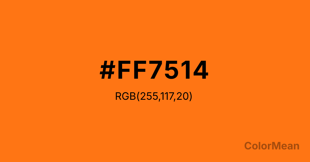
Pastel Orange (#FF7514) Color Information
Pastel Orange (#FF7514) RGB value is (255, 117, 20). The hex color red value is 255, green is 117, and blue is 20. Its HSL format shows a hue of 25°, saturation of 100 percent, and lightness of 54 percent. The CMYK process values are 0 percent, 54 percent, 92 percent, 0 percent.
Pastel Orange (#FF7514) Color Meaning
Pastel Orange (#FF7514) embodies energetic warmth, vibrant approachability, and autumnal zest. This bright, saturated orange is more intense than its peachy counterpart, evoking ripe persimmons, Halloween pumpkins, and terracotta clay. Psychologically, Pastel Orange (#FF7514) is stimulating and sociable, generating feelings of enthusiasm, confidence, and friendly extroversion. It commands attention with its cheerful boldness, making it effective for calls to action or designs needing to project energy and approachable excitement. This color is warm, welcoming, and inherently dynamic. Culturally, Pastel Orange (#FF7514) is linked to harvest festivals, athletic branding, and safety equipment, symbolizing visibility, festivity, and high-spirited activity. Symbolically, it represents abundant joy, creative fire, and an invitation to engage actively with the world. Therefore, Pastel Orange (#FF7514) acts as a visual catalyst for community, celebration, and motivated action, bridging the gap between playful energy and purposeful intensity.
Color Conversion
Convert Pastel Orange (#FF7514) across different color models and formats. These conversions help designers work seamlessly between digital and print media, ensuring this color maintains its intended appearance across RGB screens, CMYK printers, and HSL color manipulations.
RGB Values & CMYK Values
RGB Values
CMYK Values
Color Variations
Pastel Orange (#FF7514) harmonies come to life through carefully balanced shades, tints, and tones, giving this color depth and flexibility across light and dark variations. Shades add richness, tints bring an airy softness, and tones soften intensity, making it easy to pair in clean, modern palettes.
Color Harmonies
Pastel Orange (#FF7514) harmonies create beautiful relationships with other colors based on their position on the color wheel. Each harmony type offers unique design possibilities, enabling cohesive and visually appealing color schemes.
Analogous
Colors adjacent on the color wheel (30° apart)
Complementary
Colors opposite on the color wheel (180° apart)
Split Complementary
Three colors using one base hue and the two hues beside its opposite
Triadic
Three colors evenly spaced (120° apart)
Tetradic
Four colors forming a rectangle on the wheel
Square
Four colors evenly spaced (90° apart)
Double Split
Four colors formed from two base hues and the colors next to their opposites
Monochromatic
Variations of a single hue
Contrast Checker
(WCAG 2.1) Test Pastel Orange (#FF7514) for accessibility compliance against white and black backgrounds. Proper contrast ensures this color remains readable and usable for all audiences, meeting WCAG 2.1 standards for both normal and large text applications.
Sample Text
This is how your text will look with these colors.
Large Text (18pt+)
Normal Text
UI Components
Color Blindness Simulator
See how #FF7514 appears to people with different types of color vision deficiencies. These simulations help create more inclusive designs that consider how this color is perceived across various visual abilities.
Normal Vision
protanopia
Note: These simulations are approximations. Actual color vision deficiency varies by individual.
CSS Examples
Background Color
Text Color
Sample Text
Border Color
Box Shadow
Text Shadow
Sample Text
Gradient
Pastel Orange (#FF7514) Color FAQs
Frequently asked questions about Pastel Orange (#FF7514) color meaning, symbolism, and applications. Click on any question to expand detailed answers.
