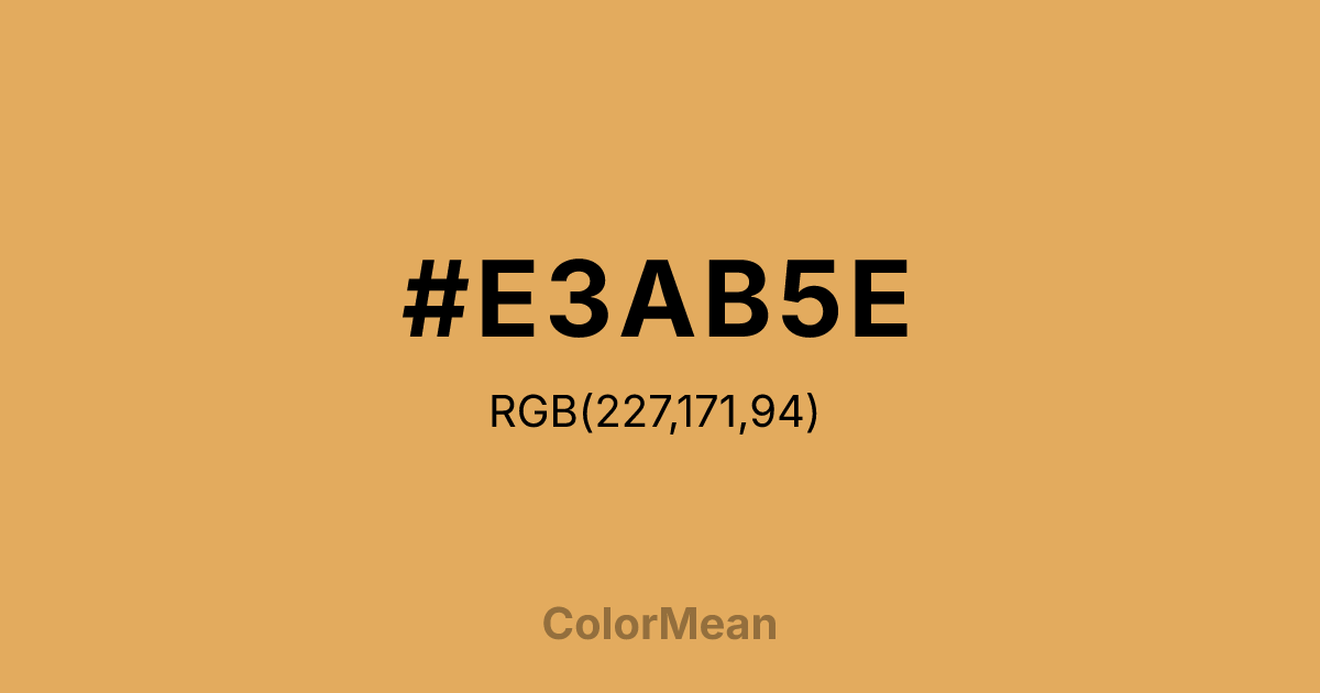
#E3AB5E Color Information
#E3AB5E RGB value is (227, 171, 94). The hex color red value is 227, green is 171, and blue is 94. Its HSL format shows a hue of 35°, saturation of 70 percent, and lightness of 63 percent. The CMYK process values are 0 percent, 25 percent, 59 percent, 11 percent.
#E3AB5E Color Meaning
Color #E3AB5E embodies warmth, grounded energy, and organic nourishment. #E3AB5E muted golden tone draws from sunbaked clay, desert sands, and autumn harvests, signaling resilience and practical optimism. Unlike bright yellows that stimulate urgency, color #E3AB5E offers a subdued radiance that supports focus without agitation. Psychological studies link earthy yellows to increased concentration in learning environments, especially when paired with neutral backgrounds, because they reduce visual fatigue while maintaining alertness. Culturally, color #E3AB5E appears in traditional textiles, adobe architecture, and agricultural symbolism across Mediterranean and Southwestern communities. #E3AB5E represents sustenance, labor, and connection to land—values deeply tied to stewardship and seasonal cycles. Spiritually, color #E3AB5E bridges the material and emotional, promoting patience, resourcefulness, and a steady inner flame. Designers use #E3AB5E to add human warmth to digital interfaces without sacrificing clarity or calm.
Color Conversion
Convert #E3AB5E across different color models and formats. These conversions help designers work seamlessly between digital and print media, ensuring this color maintains its intended appearance across RGB screens, CMYK printers, and HSL color manipulations.
RGB Values & CMYK Values
RGB Values
CMYK Values
Color Variations
#E3AB5E harmonies come to life through carefully balanced shades, tints, and tones, giving this color depth and flexibility across light and dark variations. Shades add richness, tints bring an airy softness, and tones soften intensity, making it easy to pair in clean, modern palettes.
Color Harmonies
#E3AB5E harmonies create beautiful relationships with other colors based on their position on the color wheel. Each harmony type offers unique design possibilities, enabling cohesive and visually appealing color schemes.
Analogous
Colors adjacent on the color wheel (30° apart)
Complementary
Colors opposite on the color wheel (180° apart)
Split Complementary
Three colors using one base hue and the two hues beside its opposite
Triadic
Three colors evenly spaced (120° apart)
Tetradic
Four colors forming a rectangle on the wheel
Square
Four colors evenly spaced (90° apart)
Double Split
Four colors formed from two base hues and the colors next to their opposites
Monochromatic
Variations of a single hue
Contrast Checker
(WCAG 2.1) Test #E3AB5E for accessibility compliance against white and black backgrounds. Proper contrast ensures this color remains readable and usable for all audiences, meeting WCAG 2.1 standards for both normal and large text applications.
Sample Text
This is how your text will look with these colors.
Large Text (18pt+)
Normal Text
UI Components
Color Blindness Simulator
See how #E3AB5E appears to people with different types of color vision deficiencies. These simulations help create more inclusive designs that consider how this color is perceived across various visual abilities.
Normal Vision
protanopia
Note: These simulations are approximations. Actual color vision deficiency varies by individual.
CSS Examples
Background Color
Text Color
Sample Text
Border Color
Box Shadow
Text Shadow
Sample Text
Gradient
#E3AB5E Color FAQs
Frequently asked questions about #E3AB5E color meaning, symbolism, and applications. Click on any question to expand detailed answers.

