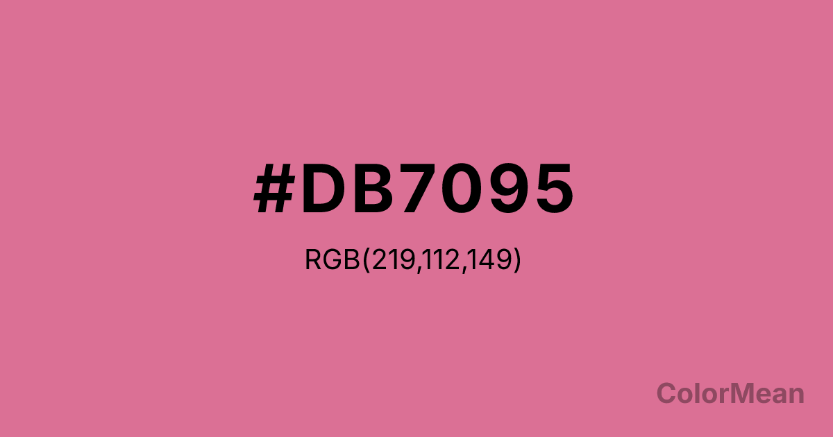
#DB7095 Color Information
#DB7095 RGB value is (219, 112, 149). The hex color red value is 219, green is 112, and blue is 149. Its HSL format shows a hue of 339°, saturation of 60 percent, and lightness of 65 percent. The CMYK process values are 0 percent, 49 percent, 32 percent, 14 percent.
#DB7095 Color Meaning
Color #DB7095 embodies compassionate maturity, romantic durability, and softened passion. #DB7095 recurring dusty pink-red-violet consistently communicates emotion that has been felt deeply and integrated over time. Psychologically, PaleVioletRed (#DB7095) comforts and connects, blending the warmth of affection with the wisdom of experience. #DB7095 fosters empathetic understanding and a nurturing strength, speaking to a heart that remains tender but is no longer fragile. #DB7095 color is emotionally resonant without being demanding, offering a sophisticated and sustainable form of love. Symbolically, PaleVioletRed (#DB7095) represents a scar that has healed into greater sensitivity, passion that has mellowed into devotion, and beauty that acknowledges its own history. #DB7095 is the color of a cherished, oft-read love letter. Culturally, #DB7095 carries a literary and vintage film quality, often associated with complex, empathetic characters of depth. In its role as a web color, PaleVioletRed (#DB7095) provides a specific, emotionally nuanced alternative to pure pinks or reds, allowing digital design to express a more mature form of sentiment.
Color Conversion
Convert #DB7095 across different color models and formats. These conversions help designers work seamlessly between digital and print media, ensuring this color maintains its intended appearance across RGB screens, CMYK printers, and HSL color manipulations.
RGB Values & CMYK Values
RGB Values
CMYK Values
Color Variations
#DB7095 harmonies come to life through carefully balanced shades, tints, and tones, giving this color depth and flexibility across light and dark variations. Shades add richness, tints bring an airy softness, and tones soften intensity, making it easy to pair in clean, modern palettes.
Color Harmonies
#DB7095 harmonies create beautiful relationships with other colors based on their position on the color wheel. Each harmony type offers unique design possibilities, enabling cohesive and visually appealing color schemes.
Analogous
Colors adjacent on the color wheel (30° apart)
Complementary
Colors opposite on the color wheel (180° apart)
Split Complementary
Three colors using one base hue and the two hues beside its opposite
Triadic
Three colors evenly spaced (120° apart)
Tetradic
Four colors forming a rectangle on the wheel
Square
Four colors evenly spaced (90° apart)
Double Split
Four colors formed from two base hues and the colors next to their opposites
Monochromatic
Variations of a single hue
Contrast Checker
(WCAG 2.1) Test #DB7095 for accessibility compliance against white and black backgrounds. Proper contrast ensures this color remains readable and usable for all audiences, meeting WCAG 2.1 standards for both normal and large text applications.
Sample Text
This is how your text will look with these colors.
Large Text (18pt+)
Normal Text
UI Components
Color Blindness Simulator
See how #DB7095 appears to people with different types of color vision deficiencies. These simulations help create more inclusive designs that consider how this color is perceived across various visual abilities.
Normal Vision
protanopia
Note: These simulations are approximations. Actual color vision deficiency varies by individual.
CSS Examples
Background Color
Text Color
Sample Text
Border Color
Box Shadow
Text Shadow
Sample Text
Gradient
#DB7095 Color FAQs
Frequently asked questions about #DB7095 color meaning, symbolism, and applications. Click on any question to expand detailed answers.
