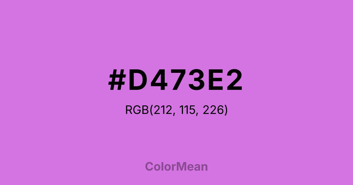
#D473E2 Color Information
#D473E2 RGB value is (212, 115, 226). The hex color red value is 212, green is 115, and blue is 226. Its HSL format shows a hue of 292°, saturation of 66 percent, and lightness of 67 percent. The CMYK process values are 6 percent, 49 percent, 0 percent, 11 percent.
#D473E2 Color Meaning
Color #D473E2 blends floral delicacy with electric confidence. #D473E2 mid-saturated purple-pink avoids the infantilization of pastels and the austerity of royal purples, landing instead in a space of playful sophistication. Color #D473E2 suggests imagination with structure—ideal for creative tech, wellness, and inclusive branding. Studies on gender-neutral color perception reveal that hues like color #D473E2 score high in cross-demographic appeal, especially among Gen Z and millennial audiences seeking authenticity over tradition. Its balance of red and blue wavelengths creates a chromatic tension that feels both warm and cool—emotionally resonant yet mentally clear. Historically tied to rare blooms and Victorian parlors, modern color #D473E2 reclaims its legacy as a symbol of unconventional beauty. #D473E2 appears in LGBTQ+ advocacy, mental health campaigns, and avant-garde fashion precisely because #D473E2 defies binary expectations. Visually, #D473E2 pairs powerfully with slate grays or deep teals to anchor its vibrancy in credibility.
Color Conversion
Convert #D473E2 across different color models and formats. These conversions help designers work seamlessly between digital and print media, ensuring this color maintains its intended appearance across RGB screens, CMYK printers, and HSL color manipulations.
RGB Values & CMYK Values
RGB Values
CMYK Values
Color Variations
#D473E2 harmonies come to life through carefully balanced shades, tints, and tones, giving this color depth and flexibility across light and dark variations. Shades add richness, tints bring an airy softness, and tones soften intensity, making it easy to pair in clean, modern palettes.
Color Harmonies
#D473E2 harmonies create beautiful relationships with other colors based on their position on the color wheel. Each harmony type offers unique design possibilities, enabling cohesive and visually appealing color schemes.
Analogous
Colors adjacent on the color wheel (30° apart)
Complementary
Colors opposite on the color wheel (180° apart)
Split Complementary
Three colors using one base hue and the two hues beside its opposite
Triadic
Three colors evenly spaced (120° apart)
Tetradic
Four colors forming a rectangle on the wheel
Square
Four colors evenly spaced (90° apart)
Double Split
Four colors formed from two base hues and the colors next to their opposites
Monochromatic
Variations of a single hue
Contrast Checker
(WCAG 2.1) Test #D473E2 for accessibility compliance against white and black backgrounds. Proper contrast ensures this color remains readable and usable for all audiences, meeting WCAG 2.1 standards for both normal and large text applications.
Sample Text
This is how your text will look with these colors.
Large Text (18pt+)
Normal Text
UI Components
Color Blindness Simulator
See how #D473E2 appears to people with different types of color vision deficiencies. These simulations help create more inclusive designs that consider how this color is perceived across various visual abilities.
Normal Vision
protanopia
Note: These simulations are approximations. Actual color vision deficiency varies by individual.
CSS Examples
Background Color
Text Color
Sample Text
Border Color
Box Shadow
Text Shadow
Sample Text
Gradient
#D473E2 Color FAQs
Frequently asked questions about #D473E2 color meaning, symbolism, and applications. Click on any question to expand detailed answers.
