#D473C6 Color Information
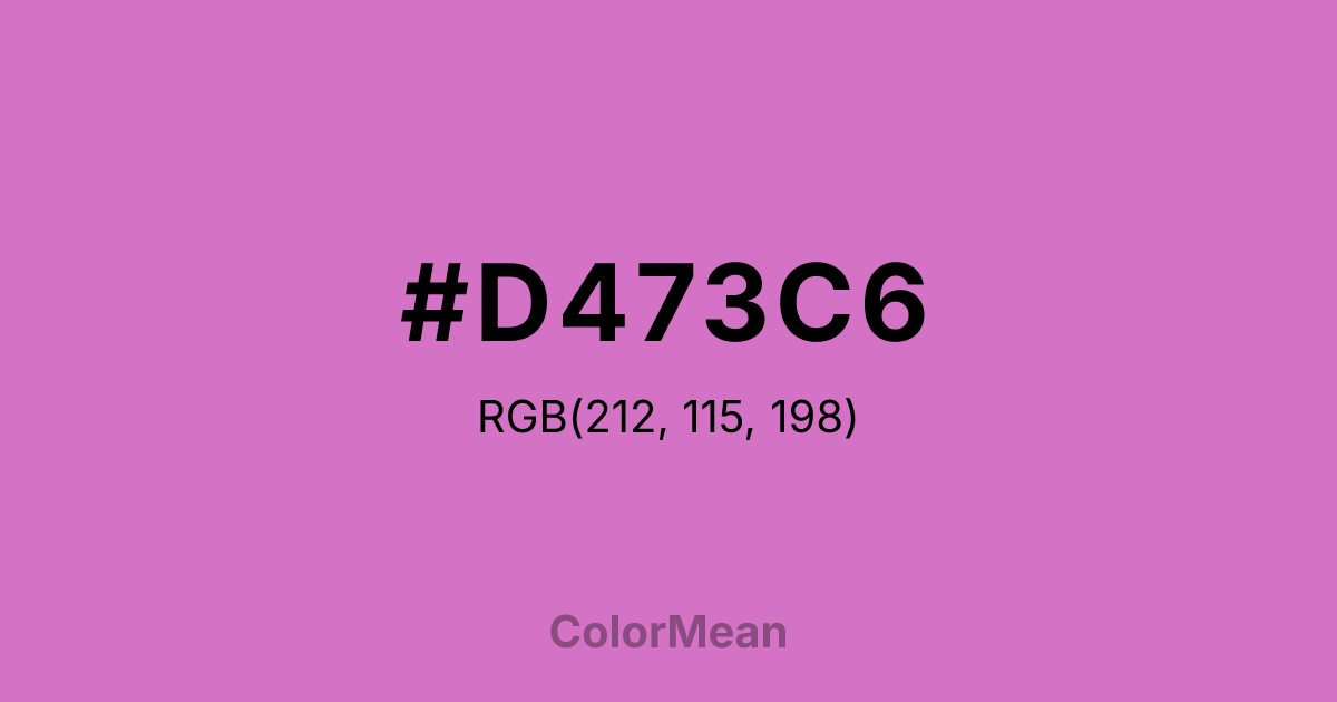
#D473C6 RGB value is (212, 115, 198). The hex color red value is 212, green is 115, and blue is 198. Its HSL format shows a hue of 309°, saturation of 53 percent, and lightness of 64 percent. The CMYK process values are 0 percent, 46 percent, 7 percent, 17 percent.
#D473C6 Color Meaning
Color #D473C6 grounds fantasy in substance. #D473C6 mid-saturation purple-pink avoids both neon flash and pastel fragility, landing in a zone of confident individuality. Color #D473C6 was designed for legibility in early color printers, where extreme hues bled. Color #D473C6 prioritizes clarity over spectacle. In editorial design, color #D473C6 enhances quote highlights and pull text without distracting from body copy—especially in literary or feminist publishing. Color #D473C6 feels intentional because #D473C6’s been tested, not just chosen. #D473C6 carries the weight of use, not just beauty. Today, color #D473C6 appears in boutique fitness, indie beauty, and art schools where creativity meets discipline. Paired with olive or warm taupe, color #D473C6 creates contrast that feels curated, not chaotic. Color #D473C6 doesn’t trend—#D473C6 defines.
Color Conversion
Convert #D473C6 across different color models and formats. These conversions help designers work seamlessly between digital and print media, ensuring this color maintains its intended appearance across RGB screens, CMYK printers, and HSL color manipulations.
RGB Values & CMYK Values
RGB Values
CMYK Values
Color Variations
#D473C6 harmonies come to life through carefully balanced shades, tints, and tones, giving this color depth and flexibility across light and dark variations. Shades add richness, tints bring an airy softness, and tones soften intensity, making it easy to pair in clean, modern palettes.
Color Harmonies
#D473C6 harmonies create beautiful relationships with other colors based on their position on the color wheel. Each harmony type offers unique design possibilities, enabling cohesive and visually appealing color schemes.
Analogous
Colors adjacent on the color wheel (30° apart)
Complementary
Colors opposite on the color wheel (180° apart)
Split Complementary
Three colors using one base hue and the two hues beside its opposite
Triadic
Three colors evenly spaced (120° apart)
Tetradic
Four colors forming a rectangle on the wheel
Square
Four colors evenly spaced (90° apart)
Double Split
Four colors formed from two base hues and the colors next to their opposites
Monochromatic
Variations of a single hue
Contrast Checker
(WCAG 2.1) Test #D473C6 for accessibility compliance against white and black backgrounds. Proper contrast ensures this color remains readable and usable for all audiences, meeting WCAG 2.1 standards for both normal and large text applications.
Sample Text
This is how your text will look with these colors.
Large Text (18pt+)
Normal Text
UI Components
Color Blindness Simulator
See how #D473C6 appears to people with different types of color vision deficiencies. These simulations help create more inclusive designs that consider how this color is perceived across various visual abilities.
Normal Vision
protanopia
Note: These simulations are approximations. Actual color vision deficiency varies by individual.
CSS Examples
Background Color
Text Color
Sample Text
Border Color
Box Shadow
Text Shadow
Sample Text
Gradient
#D473C6 Color FAQs
Frequently asked questions about #D473C6 color meaning, symbolism, and applications. Click on any question to expand detailed answers.
