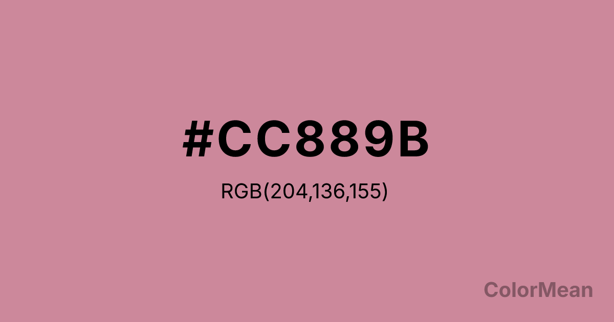
#CC889B Color Information
#CC889B RGB value is (204, 136, 155). The hex color red value is 204, green is 136, and blue is 155. Its HSL format shows a hue of 343°, saturation of 40 percent, and lightness of 67 percent. The CMYK process values are 0 percent, 33 percent, 24 percent, 20 percent.
#CC889B Color Meaning
Color #CC889B conveys muted morbidity, faded elegance, and complex ambiguity. #CC889B dusty, greyish pink-brown is historically associated with flea blood and faded fabrics, suggesting something once vibrant now subdued by age or neglect. Psychologically, color #CC889B is intriguing and slightly melancholic, promoting feelings of nostalgic decay, sophisticated weariness, and a fascination with the imperfect and the aged. #CC889B sits in an ambiguous zone between pink, brown, and grey, defying easy categorization. #CC889B color is beauty in a state of dignified decline. Symbolically, color #CC889B represents the patina of memory, the elegance of decay, and the complex history written in faded stains and worn materials. #CC889B is the color of a faded rose in a forgotten book or the walls of an abandoned mansion. Culturally, #CC889B has oscillated between being reviled and revered, often used in historical costuming or design to convey a specific, nuanced sense of time-worn authenticity. Color #CC889B offers a color for stories that are not about bright beginnings, but about rich, complicated, and weathered middles or ends.
Color Conversion
Convert #CC889B across different color models and formats. These conversions help designers work seamlessly between digital and print media, ensuring this color maintains its intended appearance across RGB screens, CMYK printers, and HSL color manipulations.
RGB Values & CMYK Values
RGB Values
CMYK Values
Color Variations
#CC889B harmonies come to life through carefully balanced shades, tints, and tones, giving this color depth and flexibility across light and dark variations. Shades add richness, tints bring an airy softness, and tones soften intensity, making it easy to pair in clean, modern palettes.
Color Harmonies
#CC889B harmonies create beautiful relationships with other colors based on their position on the color wheel. Each harmony type offers unique design possibilities, enabling cohesive and visually appealing color schemes.
Analogous
Colors adjacent on the color wheel (30° apart)
Complementary
Colors opposite on the color wheel (180° apart)
Split Complementary
Three colors using one base hue and the two hues beside its opposite
Triadic
Three colors evenly spaced (120° apart)
Tetradic
Four colors forming a rectangle on the wheel
Square
Four colors evenly spaced (90° apart)
Double Split
Four colors formed from two base hues and the colors next to their opposites
Monochromatic
Variations of a single hue
Contrast Checker
(WCAG 2.1) Test #CC889B for accessibility compliance against white and black backgrounds. Proper contrast ensures this color remains readable and usable for all audiences, meeting WCAG 2.1 standards for both normal and large text applications.
Sample Text
This is how your text will look with these colors.
Large Text (18pt+)
Normal Text
UI Components
Color Blindness Simulator
See how #CC889B appears to people with different types of color vision deficiencies. These simulations help create more inclusive designs that consider how this color is perceived across various visual abilities.
Normal Vision
protanopia
Note: These simulations are approximations. Actual color vision deficiency varies by individual.
CSS Examples
Background Color
Text Color
Sample Text
Border Color
Box Shadow
Text Shadow
Sample Text
Gradient
#CC889B Color FAQs
Frequently asked questions about #CC889B color meaning, symbolism, and applications. Click on any question to expand detailed answers.
