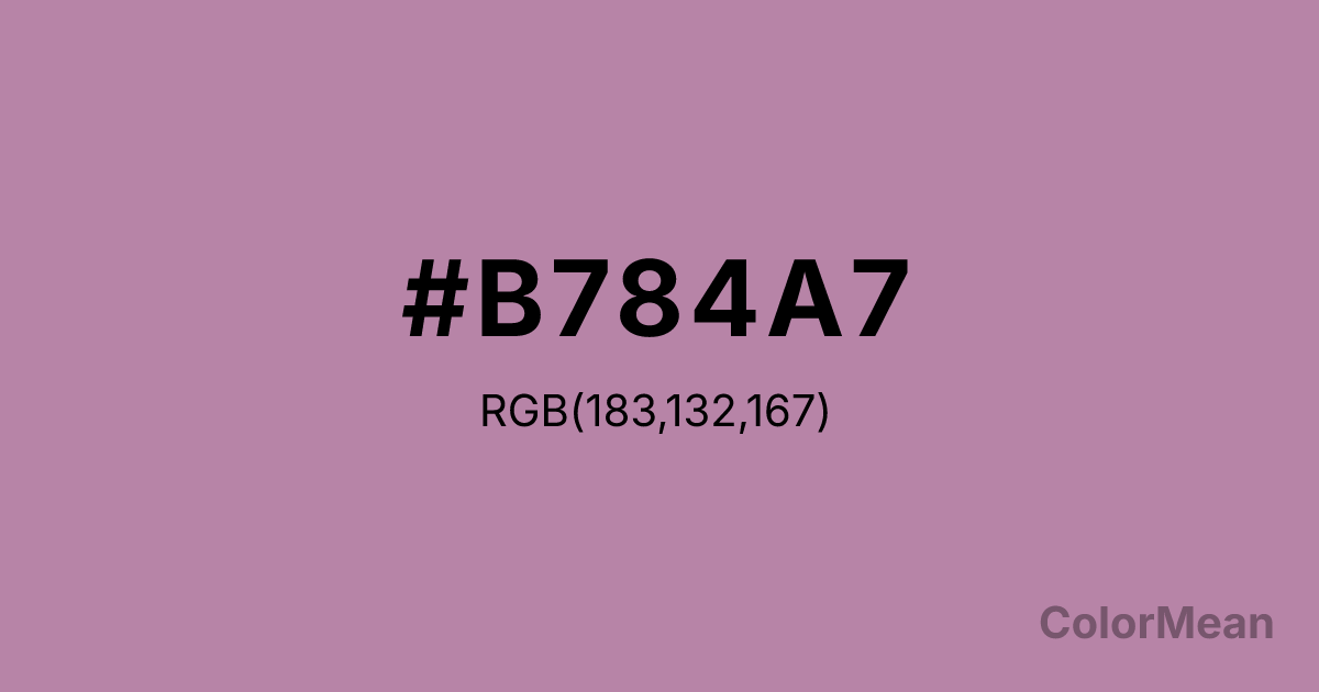
Opera Mauve (#B784A7) Color Information
Opera Mauve (#B784A7) RGB value is (183, 132, 167). The hex color red value is 183, green is 132, and blue is 167. Its HSL format shows a hue of 319°, saturation of 26 percent, and lightness of 62 percent. The CMYK process values are 0 percent, 28 percent, 9 percent, 28 percent.
Opera Mauve (#B784A7) Color Meaning
Opera Mauve (#B784A7) blends theatricality with restraint. This dusty rose-purple draws from faded velvet curtains and vintage stage costumes—suggesting drama softened by time. Opera Mauve (#B784A7) doesn’t overwhelm; it lingers, evoking nostalgia without sentimentality. Opera Mauve (#B784A7) appeals to audiences seeking elegance that feels earned, not imposed. Color perception studies show that desaturated purples like Opera Mauve (#B784A7) activate regions linked to memory and introspection, making them effective in wellness and editorial design. Opera Mauve (#B784A7) avoids the gendered clichés of bright pinks while retaining emotional warmth. Its gray undertone adds sophistication—ideal for brands balancing creativity and credibility. Historically tied to 19th-century salons and bohemian aesthetics, modern interpretations use Opera Mauve (#B784A7) to signal inclusive refinement. It works beautifully in typography-heavy layouts, where it adds subtle chromatic interest without distracting from text. Paired with warm neutrals or deep olives, Opera Mauve (#B784A7) creates palettes that feel both poetic and purposeful. Opera Mauve (#B784A7) isn’t loud—it’s layered.
Color Conversion
Convert Opera Mauve (#B784A7) across different color models and formats. These conversions help designers work seamlessly between digital and print media, ensuring this color maintains its intended appearance across RGB screens, CMYK printers, and HSL color manipulations.
RGB Values & CMYK Values
RGB Values
CMYK Values
Color Variations
Opera Mauve (#B784A7) harmonies come to life through carefully balanced shades, tints, and tones, giving this color depth and flexibility across light and dark variations. Shades add richness, tints bring an airy softness, and tones soften intensity, making it easy to pair in clean, modern palettes.
Color Harmonies
Opera Mauve (#B784A7) harmonies create beautiful relationships with other colors based on their position on the color wheel. Each harmony type offers unique design possibilities, enabling cohesive and visually appealing color schemes.
Analogous
Colors adjacent on the color wheel (30° apart)
Complementary
Colors opposite on the color wheel (180° apart)
Split Complementary
Three colors using one base hue and the two hues beside its opposite
Triadic
Three colors evenly spaced (120° apart)
Tetradic
Four colors forming a rectangle on the wheel
Square
Four colors evenly spaced (90° apart)
Double Split
Four colors formed from two base hues and the colors next to their opposites
Monochromatic
Variations of a single hue
Contrast Checker
(WCAG 2.1) Test Opera Mauve (#B784A7) for accessibility compliance against white and black backgrounds. Proper contrast ensures this color remains readable and usable for all audiences, meeting WCAG 2.1 standards for both normal and large text applications.
Sample Text
This is how your text will look with these colors.
Large Text (18pt+)
Normal Text
UI Components
Color Blindness Simulator
See how #B784A7 appears to people with different types of color vision deficiencies. These simulations help create more inclusive designs that consider how this color is perceived across various visual abilities.
Normal Vision
protanopia
Note: These simulations are approximations. Actual color vision deficiency varies by individual.
CSS Examples
Background Color
Text Color
Sample Text
Border Color
Box Shadow
Text Shadow
Sample Text
Gradient
Opera Mauve (#B784A7) Color FAQs
Frequently asked questions about Opera Mauve (#B784A7) color meaning, symbolism, and applications. Click on any question to expand detailed answers.
