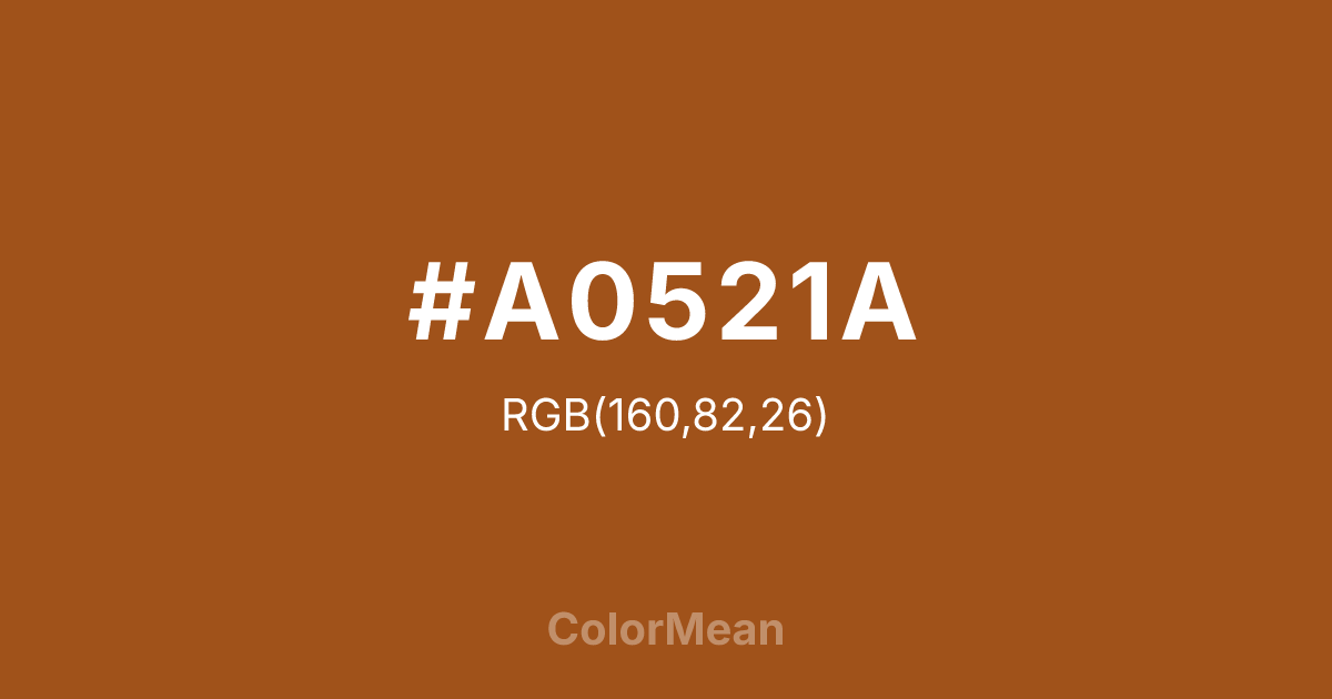
#A0521A Color Information
#A0521A RGB value is (160, 82, 26). The hex color red value is 160, green is 82, and blue is 26. Its HSL format shows a hue of 25°, saturation of 72 percent, and lightness of 36 percent. The CMYK process values are 0 percent, 49 percent, 84 percent, 37 percent.
#A0521A Color Meaning
Color #A0521A deepens the earth. #A0521A rich, red-leaning brown strips ochre of its yellow brightness, leaving a pigment that feels dug, not mixed. Color #A0521A suggests clay vessels, adobe walls, and hand-ground spices—materials shaped by climate and craft. Color #A0521A conveys warmth through density. Neuroaesthetic studies show that warm, low-chroma browns like color #A0521A activate olfactory and tactile memory centers, enhancing product recall in food and fragrance branding. Color #A0521A doesn’t just look earthy—#A0521A feels earthy. Designers use color #A0521A in packaging that wants to signal origin, not just ingredient. Historically used in prehistoric cave art and desert architecture, color #A0521A now anchors sustainable luxury—appearing in leather goods, ceramic tableware, and artisan coffee. Paired with raw linen or oxidized green, color #A0521A creates narratives of human hands meeting natural elements. Color #A0521A is never trendy; #A0521A’s timeless.
Color Conversion
Convert #A0521A across different color models and formats. These conversions help designers work seamlessly between digital and print media, ensuring this color maintains its intended appearance across RGB screens, CMYK printers, and HSL color manipulations.
RGB Values & CMYK Values
RGB Values
CMYK Values
Color Variations
#A0521A harmonies come to life through carefully balanced shades, tints, and tones, giving this color depth and flexibility across light and dark variations. Shades add richness, tints bring an airy softness, and tones soften intensity, making it easy to pair in clean, modern palettes.
Color Harmonies
#A0521A harmonies create beautiful relationships with other colors based on their position on the color wheel. Each harmony type offers unique design possibilities, enabling cohesive and visually appealing color schemes.
Analogous
Colors adjacent on the color wheel (30° apart)
Complementary
Colors opposite on the color wheel (180° apart)
Split Complementary
Three colors using one base hue and the two hues beside its opposite
Triadic
Three colors evenly spaced (120° apart)
Tetradic
Four colors forming a rectangle on the wheel
Square
Four colors evenly spaced (90° apart)
Double Split
Four colors formed from two base hues and the colors next to their opposites
Monochromatic
Variations of a single hue
Contrast Checker
(WCAG 2.1) Test #A0521A for accessibility compliance against white and black backgrounds. Proper contrast ensures this color remains readable and usable for all audiences, meeting WCAG 2.1 standards for both normal and large text applications.
Sample Text
This is how your text will look with these colors.
Large Text (18pt+)
Normal Text
UI Components
Color Blindness Simulator
See how #A0521A appears to people with different types of color vision deficiencies. These simulations help create more inclusive designs that consider how this color is perceived across various visual abilities.
Normal Vision
protanopia
Note: These simulations are approximations. Actual color vision deficiency varies by individual.
CSS Examples
Background Color
Text Color
Sample Text
Border Color
Box Shadow
Text Shadow
Sample Text
Gradient
#A0521A Color FAQs
Frequently asked questions about #A0521A color meaning, symbolism, and applications. Click on any question to expand detailed answers.
