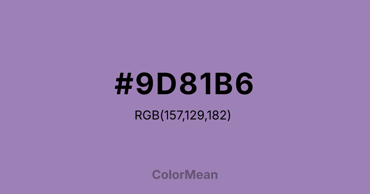
#9D81B6 Color Information
#9D81B6 RGB value is (157, 129, 182). The hex color red value is 157, green is 129, and blue is 182. Its HSL format shows a hue of 272°, saturation of 27 percent, and lightness of 61 percent. The CMYK process values are 14 percent, 29 percent, 0 percent, 29 percent.
#9D81B6 Color Meaning
Color #9D81B6 conveys a slightly brighter and more luminous variant of the same scenic idealism. #9D81B6 light, reddish-purple maintains the majestic quality but with a warmer, more vibrant tone, as if the mountains are bathed in late afternoon sun. Psychologically, color #9D81B6 retains the uplifting and awe-inspiring qualities of its counterpart but adds a note of hopeful energy and vibrant possibility. #9D81B6 feels less wistful and more actively inspiring, stimulating creative ambition within a framework of serene beauty. #9D81B6 shade is majesty with a spark of vitality. Culturally, #9D81B6 alternate spelling and hue solidify the connection to the American landscape ideal, offering a slightly different interpretation of the same poetic concept. Symbolically, #9D81B6 represents the same noble distance but with a clearer path forward, a dream that feels within reach on a bright day. Color #9D81B6 ensures the lyrical color can adapt to different design needs while maintaining its core identity as a color of dignified, natural splendor.
Color Conversion
Convert #9D81B6 across different color models and formats. These conversions help designers work seamlessly between digital and print media, ensuring this color maintains its intended appearance across RGB screens, CMYK printers, and HSL color manipulations.
RGB Values & CMYK Values
RGB Values
CMYK Values
Color Variations
#9D81B6 harmonies come to life through carefully balanced shades, tints, and tones, giving this color depth and flexibility across light and dark variations. Shades add richness, tints bring an airy softness, and tones soften intensity, making it easy to pair in clean, modern palettes.
Color Harmonies
#9D81B6 harmonies create beautiful relationships with other colors based on their position on the color wheel. Each harmony type offers unique design possibilities, enabling cohesive and visually appealing color schemes.
Analogous
Colors adjacent on the color wheel (30° apart)
Complementary
Colors opposite on the color wheel (180° apart)
Split Complementary
Three colors using one base hue and the two hues beside its opposite
Triadic
Three colors evenly spaced (120° apart)
Tetradic
Four colors forming a rectangle on the wheel
Square
Four colors evenly spaced (90° apart)
Double Split
Four colors formed from two base hues and the colors next to their opposites
Monochromatic
Variations of a single hue
Contrast Checker
(WCAG 2.1) Test #9D81B6 for accessibility compliance against white and black backgrounds. Proper contrast ensures this color remains readable and usable for all audiences, meeting WCAG 2.1 standards for both normal and large text applications.
Sample Text
This is how your text will look with these colors.
Large Text (18pt+)
Normal Text
UI Components
Color Blindness Simulator
See how #9D81B6 appears to people with different types of color vision deficiencies. These simulations help create more inclusive designs that consider how this color is perceived across various visual abilities.
Normal Vision
protanopia
Note: These simulations are approximations. Actual color vision deficiency varies by individual.
CSS Examples
Background Color
Text Color
Sample Text
Border Color
Box Shadow
Text Shadow
Sample Text
Gradient
#9D81B6 Color FAQs
Frequently asked questions about #9D81B6 color meaning, symbolism, and applications. Click on any question to expand detailed answers.

