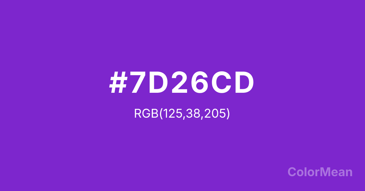
Purple3 (#7D26CD) Color Information
Purple3 (#7D26CD) RGB value is (125, 38, 205). The hex color red value is 125, green is 38, and blue is 205. Its HSL format shows a hue of 271°, saturation of 69 percent, and lightness of 48 percent. The CMYK process values are 39 percent, 81 percent, 0 percent, 20 percent.
Purple3 (#7D26CD) Color Meaning
Purple3 (#7D26CD) suggests a mature, substantial depth within the systematic digital purple family, indicating shaded vibrancy and grounded fantasy. This muted, medium violet adds weight and realism to the palette, resembling a purple object in partial shadow. Psychologically, Purple3 (#7D26CD) is comforting and substantive, promoting a sense of durable creativity, established identity, and imagination that has structure and history. It feels less ephemeral and more tangible than its brighter counterparts, providing the body and form in a digital scene. This color offers creative depth. Culturally, as part of the X11 gradient, Purple3 (#7D26CD) is essential for creating dimension and hierarchy. It allows designers to model three-dimensional purple objects, create realistic interfaces with depth, or indicate a "pressed" state, all while staying within a specific, emotionally coded color family. It translates the concept of "purple" from a flat icon into something with volume and presence.
Color Conversion
Convert Purple3 (#7D26CD) across different color models and formats. These conversions help designers work seamlessly between digital and print media, ensuring this color maintains its intended appearance across RGB screens, CMYK printers, and HSL color manipulations.
RGB Values & CMYK Values
RGB Values
CMYK Values
Color Variations
Purple3 (#7D26CD) harmonies come to life through carefully balanced shades, tints, and tones, giving this color depth and flexibility across light and dark variations. Shades add richness, tints bring an airy softness, and tones soften intensity, making it easy to pair in clean, modern palettes.
Color Harmonies
Purple3 (#7D26CD) harmonies create beautiful relationships with other colors based on their position on the color wheel. Each harmony type offers unique design possibilities, enabling cohesive and visually appealing color schemes.
Analogous
Colors adjacent on the color wheel (30° apart)
Complementary
Colors opposite on the color wheel (180° apart)
Split Complementary
Three colors using one base hue and the two hues beside its opposite
Triadic
Three colors evenly spaced (120° apart)
Tetradic
Four colors forming a rectangle on the wheel
Square
Four colors evenly spaced (90° apart)
Double Split
Four colors formed from two base hues and the colors next to their opposites
Monochromatic
Variations of a single hue
Contrast Checker
(WCAG 2.1) Test Purple3 (#7D26CD) for accessibility compliance against white and black backgrounds. Proper contrast ensures this color remains readable and usable for all audiences, meeting WCAG 2.1 standards for both normal and large text applications.
Sample Text
This is how your text will look with these colors.
Large Text (18pt+)
Normal Text
UI Components
Color Blindness Simulator
See how #7D26CD appears to people with different types of color vision deficiencies. These simulations help create more inclusive designs that consider how this color is perceived across various visual abilities.
Normal Vision
protanopia
Note: These simulations are approximations. Actual color vision deficiency varies by individual.
CSS Examples
Background Color
Text Color
Sample Text
Border Color
Box Shadow
Text Shadow
Sample Text
Gradient
Purple3 (#7D26CD) Color FAQs
Frequently asked questions about Purple3 (#7D26CD) color meaning, symbolism, and applications. Click on any question to expand detailed answers.
