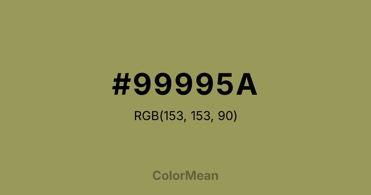
#99995A Color Information
#99995A RGB value is (153, 153, 90). The hex color red value is 153, green is 153, and blue is 90. Its HSL format shows a hue of 60°, saturation of 26 percent, and lightness of 48 percent. The CMYK process values are 0 percent, 0 percent, 41 percent, 40 percent.
#99995A Color Meaning
Color #99995A tempers brightness with earth. #99995A muted yellow-green avoids the cheer of lemon or the sterility of chartreuse, landing instead in a zone of agricultural realism—think dried hay, parchment, or late-summer fields. Color #99995A signals ripeness without decay, making #99995A ideal for organic food branding and educational materials. Color #99995A offers luminosity without glare. In classroom design, color #99995A enhances concentration without overstimulation—unlike high-chroma yellows that can induce anxiety. Color #99995A works best as an accent against deep blues or warm browns, where #99995A adds warmth without visual noise. Culturally, #99995A references harvest cycles, manuscript illumination, and Mediterranean sunbaked walls. In digital contexts, color #99995A improves icon visibility in dark-mode interfaces while maintaining accessibility. Color #99995A feels seasonal, not trend-driven—rooted in natural rhythm, not algorithmic preference.
Color Conversion
Convert #99995A across different color models and formats. These conversions help designers work seamlessly between digital and print media, ensuring this color maintains its intended appearance across RGB screens, CMYK printers, and HSL color manipulations.
RGB Values & CMYK Values
RGB Values
CMYK Values
Color Variations
#99995A harmonies come to life through carefully balanced shades, tints, and tones, giving this color depth and flexibility across light and dark variations. Shades add richness, tints bring an airy softness, and tones soften intensity, making it easy to pair in clean, modern palettes.
Color Harmonies
#99995A harmonies create beautiful relationships with other colors based on their position on the color wheel. Each harmony type offers unique design possibilities, enabling cohesive and visually appealing color schemes.
Analogous
Colors adjacent on the color wheel (30° apart)
Complementary
Colors opposite on the color wheel (180° apart)
Split Complementary
Three colors using one base hue and the two hues beside its opposite
Triadic
Three colors evenly spaced (120° apart)
Tetradic
Four colors forming a rectangle on the wheel
Square
Four colors evenly spaced (90° apart)
Double Split
Four colors formed from two base hues and the colors next to their opposites
Monochromatic
Variations of a single hue
Contrast Checker
(WCAG 2.1) Test #99995A for accessibility compliance against white and black backgrounds. Proper contrast ensures this color remains readable and usable for all audiences, meeting WCAG 2.1 standards for both normal and large text applications.
Sample Text
This is how your text will look with these colors.
Large Text (18pt+)
Normal Text
UI Components
Color Blindness Simulator
See how #99995A appears to people with different types of color vision deficiencies. These simulations help create more inclusive designs that consider how this color is perceived across various visual abilities.
Normal Vision
protanopia
Note: These simulations are approximations. Actual color vision deficiency varies by individual.
CSS Examples
Background Color
Text Color
Sample Text
Border Color
Box Shadow
Text Shadow
Sample Text
Gradient
#99995A Color FAQs
Frequently asked questions about #99995A color meaning, symbolism, and applications. Click on any question to expand detailed answers.

