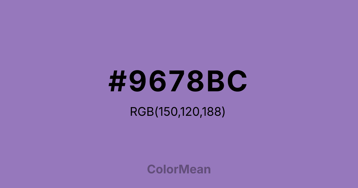
#9678BC Color Information
#9678BC RGB value is (150, 120, 188). The hex color red value is 150, green is 120, and blue is 188. Its HSL format shows a hue of 266°, saturation of 34 percent, and lightness of 60 percent. The CMYK process values are 20 percent, 36 percent, 0 percent, 26 percent.
#9678BC Color Meaning
Color #9678BC evokes dreamy grandeur, romantic distance, and serene elevation. #9678BC soft, greyish violet is the color of faraway peaks at dusk, wild lilacs, and hazy, beautiful horizons. Psychologically, color #9678BC is calming and uplifting, promoting feelings of peaceful awe, gentle aspiration, and a pleasant, manageable melancholy. #9678BC suggests beauty that is vast and impressive yet softened by atmosphere and distance, not intimidating but inviting. #9678BC color is a scenic overlook captured in a single hue. Culturally, the name is drawn from the patriotic song "America the Beautiful," forever linking #9678BC color to a sense of idealized, picturesque national landscape. Symbolically, #9678BC represents the beauty of the journey, goals that inspire but do not overwhelm, and nature’s ability to soften its own majesty with mist and light. Therefore, color #9678BC acts as a visual metaphor for an achievable dream, a majestic view made soft, approachable, and deeply soothing.
Color Conversion
Convert #9678BC across different color models and formats. These conversions help designers work seamlessly between digital and print media, ensuring this color maintains its intended appearance across RGB screens, CMYK printers, and HSL color manipulations.
RGB Values & CMYK Values
RGB Values
CMYK Values
Color Variations
#9678BC harmonies come to life through carefully balanced shades, tints, and tones, giving this color depth and flexibility across light and dark variations. Shades add richness, tints bring an airy softness, and tones soften intensity, making it easy to pair in clean, modern palettes.
Color Harmonies
#9678BC harmonies create beautiful relationships with other colors based on their position on the color wheel. Each harmony type offers unique design possibilities, enabling cohesive and visually appealing color schemes.
Analogous
Colors adjacent on the color wheel (30° apart)
Complementary
Colors opposite on the color wheel (180° apart)
Split Complementary
Three colors using one base hue and the two hues beside its opposite
Triadic
Three colors evenly spaced (120° apart)
Tetradic
Four colors forming a rectangle on the wheel
Square
Four colors evenly spaced (90° apart)
Double Split
Four colors formed from two base hues and the colors next to their opposites
Monochromatic
Variations of a single hue
Contrast Checker
(WCAG 2.1) Test #9678BC for accessibility compliance against white and black backgrounds. Proper contrast ensures this color remains readable and usable for all audiences, meeting WCAG 2.1 standards for both normal and large text applications.
Sample Text
This is how your text will look with these colors.
Large Text (18pt+)
Normal Text
UI Components
Color Blindness Simulator
See how #9678BC appears to people with different types of color vision deficiencies. These simulations help create more inclusive designs that consider how this color is perceived across various visual abilities.
Normal Vision
protanopia
Note: These simulations are approximations. Actual color vision deficiency varies by individual.
CSS Examples
Background Color
Text Color
Sample Text
Border Color
Box Shadow
Text Shadow
Sample Text
Gradient
#9678BC Color FAQs
Frequently asked questions about #9678BC color meaning, symbolism, and applications. Click on any question to expand detailed answers.

