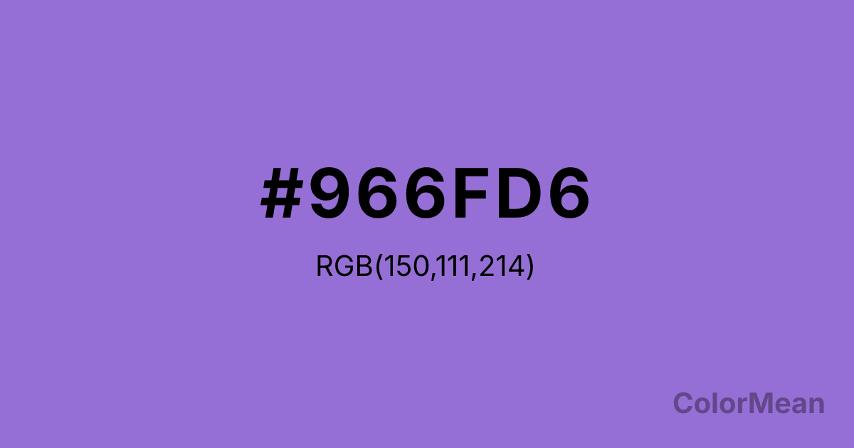
Dark Pastel Purple (#966FD6) Color Information
Dark Pastel Purple (#966FD6) RGB value is (150, 111, 214). The hex color red value is 150, green is 111, and blue is 214. Its HSL format shows a hue of 263°, saturation of 56 percent, and lightness of 64 percent. The CMYK process values are 30 percent, 48 percent, 0 percent, 16 percent.
Dark Pastel Purple (#966FD6) Color Meaning
Dark Pastel Purple (#966FD6) signifies imaginative depth, accessible luxury, and creative twilight. This soft, medium violet has a dusty quality, suggesting heirloom fabrics, lavender fields at dusk, and imaginative play. Psychologically, Dark Pastel Purple (#966FD6) stimulates gentle creativity, nostalgic fantasy, and a sense of affordable indulgence. It culturally references vintage bedroom decor, whimsical illustration, and the color of certain crystals like amethyst. Spiritually, this color represents daydreams with foundation, spiritual accessibility, and magic in the everyday, embodying a creative and comforting mystique.
Color Conversion
Convert Dark Pastel Purple (#966FD6) across different color models and formats. These conversions help designers work seamlessly between digital and print media, ensuring this color maintains its intended appearance across RGB screens, CMYK printers, and HSL color manipulations.
RGB Values & CMYK Values
RGB Values
CMYK Values
Color Variations
Dark Pastel Purple (#966FD6) harmonies come to life through carefully balanced shades, tints, and tones, giving this color depth and flexibility across light and dark variations. Shades add richness, tints bring an airy softness, and tones soften intensity, making it easy to pair in clean, modern palettes.
Color Harmonies
Dark Pastel Purple (#966FD6) harmonies create beautiful relationships with other colors based on their position on the color wheel. Each harmony type offers unique design possibilities, enabling cohesive and visually appealing color schemes.
Analogous
Colors adjacent on the color wheel (30° apart)
Complementary
Colors opposite on the color wheel (180° apart)
Split Complementary
Three colors using one base hue and the two hues beside its opposite
Triadic
Three colors evenly spaced (120° apart)
Tetradic
Four colors forming a rectangle on the wheel
Square
Four colors evenly spaced (90° apart)
Double Split
Four colors formed from two base hues and the colors next to their opposites
Monochromatic
Variations of a single hue
Contrast Checker
(WCAG 2.1) Test Dark Pastel Purple (#966FD6) for accessibility compliance against white and black backgrounds. Proper contrast ensures this color remains readable and usable for all audiences, meeting WCAG 2.1 standards for both normal and large text applications.
Sample Text
This is how your text will look with these colors.
Large Text (18pt+)
Normal Text
UI Components
Color Blindness Simulator
See how #966FD6 appears to people with different types of color vision deficiencies. These simulations help create more inclusive designs that consider how this color is perceived across various visual abilities.
Normal Vision
protanopia
Note: These simulations are approximations. Actual color vision deficiency varies by individual.
CSS Examples
Background Color
Text Color
Sample Text
Border Color
Box Shadow
Text Shadow
Sample Text
Gradient
Dark Pastel Purple (#966FD6) Color FAQs
Frequently asked questions about Dark Pastel Purple (#966FD6) color meaning, symbolism, and applications. Click on any question to expand detailed answers.
