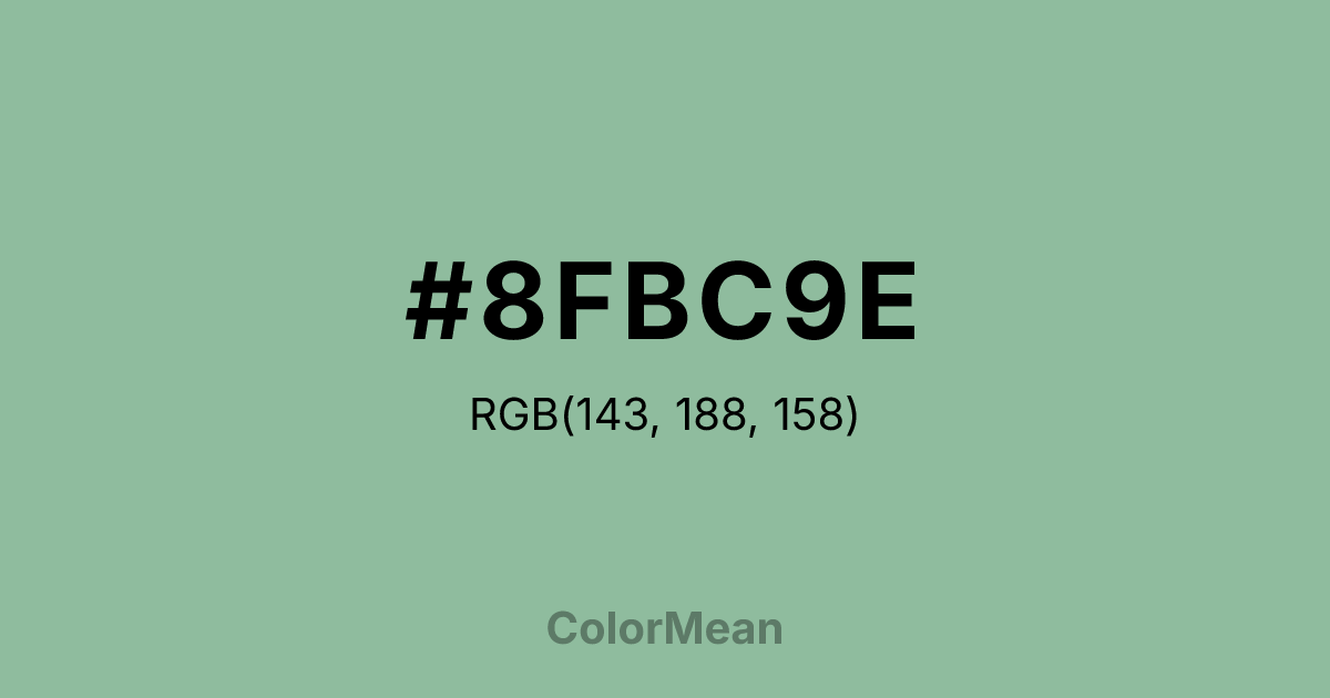
#8FBC9E Color Information
#8FBC9E RGB value is (143, 188, 158). The hex color red value is 143, green is 188, and blue is 158. Its HSL format shows a hue of 140°, saturation of 25 percent, and lightness of 65 percent. The CMYK process values are 24 percent, 0 percent, 16 percent, 26 percent.
#8FBC9E Color Meaning
Color #8FBC9E expresses serene confidence, institutional grace, and understated vitality. #8FBC9E soft green-blue—named after the historic English school—balances the calm of aqua with the freshness of spring foliage, creating a tone that feels both traditional and quietly progressive. Color #8FBC9E reduces visual stress in educational and healthcare settings, where clarity and emotional neutrality are essential. Its moderate saturation supports prolonged focus without triggering overstimulation. Culturally, color #8FBC9E carries connotations of privilege reimagined as service, discipline paired with compassion. #8FBC9E appears in heritage branding that seeks to modernize without erasing history. Spiritually, color #8FBC9E represents thoughtful action—growth guided by principle, not impulse. In design systems, #8FBC9E serves as a bridge between warm and cool palettes, offering cohesion without compromise. #8FBC9E is the color of steady breath before decisive speech.
Color Conversion
Convert #8FBC9E across different color models and formats. These conversions help designers work seamlessly between digital and print media, ensuring this color maintains its intended appearance across RGB screens, CMYK printers, and HSL color manipulations.
RGB Values & CMYK Values
RGB Values
CMYK Values
Color Variations
#8FBC9E harmonies come to life through carefully balanced shades, tints, and tones, giving this color depth and flexibility across light and dark variations. Shades add richness, tints bring an airy softness, and tones soften intensity, making it easy to pair in clean, modern palettes.
Color Harmonies
#8FBC9E harmonies create beautiful relationships with other colors based on their position on the color wheel. Each harmony type offers unique design possibilities, enabling cohesive and visually appealing color schemes.
Analogous
Colors adjacent on the color wheel (30° apart)
Complementary
Colors opposite on the color wheel (180° apart)
Split Complementary
Three colors using one base hue and the two hues beside its opposite
Triadic
Three colors evenly spaced (120° apart)
Tetradic
Four colors forming a rectangle on the wheel
Square
Four colors evenly spaced (90° apart)
Double Split
Four colors formed from two base hues and the colors next to their opposites
Monochromatic
Variations of a single hue
Contrast Checker
(WCAG 2.1) Test #8FBC9E for accessibility compliance against white and black backgrounds. Proper contrast ensures this color remains readable and usable for all audiences, meeting WCAG 2.1 standards for both normal and large text applications.
Sample Text
This is how your text will look with these colors.
Large Text (18pt+)
Normal Text
UI Components
Color Blindness Simulator
See how #8FBC9E appears to people with different types of color vision deficiencies. These simulations help create more inclusive designs that consider how this color is perceived across various visual abilities.
Normal Vision
protanopia
Note: These simulations are approximations. Actual color vision deficiency varies by individual.
CSS Examples
Background Color
Text Color
Sample Text
Border Color
Box Shadow
Text Shadow
Sample Text
Gradient
#8FBC9E Color FAQs
Frequently asked questions about #8FBC9E color meaning, symbolism, and applications. Click on any question to expand detailed answers.
