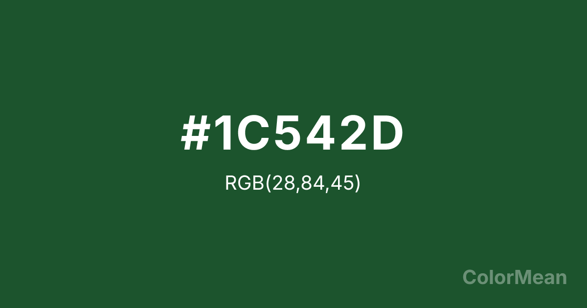
Pearl Green (#1C542D) Color Information
Pearl Green (#1C542D) RGB value is (28, 84, 45). The hex color red value is 28, green is 84, and blue is 45. Its HSL format shows a hue of 138°, saturation of 50 percent, and lightness of 22 percent. The CMYK process values are 67 percent, 0 percent, 46 percent, 67 percent.
Pearl Green (#1C542D) Color Meaning
Pearl Green (#1C542D) denotes lush density, forest solemnity, and vital tradition. This very dark, yellow-green resembles deep pine forests, mossy stones, and military olive drab, suggesting abundant, silent life and enduring natural systems. Psychologically, Pearl Green (#1C542D) is deeply stabilizing and reassuring, promoting feelings of security, growth, and connection to primal, cyclical forces. It is a serious, substantial green that conveys resilience, heritage, and a quiet, pervasive vitality. This color feels both nourishing and imposing. Symbolically, Pearl Green (#1C542D) represents the heart of the wilderness, the wisdom of old growth, and life forces that are slow, patient, and indomitable. It is the color of legacy and lineage in the natural world. Culturally, it appears in national park iconography, traditional hunting attire, and designs aiming to convey robustness, reliability, and a no-nonsense connection to nature. Pearl Green (#1C542D) grounds any palette with the weight and richness of the deep woods.
Color Conversion
Convert Pearl Green (#1C542D) across different color models and formats. These conversions help designers work seamlessly between digital and print media, ensuring this color maintains its intended appearance across RGB screens, CMYK printers, and HSL color manipulations.
RGB Values & CMYK Values
RGB Values
CMYK Values
Color Variations
Pearl Green (#1C542D) harmonies come to life through carefully balanced shades, tints, and tones, giving this color depth and flexibility across light and dark variations. Shades add richness, tints bring an airy softness, and tones soften intensity, making it easy to pair in clean, modern palettes.
Color Harmonies
Pearl Green (#1C542D) harmonies create beautiful relationships with other colors based on their position on the color wheel. Each harmony type offers unique design possibilities, enabling cohesive and visually appealing color schemes.
Analogous
Colors adjacent on the color wheel (30° apart)
Complementary
Colors opposite on the color wheel (180° apart)
Split Complementary
Three colors using one base hue and the two hues beside its opposite
Triadic
Three colors evenly spaced (120° apart)
Tetradic
Four colors forming a rectangle on the wheel
Square
Four colors evenly spaced (90° apart)
Double Split
Four colors formed from two base hues and the colors next to their opposites
Monochromatic
Variations of a single hue
Contrast Checker
(WCAG 2.1) Test Pearl Green (#1C542D) for accessibility compliance against white and black backgrounds. Proper contrast ensures this color remains readable and usable for all audiences, meeting WCAG 2.1 standards for both normal and large text applications.
Sample Text
This is how your text will look with these colors.
Large Text (18pt+)
Normal Text
UI Components
Color Blindness Simulator
See how #1C542D appears to people with different types of color vision deficiencies. These simulations help create more inclusive designs that consider how this color is perceived across various visual abilities.
Normal Vision
protanopia
Note: These simulations are approximations. Actual color vision deficiency varies by individual.
CSS Examples
Background Color
Text Color
Sample Text
Border Color
Box Shadow
Text Shadow
Sample Text
Gradient
Pearl Green (#1C542D) Color FAQs
Frequently asked questions about Pearl Green (#1C542D) color meaning, symbolism, and applications. Click on any question to expand detailed answers.
