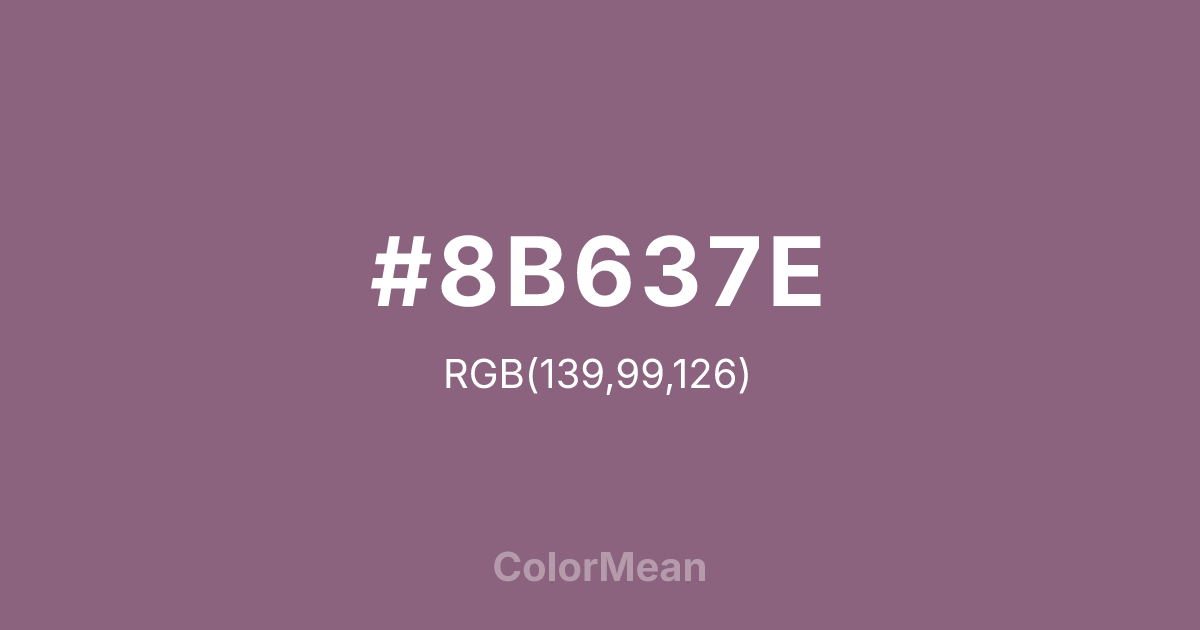
#8B637E Color Information
#8B637E RGB value is (139, 99, 126). The hex color red value is 139, green is 99, and blue is 126. Its HSL format shows a hue of 319°, saturation of 17 percent, and lightness of 47 percent. The CMYK process values are 0 percent, 29 percent, 9 percent, 45 percent.
#8B637E Color Meaning
Color #8B637E blends regal restraint with emotional depth. Unlike electric fuchsias, #8B637E muted plum-red feels weathered by time—like faded theater curtains or heirloom fabric. Psychologically, color #8B637E fosters introspection without isolation; #8B637E’s warm enough to comfort, cool enough to clarify. #8B637E appears in literary journals, boutique hospitality, and inclusive fashion that values nuance over noise. Historically, #8B637E shade echoes Victorian mourning silks and early synthetic dyes—bridging grief and innovation. Spiritually, #8B637E represents love that matures: passion tempered by experience. Use color #8B637E when your audience seeks richness without loudness, and legacy without rigidity.
Color Conversion
Convert #8B637E across different color models and formats. These conversions help designers work seamlessly between digital and print media, ensuring this color maintains its intended appearance across RGB screens, CMYK printers, and HSL color manipulations.
RGB Values & CMYK Values
RGB Values
CMYK Values
Color Variations
#8B637E harmonies come to life through carefully balanced shades, tints, and tones, giving this color depth and flexibility across light and dark variations. Shades add richness, tints bring an airy softness, and tones soften intensity, making it easy to pair in clean, modern palettes.
Color Harmonies
#8B637E harmonies create beautiful relationships with other colors based on their position on the color wheel. Each harmony type offers unique design possibilities, enabling cohesive and visually appealing color schemes.
Analogous
Colors adjacent on the color wheel (30° apart)
Complementary
Colors opposite on the color wheel (180° apart)
Split Complementary
Three colors using one base hue and the two hues beside its opposite
Triadic
Three colors evenly spaced (120° apart)
Tetradic
Four colors forming a rectangle on the wheel
Square
Four colors evenly spaced (90° apart)
Double Split
Four colors formed from two base hues and the colors next to their opposites
Monochromatic
Variations of a single hue
Contrast Checker
(WCAG 2.1) Test #8B637E for accessibility compliance against white and black backgrounds. Proper contrast ensures this color remains readable and usable for all audiences, meeting WCAG 2.1 standards for both normal and large text applications.
Sample Text
This is how your text will look with these colors.
Large Text (18pt+)
Normal Text
UI Components
Color Blindness Simulator
See how #8B637E appears to people with different types of color vision deficiencies. These simulations help create more inclusive designs that consider how this color is perceived across various visual abilities.
Normal Vision
protanopia
Note: These simulations are approximations. Actual color vision deficiency varies by individual.
CSS Examples
Background Color
Text Color
Sample Text
Border Color
Box Shadow
Text Shadow
Sample Text
Gradient
#8B637E Color FAQs
Frequently asked questions about #8B637E color meaning, symbolism, and applications. Click on any question to expand detailed answers.

