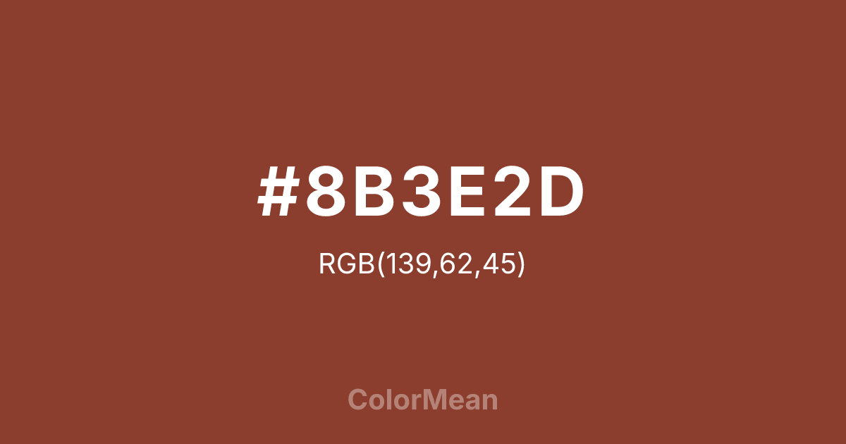
#8B3E2D Color Information
#8B3E2D RGB value is (139, 62, 45). The hex color red value is 139, green is 62, and blue is 45. Its HSL format shows a hue of 11°, saturation of 51 percent, and lightness of 36 percent. The CMYK process values are 0 percent, 55 percent, 68 percent, 45 percent.
#8B3E2D Color Meaning
Color #8B3E2D embodies concentrated earth, mineral depth, and quiet intensity. Color #8B3E2D is the darkest in the coral sequence—a deep red-brown that mirrors dried clay, roasted nuts, and unglazed terracotta. #8B3E2D rejects surface brightness, favoring instead a tone of internal warmth. In architectural and product design, #8B3E2D hue signals permanence without pretense, common in heritage restoration, artisan tools, and sustainable packaging. Environmental psychology links such deep earth tones to increased feelings of safety and belonging in communal spaces. Functionally, color #8B3E2D serves as a robust alternative to black in typography and UI elements. #8B3E2D reduces eye strain better than pure black while maintaining excellent contrast against off-whites. Print reproduction is excellent on matte finishes, where its depth enhances perceived craftsmanship. Consumer studies show higher trust in content framed in color #8B3E2D versus standard browns—ideal for editorial and archival contexts. Culturally, color #8B3E2D reflects the beauty of transformation through time—clay fired, spice dried, stories aged. #8B3E2D appears in slow design, culinary heritage, and craft cooperatives as a symbol of process over product. Spiritually, #8B3E2D connects to the root chakra’s foundational mode: being as belonging. Designers use color #8B3E2D when they want to signal depth with warmth. Its silence speaks through texture.
Color Conversion
Convert #8B3E2D across different color models and formats. These conversions help designers work seamlessly between digital and print media, ensuring this color maintains its intended appearance across RGB screens, CMYK printers, and HSL color manipulations.
RGB Values & CMYK Values
RGB Values
CMYK Values
Color Variations
#8B3E2D harmonies come to life through carefully balanced shades, tints, and tones, giving this color depth and flexibility across light and dark variations. Shades add richness, tints bring an airy softness, and tones soften intensity, making it easy to pair in clean, modern palettes.
Color Harmonies
#8B3E2D harmonies create beautiful relationships with other colors based on their position on the color wheel. Each harmony type offers unique design possibilities, enabling cohesive and visually appealing color schemes.
Analogous
Colors adjacent on the color wheel (30° apart)
Complementary
Colors opposite on the color wheel (180° apart)
Split Complementary
Three colors using one base hue and the two hues beside its opposite
Triadic
Three colors evenly spaced (120° apart)
Tetradic
Four colors forming a rectangle on the wheel
Square
Four colors evenly spaced (90° apart)
Double Split
Four colors formed from two base hues and the colors next to their opposites
Monochromatic
Variations of a single hue
Contrast Checker
(WCAG 2.1) Test #8B3E2D for accessibility compliance against white and black backgrounds. Proper contrast ensures this color remains readable and usable for all audiences, meeting WCAG 2.1 standards for both normal and large text applications.
Sample Text
This is how your text will look with these colors.
Large Text (18pt+)
Normal Text
UI Components
Color Blindness Simulator
See how #8B3E2D appears to people with different types of color vision deficiencies. These simulations help create more inclusive designs that consider how this color is perceived across various visual abilities.
Normal Vision
protanopia
Note: These simulations are approximations. Actual color vision deficiency varies by individual.
CSS Examples
Background Color
Text Color
Sample Text
Border Color
Box Shadow
Text Shadow
Sample Text
Gradient
#8B3E2D Color FAQs
Frequently asked questions about #8B3E2D color meaning, symbolism, and applications. Click on any question to expand detailed answers.

