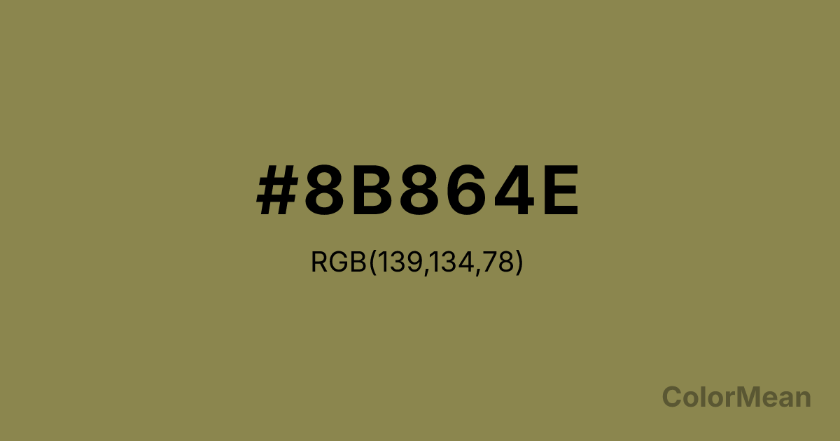
Khaki4 (#8B864E) Color Information
Khaki4 (#8B864E) RGB value is (139, 134, 78). The hex color red value is 139, green is 134, and blue is 78. Its HSL format shows a hue of 55°, saturation of 28 percent, and lightness of 43 percent. The CMYK process values are 0 percent, 4 percent, 44 percent, 45 percent.
Khaki4 (#8B864E) Color Meaning
Khaki4 (#8B864E) expresses somber resilience, mineral sobriety, and disciplined neutrality. As the darkest in the Khaki sequence (RGB 139, 134, 78), it merges olive, grey, and ochre into a tone that feels both ancient and practical—like clay tablets, mossy stone, or faded regimental wool. Khaki4 (#8B864E) absorbs light rather than reflects it, creating depth and shadow that lend gravitas to any composition. It’s not a background color; it’s a foundation. Culturally, Khaki4 (#8B864E) echoes monastic robes, archival ink, and field cartography—domains where clarity, restraint, and longevity outweigh ornament. In modern design, it grounds airy palettes, adds seriousness to playful brands, and signals authenticity in heritage storytelling. Unlike black, which can feel severe, Khaki4 (#8B864E) offers warmth within its restraint, making it more human and less absolute. Psychologically, this hue reduces impulsivity. Environments featuring Khaki4 (#8B864E) encourage deliberation, not reaction—ideal for legal, academic, or archival interfaces. Symbolically, Khaki4 (#8B864E) stands for quiet authority: the kind earned through consistency, not proclamation. Spiritually, it aligns with the virtue of apatheia—not indifference, but freedom from disruptive passions. It is the color of steady hands and clear eyes.
Color Conversion
Convert Khaki4 (#8B864E) across different color models and formats. These conversions help designers work seamlessly between digital and print media, ensuring this color maintains its intended appearance across RGB screens, CMYK printers, and HSL color manipulations.
RGB Values & CMYK Values
RGB Values
CMYK Values
Color Variations
Khaki4 (#8B864E) harmonies come to life through carefully balanced shades, tints, and tones, giving this color depth and flexibility across light and dark variations. Shades add richness, tints bring an airy softness, and tones soften intensity, making it easy to pair in clean, modern palettes.
Color Harmonies
Khaki4 (#8B864E) harmonies create beautiful relationships with other colors based on their position on the color wheel. Each harmony type offers unique design possibilities, enabling cohesive and visually appealing color schemes.
Analogous
Colors adjacent on the color wheel (30° apart)
Complementary
Colors opposite on the color wheel (180° apart)
Split Complementary
Three colors using one base hue and the two hues beside its opposite
Triadic
Three colors evenly spaced (120° apart)
Tetradic
Four colors forming a rectangle on the wheel
Square
Four colors evenly spaced (90° apart)
Double Split
Four colors formed from two base hues and the colors next to their opposites
Monochromatic
Variations of a single hue
Contrast Checker
(WCAG 2.1) Test Khaki4 (#8B864E) for accessibility compliance against white and black backgrounds. Proper contrast ensures this color remains readable and usable for all audiences, meeting WCAG 2.1 standards for both normal and large text applications.
Sample Text
This is how your text will look with these colors.
Large Text (18pt+)
Normal Text
UI Components
Color Blindness Simulator
See how #8B864E appears to people with different types of color vision deficiencies. These simulations help create more inclusive designs that consider how this color is perceived across various visual abilities.
Normal Vision
protanopia
Note: These simulations are approximations. Actual color vision deficiency varies by individual.
CSS Examples
Background Color
Text Color
Sample Text
Border Color
Box Shadow
Text Shadow
Sample Text
Gradient
Khaki4 (#8B864E) Color FAQs
Frequently asked questions about Khaki4 (#8B864E) color meaning, symbolism, and applications. Click on any question to expand detailed answers.

