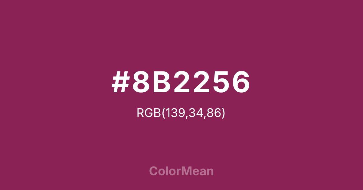
#8B2256 Color Information
#8B2256 RGB value is (139, 34, 86). The hex color red value is 139, green is 34, and blue is 86. Its HSL format shows a hue of 330°, saturation of 61 percent, and lightness of 34 percent. The CMYK process values are 0 percent, 76 percent, 38 percent, 45 percent.
#8B2256 Color Meaning
Color #8B2256 embodies profound intensity, emotional grounding, and resilience. #8B2256 deep, muted reddish-purple conveys seriousness, maturity, and subtle power. Psychologically, color #8B2256 promotes introspection, determination, and emotional steadiness. Culturally, color #8B2256 is linked with refinement, authority, and deep passion in Western traditions, while Eastern symbolism associates #8B2256 with grounded vitality and spiritual protection. Fengshui uses #8B2256 in spaces where deep focus, emotional balance, or intentional energy flow is desired. Spiritually, color #8B2256 corresponds to the Heart and Root chakras, merging emotional depth with grounding energy. Designers and artists employ #8B2256 dark tone for accent pieces, sophisticated palettes, and contemplative art that conveys emotional intensity and stability.
Color Conversion
Convert #8B2256 across different color models and formats. These conversions help designers work seamlessly between digital and print media, ensuring this color maintains its intended appearance across RGB screens, CMYK printers, and HSL color manipulations.
RGB Values & CMYK Values
RGB Values
CMYK Values
Color Variations
#8B2256 harmonies come to life through carefully balanced shades, tints, and tones, giving this color depth and flexibility across light and dark variations. Shades add richness, tints bring an airy softness, and tones soften intensity, making it easy to pair in clean, modern palettes.
Color Harmonies
#8B2256 harmonies create beautiful relationships with other colors based on their position on the color wheel. Each harmony type offers unique design possibilities, enabling cohesive and visually appealing color schemes.
Analogous
Colors adjacent on the color wheel (30° apart)
Complementary
Colors opposite on the color wheel (180° apart)
Split Complementary
Three colors using one base hue and the two hues beside its opposite
Triadic
Three colors evenly spaced (120° apart)
Tetradic
Four colors forming a rectangle on the wheel
Square
Four colors evenly spaced (90° apart)
Double Split
Four colors formed from two base hues and the colors next to their opposites
Monochromatic
Variations of a single hue
Contrast Checker
(WCAG 2.1) Test #8B2256 for accessibility compliance against white and black backgrounds. Proper contrast ensures this color remains readable and usable for all audiences, meeting WCAG 2.1 standards for both normal and large text applications.
Sample Text
This is how your text will look with these colors.
Large Text (18pt+)
Normal Text
UI Components
Color Blindness Simulator
See how #8B2256 appears to people with different types of color vision deficiencies. These simulations help create more inclusive designs that consider how this color is perceived across various visual abilities.
Normal Vision
protanopia
Note: These simulations are approximations. Actual color vision deficiency varies by individual.
CSS Examples
Background Color
Text Color
Sample Text
Border Color
Box Shadow
Text Shadow
Sample Text
Gradient
#8B2256 Color FAQs
Frequently asked questions about #8B2256 color meaning, symbolism, and applications. Click on any question to expand detailed answers.

