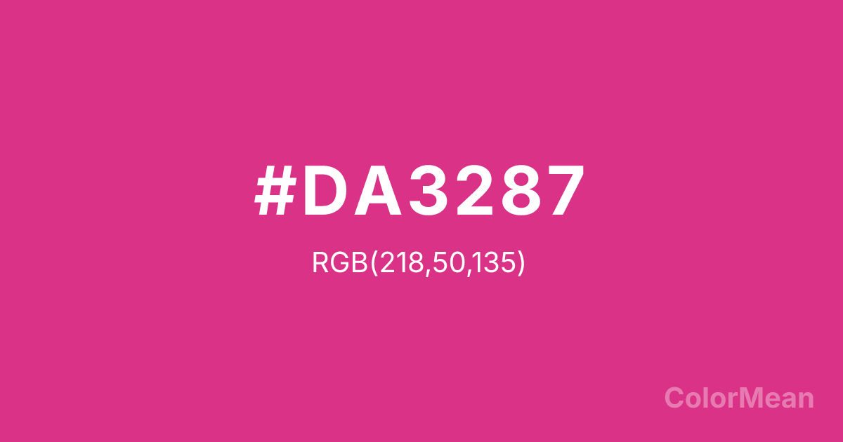
Deep Cerise (#DA3287) Color Information
Deep Cerise (#DA3287) RGB value is (218, 50, 135). The hex color red value is 218, green is 50, and blue is 135. Its HSL format shows a hue of 330°, saturation of 69 percent, and lightness of 53 percent. The CMYK process values are 0 percent, 77 percent, 38 percent, 15 percent.
Deep Cerise (#DA3287) Color Meaning
Deep Cerise (#DA3287) signifies flamboyant passion, unapologetic femininity, and electric romance. This bright, pinkish-red is intense and saturated, suggesting exotic flowers, vibrant nightlife, and bold fashion statements. Psychologically, Deep Cerise (#DA3287) stimulates extroverted expression, confident sensuality, and a playful yet powerful form of emotional display. It culturally references 1980s aesthetics, tropical birds, and the packaging of luxury cosmetics. Spiritually, this color represents the joy of bold emotion, love expressed with exuberance, and a spirit that refuses to be muted, acting as a celebration of vibrant, self-assured feeling.
Color Conversion
Convert Deep Cerise (#DA3287) across different color models and formats. These conversions help designers work seamlessly between digital and print media, ensuring this color maintains its intended appearance across RGB screens, CMYK printers, and HSL color manipulations.
RGB Values & CMYK Values
RGB Values
CMYK Values
Color Variations
Deep Cerise (#DA3287) harmonies come to life through carefully balanced shades, tints, and tones, giving this color depth and flexibility across light and dark variations. Shades add richness, tints bring an airy softness, and tones soften intensity, making it easy to pair in clean, modern palettes.
Color Harmonies
Deep Cerise (#DA3287) harmonies create beautiful relationships with other colors based on their position on the color wheel. Each harmony type offers unique design possibilities, enabling cohesive and visually appealing color schemes.
Analogous
Colors adjacent on the color wheel (30° apart)
Complementary
Colors opposite on the color wheel (180° apart)
Split Complementary
Three colors using one base hue and the two hues beside its opposite
Triadic
Three colors evenly spaced (120° apart)
Tetradic
Four colors forming a rectangle on the wheel
Square
Four colors evenly spaced (90° apart)
Double Split
Four colors formed from two base hues and the colors next to their opposites
Monochromatic
Variations of a single hue
Contrast Checker
(WCAG 2.1) Test Deep Cerise (#DA3287) for accessibility compliance against white and black backgrounds. Proper contrast ensures this color remains readable and usable for all audiences, meeting WCAG 2.1 standards for both normal and large text applications.
Sample Text
This is how your text will look with these colors.
Large Text (18pt+)
Normal Text
UI Components
Color Blindness Simulator
See how #DA3287 appears to people with different types of color vision deficiencies. These simulations help create more inclusive designs that consider how this color is perceived across various visual abilities.
Normal Vision
protanopia
Note: These simulations are approximations. Actual color vision deficiency varies by individual.
CSS Examples
Background Color
Text Color
Sample Text
Border Color
Box Shadow
Text Shadow
Sample Text
Gradient
Deep Cerise (#DA3287) Color FAQs
Frequently asked questions about Deep Cerise (#DA3287) color meaning, symbolism, and applications. Click on any question to expand detailed answers.
