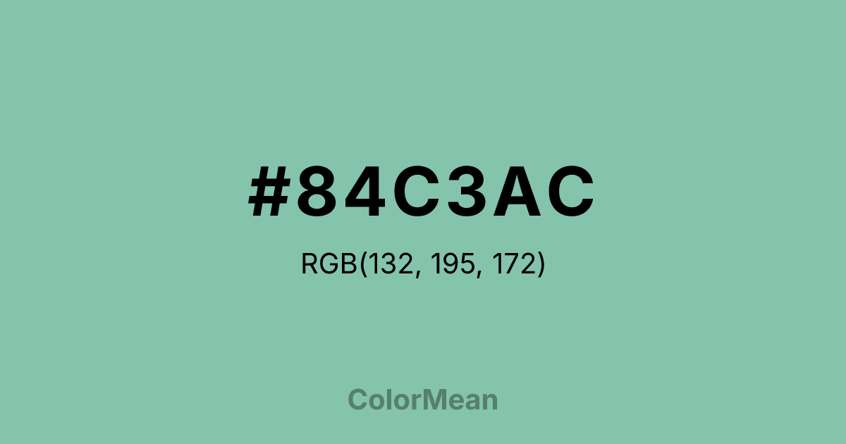
#84C3AC Color Information
#84C3AC RGB value is (132, 195, 172). The hex color red value is 132, green is 195, and blue is 172. Its HSL format shows a hue of 158°, saturation of 34 percent, and lightness of 64 percent. The CMYK process values are 32 percent, 0 percent, 12 percent, 24 percent.
#84C3AC Color Meaning
Color #84C3AC embodies serene depth, weathered tranquility, and organic coolness. #84C3AC muted, greenish-blue resembles river stones, aged sea glass, or a misty morning lake, suggesting a calm that is natural, substantial, and slightly remote. Psychologically, color #84C3AC is centering and cleansing, promoting mental clarity and emotional equilibrium through its connection to weathered, natural elements. #84C3AC offers a sense of peaceful isolation and quiet rejuvenation, ideal for creating retreat-like atmospheres. #84C3AC color feels both refreshing and ancient. Culturally, color #84C3AC is found in spa design, rustic coastal decor, and crafts inspired by nature, symbolizing holistic wellness, natural harmony, and simplicity. Symbolically, #84C3AC represents wisdom smoothed by time, emotions clarified like still water, and a return to elemental basics. Spiritually, color #84C3AC facilitates a grounded form of communication between heart and throat chakras, encouraging expression that is both clear and deeply felt, flowing from a place of inner peace.
Color Conversion
Convert #84C3AC across different color models and formats. These conversions help designers work seamlessly between digital and print media, ensuring this color maintains its intended appearance across RGB screens, CMYK printers, and HSL color manipulations.
RGB Values & CMYK Values
RGB Values
CMYK Values
Color Variations
#84C3AC harmonies come to life through carefully balanced shades, tints, and tones, giving this color depth and flexibility across light and dark variations. Shades add richness, tints bring an airy softness, and tones soften intensity, making it easy to pair in clean, modern palettes.
Color Harmonies
#84C3AC harmonies create beautiful relationships with other colors based on their position on the color wheel. Each harmony type offers unique design possibilities, enabling cohesive and visually appealing color schemes.
Analogous
Colors adjacent on the color wheel (30° apart)
Complementary
Colors opposite on the color wheel (180° apart)
Split Complementary
Three colors using one base hue and the two hues beside its opposite
Triadic
Three colors evenly spaced (120° apart)
Tetradic
Four colors forming a rectangle on the wheel
Square
Four colors evenly spaced (90° apart)
Double Split
Four colors formed from two base hues and the colors next to their opposites
Monochromatic
Variations of a single hue
Contrast Checker
(WCAG 2.1) Test #84C3AC for accessibility compliance against white and black backgrounds. Proper contrast ensures this color remains readable and usable for all audiences, meeting WCAG 2.1 standards for both normal and large text applications.
Sample Text
This is how your text will look with these colors.
Large Text (18pt+)
Normal Text
UI Components
Color Blindness Simulator
See how #84C3AC appears to people with different types of color vision deficiencies. These simulations help create more inclusive designs that consider how this color is perceived across various visual abilities.
Normal Vision
protanopia
Note: These simulations are approximations. Actual color vision deficiency varies by individual.
CSS Examples
Background Color
Text Color
Sample Text
Border Color
Box Shadow
Text Shadow
Sample Text
Gradient
#84C3AC Color FAQs
Frequently asked questions about #84C3AC color meaning, symbolism, and applications. Click on any question to expand detailed answers.
