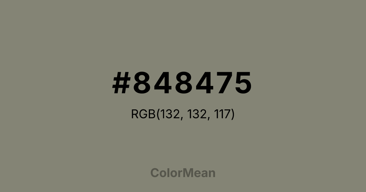
#848475 Color Information
#848475 RGB value is (132, 132, 117). The hex color red value is 132, green is 132, and blue is 117. Its HSL format shows a hue of 60°, saturation of 6 percent, and lightness of 49 percent. The CMYK process values are 0 percent, 0 percent, 11 percent, 48 percent.
#848475 Color Meaning
Color #848475 embodies earthy neutrality, tactile humility, and natural camouflage. #848475 warm, brownish-grey resembles rodent fur, dry soil, and unvarnished wood, suggesting a creature that is adaptive, unnoticed, and close to the ground. Psychologically, color #848475 is profoundly grounding and unpretentious, promoting feelings of practicality, resourcefulness, and quiet observation. #848475 soothes by virtue of its ordinariness and connection to the mundane, earthy reality. #848475 color is a humble, reliable neutral. Symbolically, color #848475 represents the wisdom of the background, survival through subtlety, and value found in the ordinary and overlooked. #848475 is the color of the craftsman's workspace, not the finished product. Culturally, #848475 appears in utilitarian design, naturalist field gear, and aesthetics that prioritize authenticity and wear over pristine presentation. Color #848475 offers a color code for resilience, discretion, and a pragmatic, unfussy connection to the physical world.
Color Conversion
Convert #848475 across different color models and formats. These conversions help designers work seamlessly between digital and print media, ensuring this color maintains its intended appearance across RGB screens, CMYK printers, and HSL color manipulations.
RGB Values & CMYK Values
RGB Values
CMYK Values
Color Variations
#848475 harmonies come to life through carefully balanced shades, tints, and tones, giving this color depth and flexibility across light and dark variations. Shades add richness, tints bring an airy softness, and tones soften intensity, making it easy to pair in clean, modern palettes.
Color Harmonies
#848475 harmonies create beautiful relationships with other colors based on their position on the color wheel. Each harmony type offers unique design possibilities, enabling cohesive and visually appealing color schemes.
Analogous
Colors adjacent on the color wheel (30° apart)
Complementary
Colors opposite on the color wheel (180° apart)
Split Complementary
Three colors using one base hue and the two hues beside its opposite
Triadic
Three colors evenly spaced (120° apart)
Tetradic
Four colors forming a rectangle on the wheel
Square
Four colors evenly spaced (90° apart)
Double Split
Four colors formed from two base hues and the colors next to their opposites
Monochromatic
Variations of a single hue
Contrast Checker
(WCAG 2.1) Test #848475 for accessibility compliance against white and black backgrounds. Proper contrast ensures this color remains readable and usable for all audiences, meeting WCAG 2.1 standards for both normal and large text applications.
Sample Text
This is how your text will look with these colors.
Large Text (18pt+)
Normal Text
UI Components
Color Blindness Simulator
See how #848475 appears to people with different types of color vision deficiencies. These simulations help create more inclusive designs that consider how this color is perceived across various visual abilities.
Normal Vision
protanopia
Note: These simulations are approximations. Actual color vision deficiency varies by individual.
CSS Examples
Background Color
Text Color
Sample Text
Border Color
Box Shadow
Text Shadow
Sample Text
Gradient
#848475 Color FAQs
Frequently asked questions about #848475 color meaning, symbolism, and applications. Click on any question to expand detailed answers.

