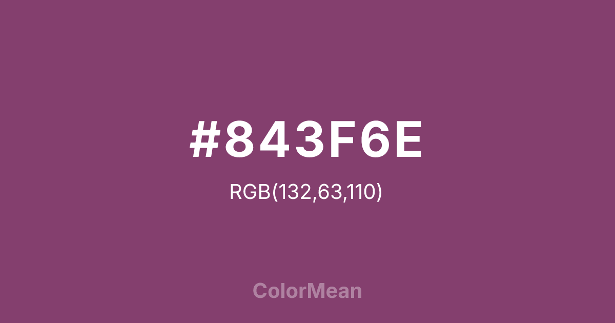
#843F6E Color Information
#843F6E RGB value is (132, 63, 110). The hex color red value is 132, green is 63, and blue is 110. Its HSL format shows a hue of 319°, saturation of 35 percent, and lightness of 38 percent. The CMYK process values are 0 percent, 52 percent, 17 percent, 48 percent.
#843F6E Color Meaning
Color #843F6E embodies reflective sophistication, creative depth, and emotional subtlety. #843F6E medium-dark purple-pink shade encourages introspection, imaginative thinking, and balanced emotional energy. Color #843F6E psychologically promotes calm, focus, and nuanced expression. Culturally, color #843F6E signifies mystery, refinement, and artistic sensibility in Western design. Eastern symbolism links #843F6E to intuition, meditation, and spiritual awareness. Fengshui interprets #843F6E medium-dark purple-pink as harmonizing, promoting creative flow and reflective energy in private or contemplative spaces. Spiritually, color #843F6E resonates with the Crown and Third Eye Chakras, enhancing insight, imaginative perception, and mindful reflection. Designers and artists use #843F6E nuanced tone in interiors, branding, and visual media to convey depth, subtle drama, and refined aesthetic balance. Its moderate-dark saturation balances presence with subtlety.
Color Conversion
Convert #843F6E across different color models and formats. These conversions help designers work seamlessly between digital and print media, ensuring this color maintains its intended appearance across RGB screens, CMYK printers, and HSL color manipulations.
RGB Values & CMYK Values
RGB Values
CMYK Values
Color Variations
#843F6E harmonies come to life through carefully balanced shades, tints, and tones, giving this color depth and flexibility across light and dark variations. Shades add richness, tints bring an airy softness, and tones soften intensity, making it easy to pair in clean, modern palettes.
Color Harmonies
#843F6E harmonies create beautiful relationships with other colors based on their position on the color wheel. Each harmony type offers unique design possibilities, enabling cohesive and visually appealing color schemes.
Analogous
Colors adjacent on the color wheel (30° apart)
Complementary
Colors opposite on the color wheel (180° apart)
Split Complementary
Three colors using one base hue and the two hues beside its opposite
Triadic
Three colors evenly spaced (120° apart)
Tetradic
Four colors forming a rectangle on the wheel
Square
Four colors evenly spaced (90° apart)
Double Split
Four colors formed from two base hues and the colors next to their opposites
Monochromatic
Variations of a single hue
Contrast Checker
(WCAG 2.1) Test #843F6E for accessibility compliance against white and black backgrounds. Proper contrast ensures this color remains readable and usable for all audiences, meeting WCAG 2.1 standards for both normal and large text applications.
Sample Text
This is how your text will look with these colors.
Large Text (18pt+)
Normal Text
UI Components
Color Blindness Simulator
See how #843F6E appears to people with different types of color vision deficiencies. These simulations help create more inclusive designs that consider how this color is perceived across various visual abilities.
Normal Vision
protanopia
Note: These simulations are approximations. Actual color vision deficiency varies by individual.
CSS Examples
Background Color
Text Color
Sample Text
Border Color
Box Shadow
Text Shadow
Sample Text
Gradient
#843F6E Color FAQs
Frequently asked questions about #843F6E color meaning, symbolism, and applications. Click on any question to expand detailed answers.

