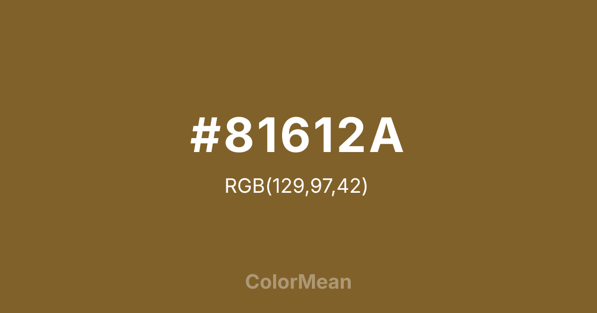
#81612A Color Information
#81612A RGB value is (129, 97, 42). The hex color red value is 129, green is 97, and blue is 42. Its HSL format shows a hue of 38°, saturation of 51 percent, and lightness of 34 percent. The CMYK process values are 0 percent, 25 percent, 67 percent, 49 percent.
#81612A Color Meaning
Color #81612A expresses profound grounding, earthy reliability, and structural support. #81612A dark brown-orange shade reinforces stability and practicality, embodying a mature, seasoned energy. Color #81612A encourages contemplation, focus, and an appreciation of natural textures. Psychologically, color #81612A promotes persistence, responsibility, and dependable behavior. In Western culture, #81612A represents classic warmth, leather, and heritage craftsmanship. Eastern symbolism emphasizes endurance, tradition, and a deep connection to earth elements. Fengshui interprets #81612A as an anchor color, fostering stability and material security in homes and workplaces. Spiritually, color #81612A aligns with the Root Chakra, intensifying grounding energy, physical presence, and life-force stability. Artists use #81612A deep shade in woodwork, rustic interiors, and natural-themed designs to create strong visual weight while maintaining warmth. Its dark intensity communicates authority with comfort.
Color Conversion
Convert #81612A across different color models and formats. These conversions help designers work seamlessly between digital and print media, ensuring this color maintains its intended appearance across RGB screens, CMYK printers, and HSL color manipulations.
RGB Values & CMYK Values
RGB Values
CMYK Values
Color Variations
#81612A harmonies come to life through carefully balanced shades, tints, and tones, giving this color depth and flexibility across light and dark variations. Shades add richness, tints bring an airy softness, and tones soften intensity, making it easy to pair in clean, modern palettes.
Color Harmonies
#81612A harmonies create beautiful relationships with other colors based on their position on the color wheel. Each harmony type offers unique design possibilities, enabling cohesive and visually appealing color schemes.
Analogous
Colors adjacent on the color wheel (30° apart)
Complementary
Colors opposite on the color wheel (180° apart)
Split Complementary
Three colors using one base hue and the two hues beside its opposite
Triadic
Three colors evenly spaced (120° apart)
Tetradic
Four colors forming a rectangle on the wheel
Square
Four colors evenly spaced (90° apart)
Double Split
Four colors formed from two base hues and the colors next to their opposites
Monochromatic
Variations of a single hue
Contrast Checker
(WCAG 2.1) Test #81612A for accessibility compliance against white and black backgrounds. Proper contrast ensures this color remains readable and usable for all audiences, meeting WCAG 2.1 standards for both normal and large text applications.
Sample Text
This is how your text will look with these colors.
Large Text (18pt+)
Normal Text
UI Components
Color Blindness Simulator
See how #81612A appears to people with different types of color vision deficiencies. These simulations help create more inclusive designs that consider how this color is perceived across various visual abilities.
Normal Vision
protanopia
Note: These simulations are approximations. Actual color vision deficiency varies by individual.
CSS Examples
Background Color
Text Color
Sample Text
Border Color
Box Shadow
Text Shadow
Sample Text
Gradient
#81612A Color FAQs
Frequently asked questions about #81612A color meaning, symbolism, and applications. Click on any question to expand detailed answers.

