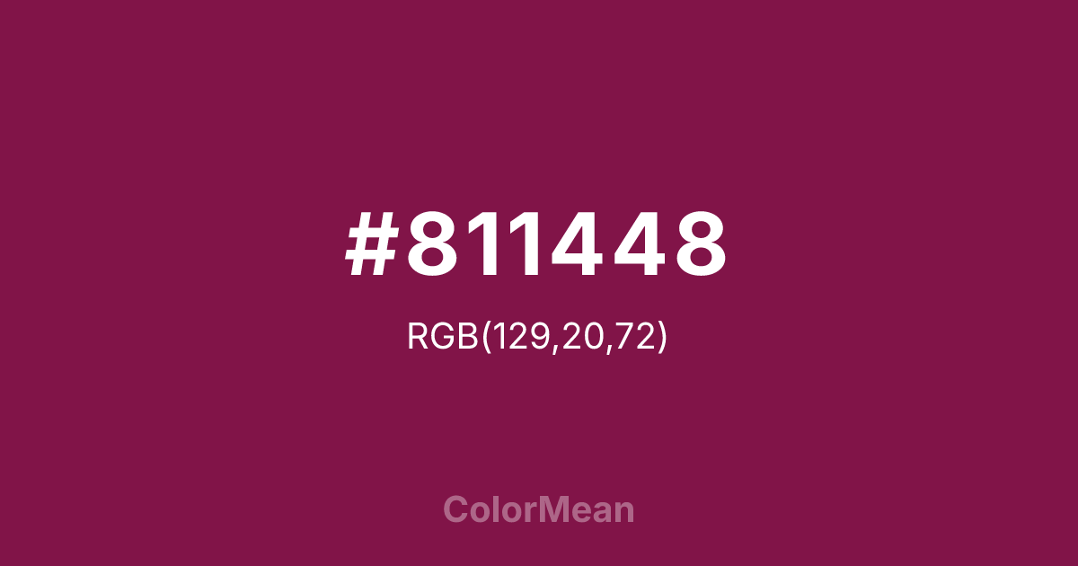
#811448 Color Information
#811448 RGB value is (129, 20, 72). The hex color red value is 129, green is 20, and blue is 72. Its HSL format shows a hue of 331°, saturation of 73 percent, and lightness of 29 percent. The CMYK process values are 0 percent, 84 percent, 44 percent, 49 percent.
#811448 Color Meaning
Color #811448 signifies dramatic devotion, poetic melancholy, and regal mourning. #811448 deep, reddish purple is intense and somber, named after the flower symbolizing thoughtful remembrance and loving memory. Psychologically, color #811448 is absorbing and introspective, encouraging deep feeling, loyalty, and a connection to memory that borders on the sacred. #811448 soothes not with lightness but with the gravity of its own depth, offering a space for profound emotional processing. #811448 color feels both noble and sorrowful, rich with unspoken stories. Culturally, color #811448 is linked to Victorian mourning jewelry, pre-Raphaelite art, and liturgical vestments during somber seasons. Symbolically, #811448 represents love that persists beyond loss, the dignity of grief, and beauty that is inseparable from a sense of transience. Spiritually, color #811448 aligns with the crown chakra's connection to higher love and acceptance, but through the pathway of deep human emotion and the transformative power of remembrance.
Color Conversion
Convert #811448 across different color models and formats. These conversions help designers work seamlessly between digital and print media, ensuring this color maintains its intended appearance across RGB screens, CMYK printers, and HSL color manipulations.
RGB Values & CMYK Values
RGB Values
CMYK Values
Color Variations
#811448 harmonies come to life through carefully balanced shades, tints, and tones, giving this color depth and flexibility across light and dark variations. Shades add richness, tints bring an airy softness, and tones soften intensity, making it easy to pair in clean, modern palettes.
Color Harmonies
#811448 harmonies create beautiful relationships with other colors based on their position on the color wheel. Each harmony type offers unique design possibilities, enabling cohesive and visually appealing color schemes.
Analogous
Colors adjacent on the color wheel (30° apart)
Complementary
Colors opposite on the color wheel (180° apart)
Split Complementary
Three colors using one base hue and the two hues beside its opposite
Triadic
Three colors evenly spaced (120° apart)
Tetradic
Four colors forming a rectangle on the wheel
Square
Four colors evenly spaced (90° apart)
Double Split
Four colors formed from two base hues and the colors next to their opposites
Monochromatic
Variations of a single hue
Contrast Checker
(WCAG 2.1) Test #811448 for accessibility compliance against white and black backgrounds. Proper contrast ensures this color remains readable and usable for all audiences, meeting WCAG 2.1 standards for both normal and large text applications.
Sample Text
This is how your text will look with these colors.
Large Text (18pt+)
Normal Text
UI Components
Color Blindness Simulator
See how #811448 appears to people with different types of color vision deficiencies. These simulations help create more inclusive designs that consider how this color is perceived across various visual abilities.
Normal Vision
protanopia
Note: These simulations are approximations. Actual color vision deficiency varies by individual.
CSS Examples
Background Color
Text Color
Sample Text
Border Color
Box Shadow
Text Shadow
Sample Text
Gradient
#811448 Color FAQs
Frequently asked questions about #811448 color meaning, symbolism, and applications. Click on any question to expand detailed answers.

