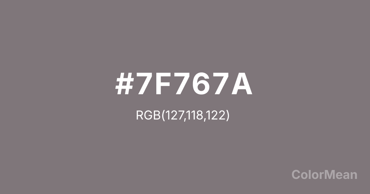
#7F767A Color Information
#7F767A RGB value is (127, 118, 122). The hex color red value is 127, green is 118, and blue is 122. Its HSL format shows a hue of 333°, saturation of 4 percent, and lightness of 48 percent. The CMYK process values are 0 percent, 7 percent, 4 percent, 50 percent.
#7F767A Color Meaning
Color #7F767A conveys complex neutrality, urban shadow, and sophisticated depth. #7F767A medium, muted grey with a hint of mauve suggests dusk, polished graphite, and the color of well-tailored suits. Psychologically, color #7F767A is stabilizing and intellectually cool, promoting nuanced thought, emotional composure, and a sense of modern, adaptive elegance. #7F767A provides a neutral backdrop that is far from bland, carrying subtle chromatic complexity and a moody, poetic resonance. #7F767A color is a thinking person's neutral. Symbolically, color #7F767A represents the grey area, ambiguity with style, and beauty found in nuanced, non-binary states. #7F767A is the color of rain clouds over cityscapes and intellectual depth. Culturally, #7F767A appears in avant-garde fashion, architectural concrete, and high-end tech design where a sense of serious, understated innovation is key. Color #7F767A offers a more emotionally and chromatically rich alternative to standard grays, perfect for conveying complexity, maturity, and refined taste.
Color Conversion
Convert #7F767A across different color models and formats. These conversions help designers work seamlessly between digital and print media, ensuring this color maintains its intended appearance across RGB screens, CMYK printers, and HSL color manipulations.
RGB Values & CMYK Values
RGB Values
CMYK Values
Color Variations
#7F767A harmonies come to life through carefully balanced shades, tints, and tones, giving this color depth and flexibility across light and dark variations. Shades add richness, tints bring an airy softness, and tones soften intensity, making it easy to pair in clean, modern palettes.
Color Harmonies
#7F767A harmonies create beautiful relationships with other colors based on their position on the color wheel. Each harmony type offers unique design possibilities, enabling cohesive and visually appealing color schemes.
Analogous
Colors adjacent on the color wheel (30° apart)
Complementary
Colors opposite on the color wheel (180° apart)
Split Complementary
Three colors using one base hue and the two hues beside its opposite
Triadic
Three colors evenly spaced (120° apart)
Tetradic
Four colors forming a rectangle on the wheel
Square
Four colors evenly spaced (90° apart)
Double Split
Four colors formed from two base hues and the colors next to their opposites
Monochromatic
Variations of a single hue
Contrast Checker
(WCAG 2.1) Test #7F767A for accessibility compliance against white and black backgrounds. Proper contrast ensures this color remains readable and usable for all audiences, meeting WCAG 2.1 standards for both normal and large text applications.
Sample Text
This is how your text will look with these colors.
Large Text (18pt+)
Normal Text
UI Components
Color Blindness Simulator
See how #7F767A appears to people with different types of color vision deficiencies. These simulations help create more inclusive designs that consider how this color is perceived across various visual abilities.
Normal Vision
protanopia
Note: These simulations are approximations. Actual color vision deficiency varies by individual.
CSS Examples
Background Color
Text Color
Sample Text
Border Color
Box Shadow
Text Shadow
Sample Text
Gradient
#7F767A Color FAQs
Frequently asked questions about #7F767A color meaning, symbolism, and applications. Click on any question to expand detailed answers.
