#73826B Color Information
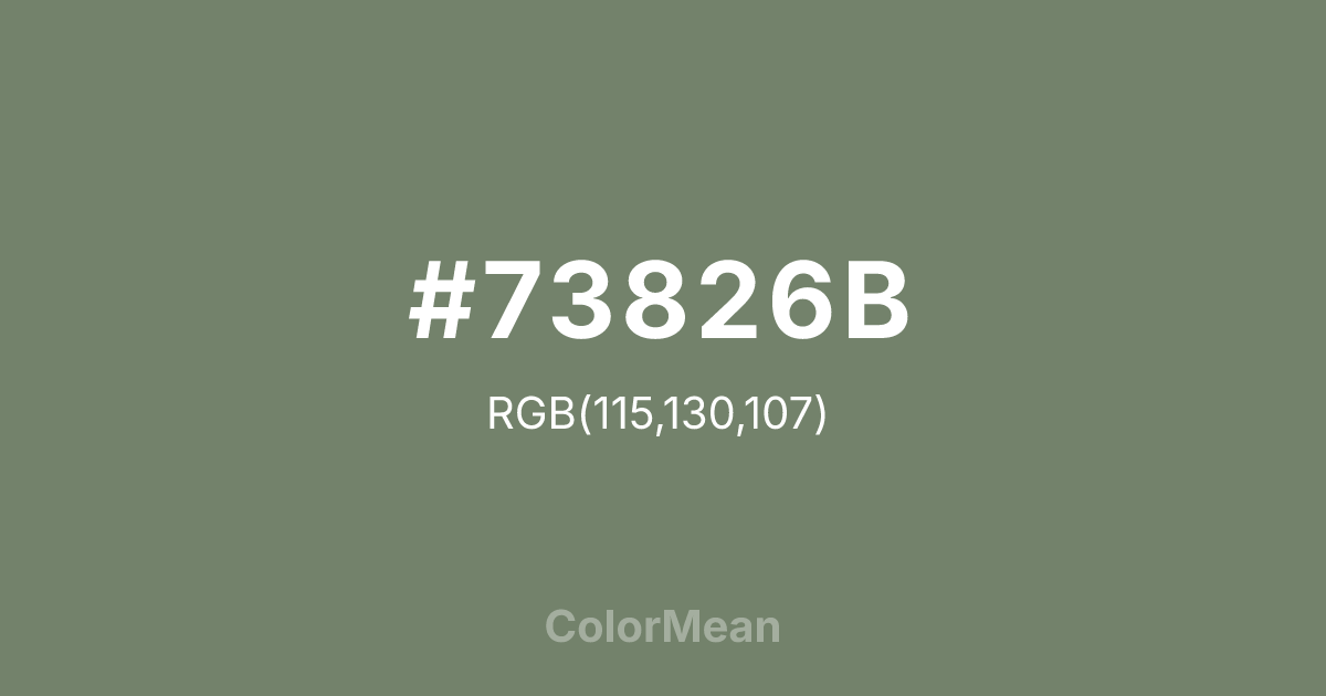
#73826B RGB value is (115, 130, 107). The hex color red value is 115, green is 130, and blue is 107. Its HSL format shows a hue of 99°, saturation of 10 percent, and lightness of 46 percent. The CMYK process values are 12 percent, 0 percent, 18 percent, 49 percent.
#73826B Color Meaning
Color #73826B signifies tactical neutrality, environmental integration, and adaptive concealment. Color #73826B is a greyed olive tone derived from military concealment patterns, designed to disappear into temperate forests and urban decay. Unlike vibrant greens, #73826B rejects attention—its purpose is to blend, not stand out. In color theory, #73826B places #73826B in the “recessive” category, making #73826B ideal for backgrounds that must support without competing. Psychological studies on visual search tasks confirm that mid-tone greens like color #73826B are among the hardest hues for the eye to isolate quickly, validating its tactical origin. Beyond the military, color #73826B appears in outdoor gear, survivalist branding, and eco-activist design—but with a twist. In commercial contexts, #73826B signals rugged authenticity and anti-consumerism. Brands use color #73826B to imply durability, function over form, and connection to untamed nature. In UX design, #73826B functions as a calming neutral in dashboards for logistics, agriculture, or environmental monitoring, where emotional neutrality supports data clarity. Its earthy balance avoids the sterility of grey and the cheer of sage. Culturally, color #73826B has evolved from concealment to identity—worn as a statement of resilience, not hiding. #73826B appears in streetwear and protest art as a symbol of resistance through adaptation. Spiritually, #73826B reflects the wisdom of blending in to survive, not to disappear. Designers choose color #73826B when the message is about endurance through invisibility or quiet preparation. #73826B is the color of strategy, not spectacle.
Color Conversion
Convert #73826B across different color models and formats. These conversions help designers work seamlessly between digital and print media, ensuring this color maintains its intended appearance across RGB screens, CMYK printers, and HSL color manipulations.
RGB Values & CMYK Values
RGB Values
CMYK Values
Color Variations
#73826B harmonies come to life through carefully balanced shades, tints, and tones, giving this color depth and flexibility across light and dark variations. Shades add richness, tints bring an airy softness, and tones soften intensity, making it easy to pair in clean, modern palettes.
Color Harmonies
#73826B harmonies create beautiful relationships with other colors based on their position on the color wheel. Each harmony type offers unique design possibilities, enabling cohesive and visually appealing color schemes.
Analogous
Colors adjacent on the color wheel (30° apart)
Complementary
Colors opposite on the color wheel (180° apart)
Split Complementary
Three colors using one base hue and the two hues beside its opposite
Triadic
Three colors evenly spaced (120° apart)
Tetradic
Four colors forming a rectangle on the wheel
Square
Four colors evenly spaced (90° apart)
Double Split
Four colors formed from two base hues and the colors next to their opposites
Monochromatic
Variations of a single hue
Contrast Checker
(WCAG 2.1) Test #73826B for accessibility compliance against white and black backgrounds. Proper contrast ensures this color remains readable and usable for all audiences, meeting WCAG 2.1 standards for both normal and large text applications.
Sample Text
This is how your text will look with these colors.
Large Text (18pt+)
Normal Text
UI Components
Color Blindness Simulator
See how #73826B appears to people with different types of color vision deficiencies. These simulations help create more inclusive designs that consider how this color is perceived across various visual abilities.
Normal Vision
protanopia
Note: These simulations are approximations. Actual color vision deficiency varies by individual.
CSS Examples
Background Color
Text Color
Sample Text
Border Color
Box Shadow
Text Shadow
Sample Text
Gradient
#73826B Color FAQs
Frequently asked questions about #73826B color meaning, symbolism, and applications. Click on any question to expand detailed answers.

