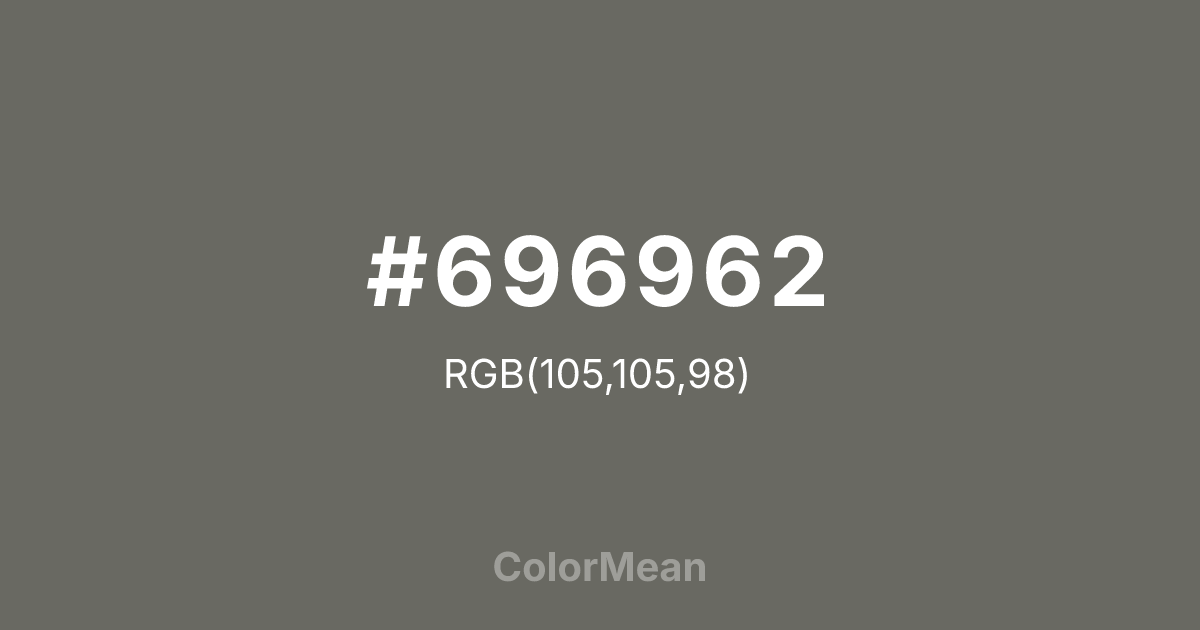
#696962 Color Information
#696962 RGB value is (105, 105, 98). The hex color red value is 105, green is 105, and blue is 98. Its HSL format shows a hue of 60°, saturation of 3 percent, and lightness of 40 percent. The CMYK process values are 0 percent, 0 percent, 7 percent, 59 percent.
#696962 Color Meaning
Color #696962 conveys earthy neutrality, textured balance, and adaptive stillness. #696962 warm, greenish-grey mimics the color of unpolished quartzite or dry river stones, suggesting a material that is natural, granular, and harmoniously blended with its environment. Psychologically, color #696962 is deeply centering and reassuring, promoting feelings of stability, pragmatic simplicity, and a quiet connection to the elemental world. #696962 serves as a sophisticated, unobtrusive backdrop that feels both modern and timelessly rustic. #696962 color is ambiguity rendered with earthy warmth. Symbolically, color #696962 represents the common ground, the aggregate of experience, and wisdom found in blended, unassuming materials. #696962 is the color of a landscape in harmonious repose. Culturally, #696962 appears in eco-conscious design, natural finish interiors, and utilitarian products where authenticity and understated functionality are key. Color #696962 embodies an aesthetic of raw refinement, offering a neutral that carries the story of erosion, mixture, and peaceful coexistence.
Color Conversion
Convert #696962 across different color models and formats. These conversions help designers work seamlessly between digital and print media, ensuring this color maintains its intended appearance across RGB screens, CMYK printers, and HSL color manipulations.
RGB Values & CMYK Values
RGB Values
CMYK Values
Color Variations
#696962 harmonies come to life through carefully balanced shades, tints, and tones, giving this color depth and flexibility across light and dark variations. Shades add richness, tints bring an airy softness, and tones soften intensity, making it easy to pair in clean, modern palettes.
Color Harmonies
#696962 harmonies create beautiful relationships with other colors based on their position on the color wheel. Each harmony type offers unique design possibilities, enabling cohesive and visually appealing color schemes.
Analogous
Colors adjacent on the color wheel (30° apart)
Complementary
Colors opposite on the color wheel (180° apart)
Split Complementary
Three colors using one base hue and the two hues beside its opposite
Triadic
Three colors evenly spaced (120° apart)
Tetradic
Four colors forming a rectangle on the wheel
Square
Four colors evenly spaced (90° apart)
Double Split
Four colors formed from two base hues and the colors next to their opposites
Monochromatic
Variations of a single hue
Contrast Checker
(WCAG 2.1) Test #696962 for accessibility compliance against white and black backgrounds. Proper contrast ensures this color remains readable and usable for all audiences, meeting WCAG 2.1 standards for both normal and large text applications.
Sample Text
This is how your text will look with these colors.
Large Text (18pt+)
Normal Text
UI Components
Color Blindness Simulator
See how #696962 appears to people with different types of color vision deficiencies. These simulations help create more inclusive designs that consider how this color is perceived across various visual abilities.
Normal Vision
protanopia
Note: These simulations are approximations. Actual color vision deficiency varies by individual.
CSS Examples
Background Color
Text Color
Sample Text
Border Color
Box Shadow
Text Shadow
Sample Text
Gradient
#696962 Color FAQs
Frequently asked questions about #696962 color meaning, symbolism, and applications. Click on any question to expand detailed answers.

