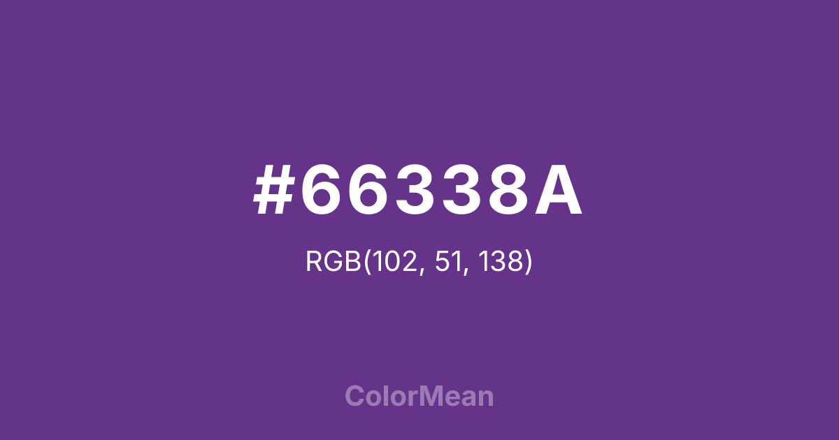
#66338A Color Information
#66338A RGB value is (102, 51, 138). The hex color red value is 102, green is 51, and blue is 138. Its HSL format shows a hue of 275°, saturation of 46 percent, and lightness of 37 percent. The CMYK process values are 26 percent, 63 percent, 0 percent, 46 percent.
#66338A Color Meaning
Color #66338A commands with quiet intensity, merging regal depth and introspective power. #66338A rich purple—darker than plum, warmer than indigo—borrows from ecclesiastical robes and twilight shadow, suggesting authority earned through wisdom, not display. Color #66338A absorbs light without disappearing, creating visual gravity that anchors layouts while avoiding the sterility of pure black. Psychological research links deep purples like color #66338A to enhanced problem-solving in collaborative environments due to their balance of stimulation and restraint. Historically, color #66338A aligns with scholarly and spiritual traditions that value silence over spectacle. #66338A appears in luxury branding seeking to convey legacy without ostentation. Spiritually, color #66338A represents the threshold between known and unknown—the courage to dwell in uncertainty while holding a steady center. In design, #66338A functions as a sophisticated base for gold or cream accents, proving that true distinction speaks in lowered tones.
Color Conversion
Convert #66338A across different color models and formats. These conversions help designers work seamlessly between digital and print media, ensuring this color maintains its intended appearance across RGB screens, CMYK printers, and HSL color manipulations.
RGB Values & CMYK Values
RGB Values
CMYK Values
Color Variations
#66338A harmonies come to life through carefully balanced shades, tints, and tones, giving this color depth and flexibility across light and dark variations. Shades add richness, tints bring an airy softness, and tones soften intensity, making it easy to pair in clean, modern palettes.
Color Harmonies
#66338A harmonies create beautiful relationships with other colors based on their position on the color wheel. Each harmony type offers unique design possibilities, enabling cohesive and visually appealing color schemes.
Analogous
Colors adjacent on the color wheel (30° apart)
Complementary
Colors opposite on the color wheel (180° apart)
Split Complementary
Three colors using one base hue and the two hues beside its opposite
Triadic
Three colors evenly spaced (120° apart)
Tetradic
Four colors forming a rectangle on the wheel
Square
Four colors evenly spaced (90° apart)
Double Split
Four colors formed from two base hues and the colors next to their opposites
Monochromatic
Variations of a single hue
Contrast Checker
(WCAG 2.1) Test #66338A for accessibility compliance against white and black backgrounds. Proper contrast ensures this color remains readable and usable for all audiences, meeting WCAG 2.1 standards for both normal and large text applications.
Sample Text
This is how your text will look with these colors.
Large Text (18pt+)
Normal Text
UI Components
Color Blindness Simulator
See how #66338A appears to people with different types of color vision deficiencies. These simulations help create more inclusive designs that consider how this color is perceived across various visual abilities.
Normal Vision
protanopia
Note: These simulations are approximations. Actual color vision deficiency varies by individual.
CSS Examples
Background Color
Text Color
Sample Text
Border Color
Box Shadow
Text Shadow
Sample Text
Gradient
#66338A Color FAQs
Frequently asked questions about #66338A color meaning, symbolism, and applications. Click on any question to expand detailed answers.

