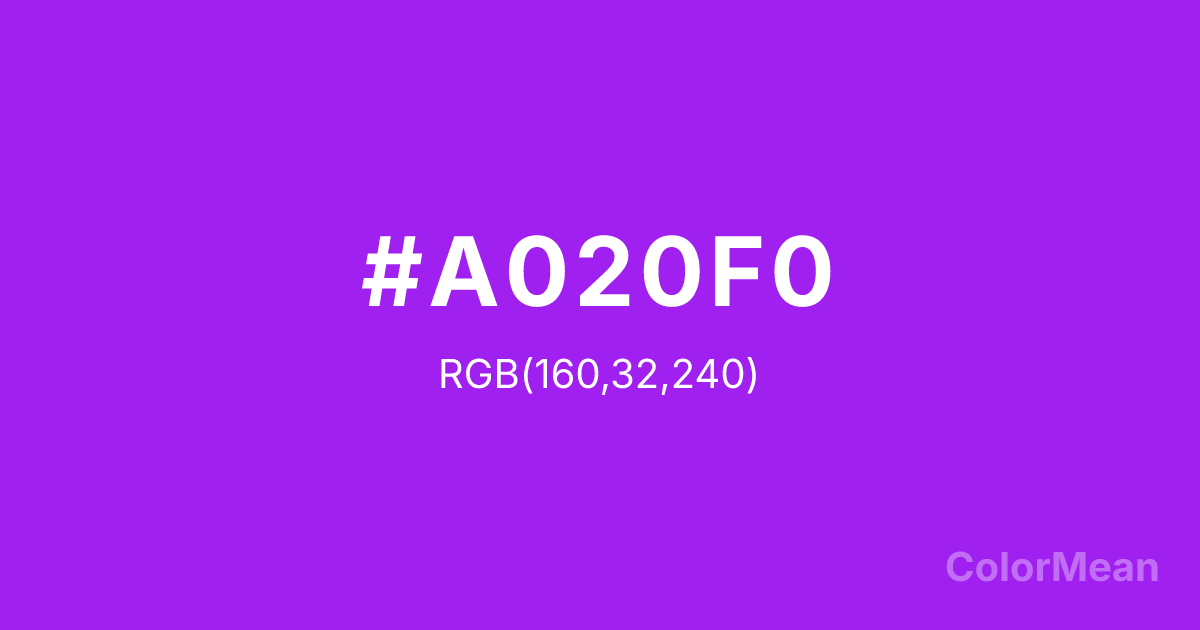
Veronica (#A020F0) Color Information
Veronica (#A020F0) RGB value is (160, 32, 240). The hex color red value is 160, green is 32, and blue is 240. Its HSL format shows a hue of 277°, saturation of 87 percent, and lightness of 53 percent. The CMYK process values are 33 percent, 87 percent, 0 percent, 6 percent.
Veronica (#A020F0) Color Meaning
Veronica (#A020F0) conveys spiritual insight, imaginative thinking, and deep inspiration. This vivid purple blends blue and red undertones, suggesting creativity, mystery, and intuitive depth. Psychologically, Veronica (#A020F0) encourages visionary thinking, artistic expression, and introspective exploration. Culturally, Veronica (#A020F0) has long been associated with royalty, sacred ceremonies, and artistic creativity. Western traditions link it with wisdom and transformation, while Eastern cultures associate purple tones with meditation, enlightenment, and spiritual authority. Fengshui interprets it as a color to enhance intuition, mental clarity, and refined spaces. Spiritually, Veronica (#A020F0) aligns with the Crown chakra, supporting spiritual growth, awareness, and inspiration. As a vivid violet shade, it balances intensity and contemplation. Designers and artists often use Veronica for imaginative projects, mystical themes, and accents that encourage reflection and creativity.
Color Conversion
Convert Veronica (#A020F0) across different color models and formats. These conversions help designers work seamlessly between digital and print media, ensuring this color maintains its intended appearance across RGB screens, CMYK printers, and HSL color manipulations.
RGB Values & CMYK Values
RGB Values
CMYK Values
Color Variations
Veronica (#A020F0) harmonies come to life through carefully balanced shades, tints, and tones, giving this color depth and flexibility across light and dark variations. Shades add richness, tints bring an airy softness, and tones soften intensity, making it easy to pair in clean, modern palettes.
Color Harmonies
Veronica (#A020F0) harmonies create beautiful relationships with other colors based on their position on the color wheel. Each harmony type offers unique design possibilities, enabling cohesive and visually appealing color schemes.
Analogous
Colors adjacent on the color wheel (30° apart)
Complementary
Colors opposite on the color wheel (180° apart)
Split Complementary
Three colors using one base hue and the two hues beside its opposite
Triadic
Three colors evenly spaced (120° apart)
Tetradic
Four colors forming a rectangle on the wheel
Square
Four colors evenly spaced (90° apart)
Double Split
Four colors formed from two base hues and the colors next to their opposites
Monochromatic
Variations of a single hue
Contrast Checker
(WCAG 2.1) Test Veronica (#A020F0) for accessibility compliance against white and black backgrounds. Proper contrast ensures this color remains readable and usable for all audiences, meeting WCAG 2.1 standards for both normal and large text applications.
Sample Text
This is how your text will look with these colors.
Large Text (18pt+)
Normal Text
UI Components
Color Blindness Simulator
See how #A020F0 appears to people with different types of color vision deficiencies. These simulations help create more inclusive designs that consider how this color is perceived across various visual abilities.
Normal Vision
protanopia
Note: These simulations are approximations. Actual color vision deficiency varies by individual.
CSS Examples
Background Color
Text Color
Sample Text
Border Color
Box Shadow
Text Shadow
Sample Text
Gradient
Veronica (#A020F0) Color FAQs
Frequently asked questions about Veronica (#A020F0) color meaning, symbolism, and applications. Click on any question to expand detailed answers.
