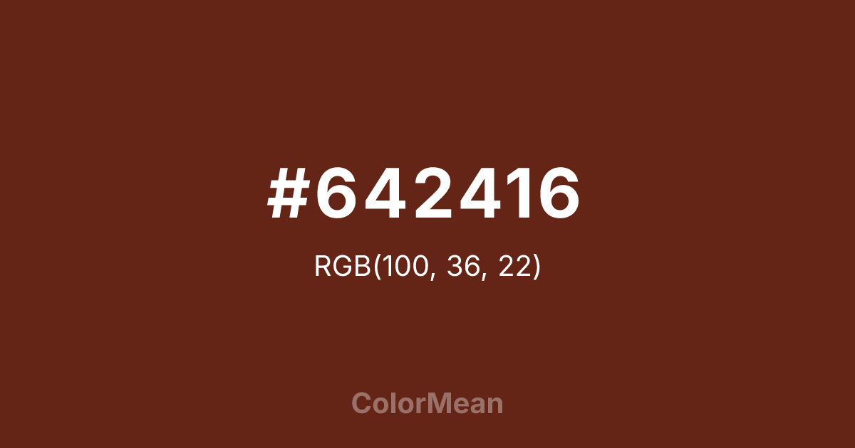
#642416 Color Information
#642416 RGB value is (100, 36, 22). The hex color red value is 100, green is 36, and blue is 22. Its HSL format shows a hue of 11°, saturation of 64 percent, and lightness of 24 percent. The CMYK process values are 0 percent, 64 percent, 78 percent, 61 percent.
#642416 Color Meaning
Color #642416 speaks of time, transformation, and elemental change. #642416 desaturated brick-red mimics rust, clay deposits, and weathered metal—tones shaped not by design, but by exposure. Color #642416 suggests authenticity through decay, not perfection. Color #642416 appeals to audiences valuing process over polish. Material science links #642416 color to iron oxidation—a chemical inevitability that architects and designers now embrace as “patina.” Psychologically, color #642416 feels stable despite its red base; its low saturation removes alarm, leaving warmth and history. #642416’s calming in a way bright reds cannot be. In sustainable branding, color #642416 signals honesty about material life cycles—celebrating aging rather than hiding #642416. #642416 appears in ceramic studios, heritage tooling, and regenerative agriculture. Paired with raw concrete or unbleached linen, color #642416 creates palettes that feel archaeological yet contemporary. Color #642416 isn’t nostalgic—#642416’s regenerative.
Color Conversion
Convert #642416 across different color models and formats. These conversions help designers work seamlessly between digital and print media, ensuring this color maintains its intended appearance across RGB screens, CMYK printers, and HSL color manipulations.
RGB Values & CMYK Values
RGB Values
CMYK Values
Color Variations
#642416 harmonies come to life through carefully balanced shades, tints, and tones, giving this color depth and flexibility across light and dark variations. Shades add richness, tints bring an airy softness, and tones soften intensity, making it easy to pair in clean, modern palettes.
Color Harmonies
#642416 harmonies create beautiful relationships with other colors based on their position on the color wheel. Each harmony type offers unique design possibilities, enabling cohesive and visually appealing color schemes.
Analogous
Colors adjacent on the color wheel (30° apart)
Complementary
Colors opposite on the color wheel (180° apart)
Split Complementary
Three colors using one base hue and the two hues beside its opposite
Triadic
Three colors evenly spaced (120° apart)
Tetradic
Four colors forming a rectangle on the wheel
Square
Four colors evenly spaced (90° apart)
Double Split
Four colors formed from two base hues and the colors next to their opposites
Monochromatic
Variations of a single hue
Contrast Checker
(WCAG 2.1) Test #642416 for accessibility compliance against white and black backgrounds. Proper contrast ensures this color remains readable and usable for all audiences, meeting WCAG 2.1 standards for both normal and large text applications.
Sample Text
This is how your text will look with these colors.
Large Text (18pt+)
Normal Text
UI Components
Color Blindness Simulator
See how #642416 appears to people with different types of color vision deficiencies. These simulations help create more inclusive designs that consider how this color is perceived across various visual abilities.
Normal Vision
protanopia
Note: These simulations are approximations. Actual color vision deficiency varies by individual.
CSS Examples
Background Color
Text Color
Sample Text
Border Color
Box Shadow
Text Shadow
Sample Text
Gradient
#642416 Color FAQs
Frequently asked questions about #642416 color meaning, symbolism, and applications. Click on any question to expand detailed answers.

