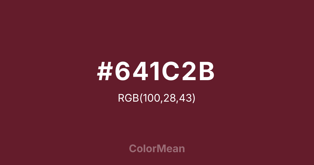
#641C2B Color Information
#641C2B RGB value is (100, 28, 43). The hex color red value is 100, green is 28, and blue is 43. Its HSL format shows a hue of 348°, saturation of 56 percent, and lightness of 25 percent. The CMYK process values are 0 percent, 72 percent, 57 percent, 61 percent.
#641C2B Color Meaning
Color #641C2B represents passion, strength, and deep emotional resonance. #641C2B dark red shade blends intensity with elegance, conveying depth and sophistication. Psychologically, color #641C2B stimulates focus, resilience, and reflective thought, creating an emotionally rich atmosphere. Culturally, color #641C2B symbolizes love, courage, and richness in Western traditions, while Eastern perspectives link #641C2B to grounded vitality and spiritual balance. Fengshui uses #641C2B for energizing yet stabilizing spaces, especially in areas emphasizing strength or confidence. Spiritually, #641C2B resonates with the root and heart chakras, fostering courage, emotional depth, and grounded passion. In design and arts, color #641C2B is ideal as a focal point or accent. Its dark, rich hue pairs well with creams, golds, and muted earth tones, appearing in classic interiors, fashion, and expressive visual projects.
Color Conversion
Convert #641C2B across different color models and formats. These conversions help designers work seamlessly between digital and print media, ensuring this color maintains its intended appearance across RGB screens, CMYK printers, and HSL color manipulations.
RGB Values & CMYK Values
RGB Values
CMYK Values
Color Variations
#641C2B harmonies come to life through carefully balanced shades, tints, and tones, giving this color depth and flexibility across light and dark variations. Shades add richness, tints bring an airy softness, and tones soften intensity, making it easy to pair in clean, modern palettes.
Color Harmonies
#641C2B harmonies create beautiful relationships with other colors based on their position on the color wheel. Each harmony type offers unique design possibilities, enabling cohesive and visually appealing color schemes.
Analogous
Colors adjacent on the color wheel (30° apart)
Complementary
Colors opposite on the color wheel (180° apart)
Split Complementary
Three colors using one base hue and the two hues beside its opposite
Triadic
Three colors evenly spaced (120° apart)
Tetradic
Four colors forming a rectangle on the wheel
Square
Four colors evenly spaced (90° apart)
Double Split
Four colors formed from two base hues and the colors next to their opposites
Monochromatic
Variations of a single hue
Contrast Checker
(WCAG 2.1) Test #641C2B for accessibility compliance against white and black backgrounds. Proper contrast ensures this color remains readable and usable for all audiences, meeting WCAG 2.1 standards for both normal and large text applications.
Sample Text
This is how your text will look with these colors.
Large Text (18pt+)
Normal Text
UI Components
Color Blindness Simulator
See how #641C2B appears to people with different types of color vision deficiencies. These simulations help create more inclusive designs that consider how this color is perceived across various visual abilities.
Normal Vision
protanopia
Note: These simulations are approximations. Actual color vision deficiency varies by individual.
CSS Examples
Background Color
Text Color
Sample Text
Border Color
Box Shadow
Text Shadow
Sample Text
Gradient
#641C2B Color FAQs
Frequently asked questions about #641C2B color meaning, symbolism, and applications. Click on any question to expand detailed answers.

