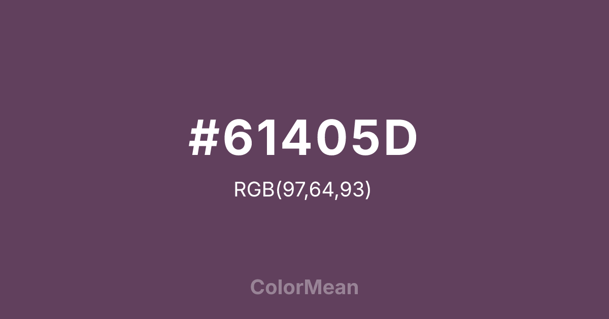
#61405D Color Information
#61405D RGB value is (97, 64, 93). The hex color red value is 97, green is 64, and blue is 93. Its HSL format shows a hue of 307°, saturation of 20 percent, and lightness of 32 percent. The CMYK process values are 0 percent, 34 percent, 4 percent, 62 percent.
#61405D Color Meaning
Color #61405D signifies tropical dusk, spiked sweetness, and complex exoticism. #61405D dark, reddish-purple is an unexpected take on the fruit, evoking its thorny crown, twilight in the tropics, and the rich, wine-like interior of an overripe specimen. Psychologically, color #61405D is intriguing and subtly intense, promoting feelings of mysterious allure, sophisticated adventure, and a taste for the uniquely beautiful. #61405D combines earthy warmth with cool purple depth, creating a sense of vibrant, shadowed richness. #61405D color is both inviting and complex. Symbolically, color #61405D represents hospitality with an edge, exotic beauty that is not easily grasped, and sweetness that carries a prickly exterior. #61405D is the color of a luxury resort at night or a rare tropical bloom. Culturally, #61405D moves beyond the cliché of sunny yellow, offering a more adult, moody, and design-oriented interpretation of tropical luxury. Color #61405D provides a sophisticated, dramatic alternative for conveying warmth, uniqueness, and a depth of flavor or experience.
Color Conversion
Convert #61405D across different color models and formats. These conversions help designers work seamlessly between digital and print media, ensuring this color maintains its intended appearance across RGB screens, CMYK printers, and HSL color manipulations.
RGB Values & CMYK Values
RGB Values
CMYK Values
Color Variations
#61405D harmonies come to life through carefully balanced shades, tints, and tones, giving this color depth and flexibility across light and dark variations. Shades add richness, tints bring an airy softness, and tones soften intensity, making it easy to pair in clean, modern palettes.
Color Harmonies
#61405D harmonies create beautiful relationships with other colors based on their position on the color wheel. Each harmony type offers unique design possibilities, enabling cohesive and visually appealing color schemes.
Analogous
Colors adjacent on the color wheel (30° apart)
Complementary
Colors opposite on the color wheel (180° apart)
Split Complementary
Three colors using one base hue and the two hues beside its opposite
Triadic
Three colors evenly spaced (120° apart)
Tetradic
Four colors forming a rectangle on the wheel
Square
Four colors evenly spaced (90° apart)
Double Split
Four colors formed from two base hues and the colors next to their opposites
Monochromatic
Variations of a single hue
Contrast Checker
(WCAG 2.1) Test #61405D for accessibility compliance against white and black backgrounds. Proper contrast ensures this color remains readable and usable for all audiences, meeting WCAG 2.1 standards for both normal and large text applications.
Sample Text
This is how your text will look with these colors.
Large Text (18pt+)
Normal Text
UI Components
Color Blindness Simulator
See how #61405D appears to people with different types of color vision deficiencies. These simulations help create more inclusive designs that consider how this color is perceived across various visual abilities.
Normal Vision
protanopia
Note: These simulations are approximations. Actual color vision deficiency varies by individual.
CSS Examples
Background Color
Text Color
Sample Text
Border Color
Box Shadow
Text Shadow
Sample Text
Gradient
#61405D Color FAQs
Frequently asked questions about #61405D color meaning, symbolism, and applications. Click on any question to expand detailed answers.

