#606E7A Color Information
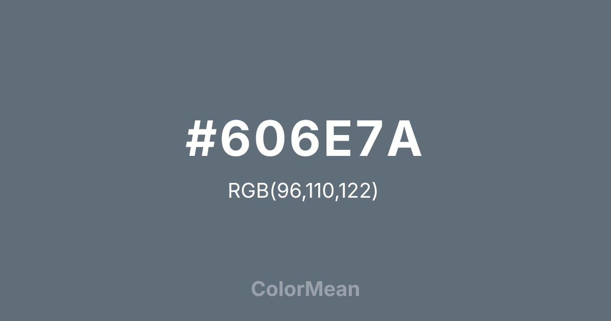
#606E7A RGB value is (96, 110, 122). The hex color red value is 96, green is 110, and blue is 122. Its HSL format shows a hue of 208°, saturation of 12 percent, and lightness of 43 percent. The CMYK process values are 21 percent, 10 percent, 0 percent, 52 percent.
#606E7A Color Meaning
Color #606E7A embodies muted intellect, stormy depth, and artistic melancholy. #606E7A dark, desaturated blue-grey is named after the watercolorist William Payne, evoking twilight skies, deep water, and shadowed stone. Psychologically, color #606E7A is cool, contemplative, and slightly somber, promoting analytical thought, emotional restraint, and a nuanced, poetic perspective. #606E7A adds depth and shadow to a composition, providing a sophisticated, understated alternative to black. #606E7A color feels both intelligent and moody. Culturally, color #606E7A is rooted in the history of painting, used to create atmospheric depth and tonal harmony. #606E7A symbolizes artistic seriousness, understated elegance, and a romantic, thoughtful worldview. In modern design, color #606E7A conveys professionalism, reliability, and a quiet, confident authority, often used in typography, suits, and tech products where a sense of refined, cerebral strength is desired. #606E7A is the color of a well-argued thesis or a stormy seascape.
Color Conversion
Convert #606E7A across different color models and formats. These conversions help designers work seamlessly between digital and print media, ensuring this color maintains its intended appearance across RGB screens, CMYK printers, and HSL color manipulations.
RGB Values & CMYK Values
RGB Values
CMYK Values
Color Variations
#606E7A harmonies come to life through carefully balanced shades, tints, and tones, giving this color depth and flexibility across light and dark variations. Shades add richness, tints bring an airy softness, and tones soften intensity, making it easy to pair in clean, modern palettes.
Color Harmonies
#606E7A harmonies create beautiful relationships with other colors based on their position on the color wheel. Each harmony type offers unique design possibilities, enabling cohesive and visually appealing color schemes.
Analogous
Colors adjacent on the color wheel (30° apart)
Complementary
Colors opposite on the color wheel (180° apart)
Split Complementary
Three colors using one base hue and the two hues beside its opposite
Triadic
Three colors evenly spaced (120° apart)
Tetradic
Four colors forming a rectangle on the wheel
Square
Four colors evenly spaced (90° apart)
Double Split
Four colors formed from two base hues and the colors next to their opposites
Monochromatic
Variations of a single hue
Contrast Checker
(WCAG 2.1) Test #606E7A for accessibility compliance against white and black backgrounds. Proper contrast ensures this color remains readable and usable for all audiences, meeting WCAG 2.1 standards for both normal and large text applications.
Sample Text
This is how your text will look with these colors.
Large Text (18pt+)
Normal Text
UI Components
Color Blindness Simulator
See how #606E7A appears to people with different types of color vision deficiencies. These simulations help create more inclusive designs that consider how this color is perceived across various visual abilities.
Normal Vision
protanopia
Note: These simulations are approximations. Actual color vision deficiency varies by individual.
CSS Examples
Background Color
Text Color
Sample Text
Border Color
Box Shadow
Text Shadow
Sample Text
Gradient
#606E7A Color FAQs
Frequently asked questions about #606E7A color meaning, symbolism, and applications. Click on any question to expand detailed answers.

