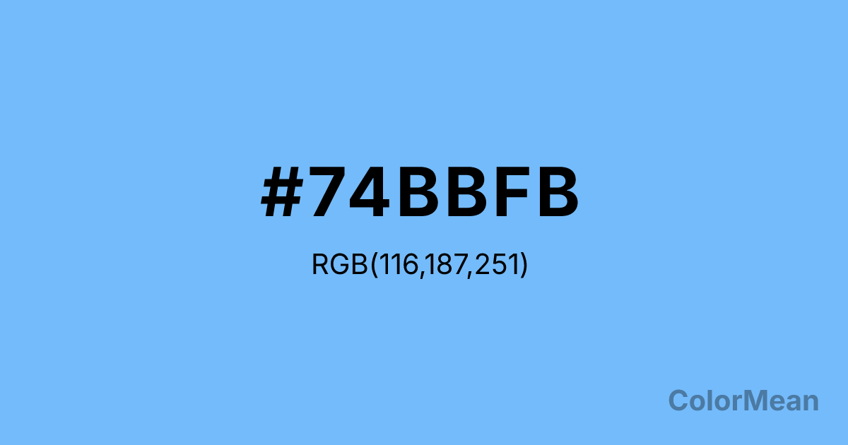
Very Light Azure (#74BBFB) Color Information
Very Light Azure (#74BBFB) RGB value is (116, 187, 251). The hex color red value is 116, green is 187, and blue is 251. Its HSL format shows a hue of 208°, saturation of 94 percent, and lightness of 72 percent. The CMYK process values are 54 percent, 25 percent, 0 percent, 2 percent.
Very Light Azure (#74BBFB) Color Meaning
Very Light Azure (#74BBFB) embodies clarity, serenity, and expansive openness. This pale blue reflects calm skies and gentle clarity, reducing stress and promoting mental peace. Psychologically, Very Light Azure (#74BBFB) encourages focus, relaxation, and emotional equilibrium, creating a sense of airy freshness. Culturally, Very Light Azure (#74BBFB) symbolizes clarity and communication in Western traditions, while Eastern interpretations associate light blues with protection, healing, and subtle spiritual awakening. Fengshui views this tone as enhancing calm and openness, suitable for meditation or study areas. Spiritually, Very Light Azure (#74BBFB) resonates with the Throat chakra, encouraging honest expression and peaceful communication. This light blue shade supports reflective thinking and design applications where calm, soothing energy is desired, such as websites, interiors, and branding with clean aesthetics.
Color Conversion
Convert Very Light Azure (#74BBFB) across different color models and formats. These conversions help designers work seamlessly between digital and print media, ensuring this color maintains its intended appearance across RGB screens, CMYK printers, and HSL color manipulations.
RGB Values & CMYK Values
RGB Values
CMYK Values
Color Variations
Very Light Azure (#74BBFB) harmonies come to life through carefully balanced shades, tints, and tones, giving this color depth and flexibility across light and dark variations. Shades add richness, tints bring an airy softness, and tones soften intensity, making it easy to pair in clean, modern palettes.
Color Harmonies
Very Light Azure (#74BBFB) harmonies create beautiful relationships with other colors based on their position on the color wheel. Each harmony type offers unique design possibilities, enabling cohesive and visually appealing color schemes.
Analogous
Colors adjacent on the color wheel (30° apart)
Complementary
Colors opposite on the color wheel (180° apart)
Split Complementary
Three colors using one base hue and the two hues beside its opposite
Triadic
Three colors evenly spaced (120° apart)
Tetradic
Four colors forming a rectangle on the wheel
Square
Four colors evenly spaced (90° apart)
Double Split
Four colors formed from two base hues and the colors next to their opposites
Monochromatic
Variations of a single hue
Contrast Checker
(WCAG 2.1) Test Very Light Azure (#74BBFB) for accessibility compliance against white and black backgrounds. Proper contrast ensures this color remains readable and usable for all audiences, meeting WCAG 2.1 standards for both normal and large text applications.
Sample Text
This is how your text will look with these colors.
Large Text (18pt+)
Normal Text
UI Components
Color Blindness Simulator
See how #74BBFB appears to people with different types of color vision deficiencies. These simulations help create more inclusive designs that consider how this color is perceived across various visual abilities.
Normal Vision
protanopia
Note: These simulations are approximations. Actual color vision deficiency varies by individual.
CSS Examples
Background Color
Text Color
Sample Text
Border Color
Box Shadow
Text Shadow
Sample Text
Gradient
Very Light Azure (#74BBFB) Color FAQs
Frequently asked questions about Very Light Azure (#74BBFB) color meaning, symbolism, and applications. Click on any question to expand detailed answers.
