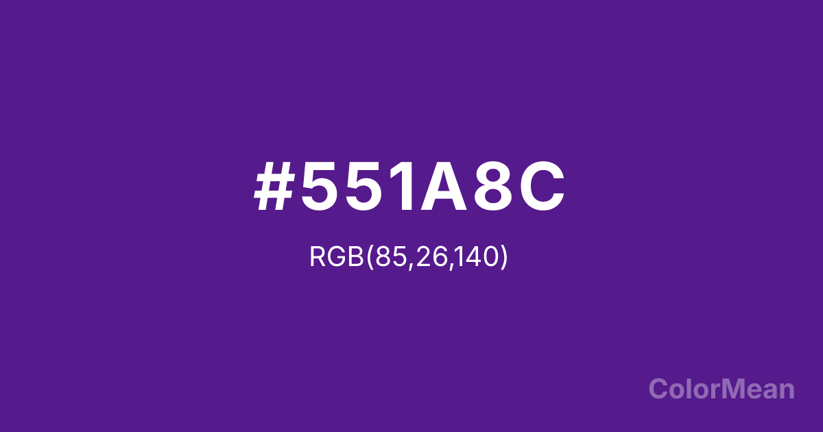
#551A8C Color Information
#551A8C RGB value is (85, 26, 140). The hex color red value is 85, green is 26, and blue is 140. Its HSL format shows a hue of 271°, saturation of 69 percent, and lightness of 33 percent. The CMYK process values are 39 percent, 81 percent, 0 percent, 45 percent.
#551A8C Color Meaning
Color #551A8C denotes solemn richness, the foundational shadow of digital creativity, and dignified purple depth. #551A8C dark, slightly reddish purple is the most serious and grounded in the series, evoking twilight, deep space, and the profound base from which lighter fantasies emerge. Psychologically, color #551A8C is weighty and resonant, conveying tradition, mysterious stability, and the deep roots of imaginative thought. #551A8C adds gravity and crucial contrast, ensuring the purple palette can be used for text, borders, and professional applications without losing its essence. #551A8C color is the serious foundation of whimsy. Symbolically, color #551A8C represents the ancient wellspring of story, the silent potential before creation, and mystery that is structural and enduring. Within the technical system, #551A8C is the indispensable anchor, providing maximum contrast for legibility and enabling the entire vibrant purple family to function with versatility and professional polish, from the brightest highlight to the deepest, most solemn shadow.
Color Conversion
Convert #551A8C across different color models and formats. These conversions help designers work seamlessly between digital and print media, ensuring this color maintains its intended appearance across RGB screens, CMYK printers, and HSL color manipulations.
RGB Values & CMYK Values
RGB Values
CMYK Values
Color Variations
#551A8C harmonies come to life through carefully balanced shades, tints, and tones, giving this color depth and flexibility across light and dark variations. Shades add richness, tints bring an airy softness, and tones soften intensity, making it easy to pair in clean, modern palettes.
Color Harmonies
#551A8C harmonies create beautiful relationships with other colors based on their position on the color wheel. Each harmony type offers unique design possibilities, enabling cohesive and visually appealing color schemes.
Analogous
Colors adjacent on the color wheel (30° apart)
Complementary
Colors opposite on the color wheel (180° apart)
Split Complementary
Three colors using one base hue and the two hues beside its opposite
Triadic
Three colors evenly spaced (120° apart)
Tetradic
Four colors forming a rectangle on the wheel
Square
Four colors evenly spaced (90° apart)
Double Split
Four colors formed from two base hues and the colors next to their opposites
Monochromatic
Variations of a single hue
Contrast Checker
(WCAG 2.1) Test #551A8C for accessibility compliance against white and black backgrounds. Proper contrast ensures this color remains readable and usable for all audiences, meeting WCAG 2.1 standards for both normal and large text applications.
Sample Text
This is how your text will look with these colors.
Large Text (18pt+)
Normal Text
UI Components
Color Blindness Simulator
See how #551A8C appears to people with different types of color vision deficiencies. These simulations help create more inclusive designs that consider how this color is perceived across various visual abilities.
Normal Vision
protanopia
Note: These simulations are approximations. Actual color vision deficiency varies by individual.
CSS Examples
Background Color
Text Color
Sample Text
Border Color
Box Shadow
Text Shadow
Sample Text
Gradient
#551A8C Color FAQs
Frequently asked questions about #551A8C color meaning, symbolism, and applications. Click on any question to expand detailed answers.
