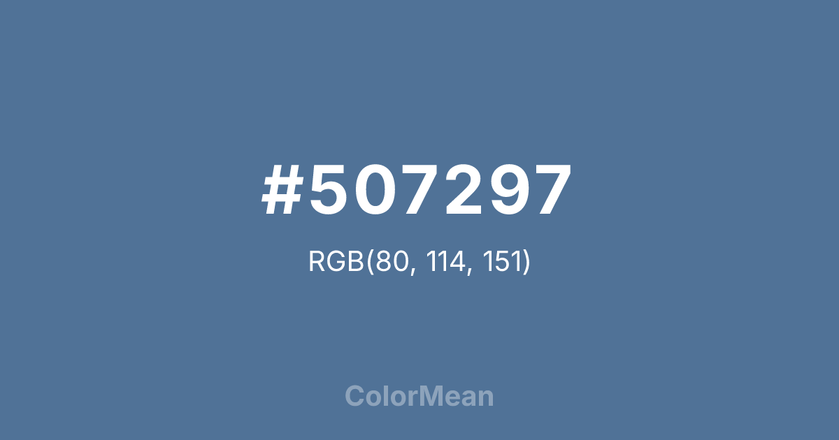
#507297 Color Information
#507297 RGB value is (80, 114, 151). The hex color red value is 80, green is 114, and blue is 151. Its HSL format shows a hue of 211°, saturation of 31 percent, and lightness of 45 percent. The CMYK process values are 47 percent, 25 percent, 0 percent, 41 percent.
#507297 Color Meaning
Color #507297 symbolizes trust, calm authority, and thoughtful reflection. #507297 muted, medium-dark shade of blue suggests intellectual steadiness, reliability, and serene confidence. Psychologically, color #507297 fosters concentration, patience, and analytical thinking, making #507297 a practical choice for learning environments. Culturally, color #507297 aligns with academia, professionalism, and structured environments in Western symbolism, while Eastern traditions associate #507297 with introspection, clarity, and stability. Feng Shui positions #507297 as a color for knowledge and self-cultivation areas, supporting clarity of thought and growth. Spiritually, color #507297 connects with the throat chakra, facilitating expression and effective communication. In design, color #507297 pairs with golds, whites, or soft greys to create balanced and authoritative visuals. Artists use #507297 to create depth, calm contrast, and sophistication, especially in illustrations or branding requiring quiet strength. Its moderate vividness ensures impact without overwhelming.
Color Conversion
Convert #507297 across different color models and formats. These conversions help designers work seamlessly between digital and print media, ensuring this color maintains its intended appearance across RGB screens, CMYK printers, and HSL color manipulations.
RGB Values & CMYK Values
RGB Values
CMYK Values
Color Variations
#507297 harmonies come to life through carefully balanced shades, tints, and tones, giving this color depth and flexibility across light and dark variations. Shades add richness, tints bring an airy softness, and tones soften intensity, making it easy to pair in clean, modern palettes.
Color Harmonies
#507297 harmonies create beautiful relationships with other colors based on their position on the color wheel. Each harmony type offers unique design possibilities, enabling cohesive and visually appealing color schemes.
Analogous
Colors adjacent on the color wheel (30° apart)
Complementary
Colors opposite on the color wheel (180° apart)
Split Complementary
Three colors using one base hue and the two hues beside its opposite
Triadic
Three colors evenly spaced (120° apart)
Tetradic
Four colors forming a rectangle on the wheel
Square
Four colors evenly spaced (90° apart)
Double Split
Four colors formed from two base hues and the colors next to their opposites
Monochromatic
Variations of a single hue
Contrast Checker
(WCAG 2.1) Test #507297 for accessibility compliance against white and black backgrounds. Proper contrast ensures this color remains readable and usable for all audiences, meeting WCAG 2.1 standards for both normal and large text applications.
Sample Text
This is how your text will look with these colors.
Large Text (18pt+)
Normal Text
UI Components
Color Blindness Simulator
See how #507297 appears to people with different types of color vision deficiencies. These simulations help create more inclusive designs that consider how this color is perceived across various visual abilities.
Normal Vision
protanopia
Note: These simulations are approximations. Actual color vision deficiency varies by individual.
CSS Examples
Background Color
Text Color
Sample Text
Border Color
Box Shadow
Text Shadow
Sample Text
Gradient
#507297 Color FAQs
Frequently asked questions about #507297 color meaning, symbolism, and applications. Click on any question to expand detailed answers.
