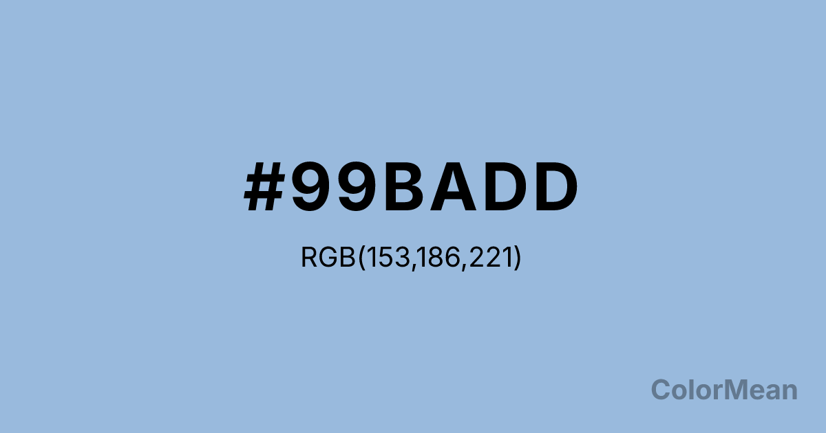
Carolina Blue (#99BADD) Color Information
Carolina Blue (#99BADD) RGB value is (153, 186, 221). The hex color red value is 153, green is 186, and blue is 221. Its HSL format shows a hue of 211°, saturation of 50 percent, and lightness of 73 percent. The CMYK process values are 31 percent, 16 percent, 0 percent, 13 percent.
Carolina Blue (#99BADD) Color Meaning
Carolina Blue (#99BADD) offers soft institutional calm, atmospheric neutrality, and inclusive serenity. This lighter variant of Carolina Blue (#99BADD) leans closer to periwinkle, carrying more white and a whisper of lavender. It evokes coastal mist, morning fog over water, and institutional linens—calm without coldness. In healthcare and education design, Carolina Blue (#99BADD) reduces perceived anxiety in waiting areas and classrooms by lowering visual contrast without inducing drowsiness. Unlike stark whites or clinical greys, it retains emotional warmth through its subtle blue base. In branding, Carolina Blue (#99BADD) signals gentleness with structure. It appears in mental health platforms, childcare services, and university sub-brands where approachability is key. Digital performance is strong: it offers sufficient contrast against dark text for readability while remaining soothing in large fields. Print consistency is high, though designers often specify coated stock to preserve its delicate luminance. Consumer research shows that products in this tone are rated as more empathetic and listener-oriented—ideal for service-based industries. Culturally, Carolina Blue (#99BADD) reflects care that listens before acting. It is not the color of leadership but of support. In spiritual contexts, it mirrors the third eye’s receptive mode: wisdom gathered through patience. Designers use Carolina Blue (#99BADD) when they want to humanize systems. Its strength lies in its softness—a quiet presence that makes others feel seen.
Color Conversion
Convert Carolina Blue (#99BADD) across different color models and formats. These conversions help designers work seamlessly between digital and print media, ensuring this color maintains its intended appearance across RGB screens, CMYK printers, and HSL color manipulations.
RGB Values & CMYK Values
RGB Values
CMYK Values
Color Variations
Carolina Blue (#99BADD) harmonies come to life through carefully balanced shades, tints, and tones, giving this color depth and flexibility across light and dark variations. Shades add richness, tints bring an airy softness, and tones soften intensity, making it easy to pair in clean, modern palettes.
Color Harmonies
Carolina Blue (#99BADD) harmonies create beautiful relationships with other colors based on their position on the color wheel. Each harmony type offers unique design possibilities, enabling cohesive and visually appealing color schemes.
Analogous
Colors adjacent on the color wheel (30° apart)
Complementary
Colors opposite on the color wheel (180° apart)
Split Complementary
Three colors using one base hue and the two hues beside its opposite
Triadic
Three colors evenly spaced (120° apart)
Tetradic
Four colors forming a rectangle on the wheel
Square
Four colors evenly spaced (90° apart)
Double Split
Four colors formed from two base hues and the colors next to their opposites
Monochromatic
Variations of a single hue
Contrast Checker
(WCAG 2.1) Test Carolina Blue (#99BADD) for accessibility compliance against white and black backgrounds. Proper contrast ensures this color remains readable and usable for all audiences, meeting WCAG 2.1 standards for both normal and large text applications.
Sample Text
This is how your text will look with these colors.
Large Text (18pt+)
Normal Text
UI Components
Color Blindness Simulator
See how #99BADD appears to people with different types of color vision deficiencies. These simulations help create more inclusive designs that consider how this color is perceived across various visual abilities.
Normal Vision
protanopia
Note: These simulations are approximations. Actual color vision deficiency varies by individual.
CSS Examples
Background Color
Text Color
Sample Text
Border Color
Box Shadow
Text Shadow
Sample Text
Gradient
Carolina Blue (#99BADD) Color FAQs
Frequently asked questions about Carolina Blue (#99BADD) color meaning, symbolism, and applications. Click on any question to expand detailed answers.
