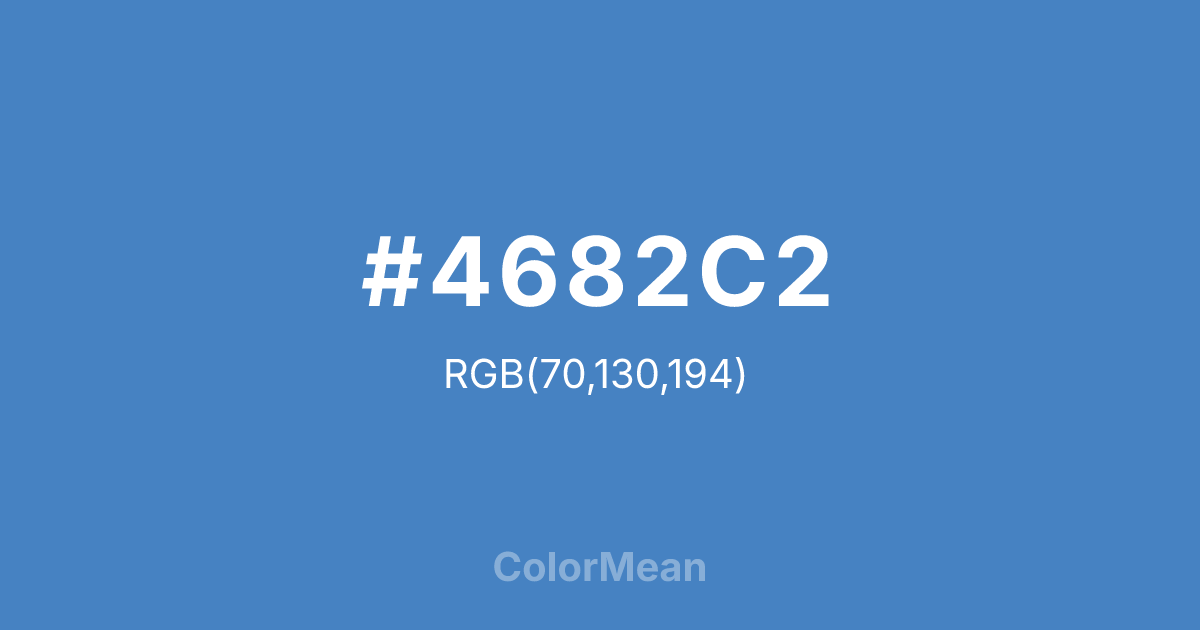
#4682C2 Color Information
#4682C2 RGB value is (70, 130, 194). The hex color red value is 70, green is 130, and blue is 194. Its HSL format shows a hue of 211°, saturation of 50 percent, and lightness of 52 percent. The CMYK process values are 64 percent, 33 percent, 0 percent, 24 percent.
#4682C2 Color Meaning
Color #4682C2 conveys balanced authority, trustworthy innovation, and structured optimism. Color #4682C2 is a harmonious blend of azure’s openness and cyan’s precision—deep enough to feel reliable, bright enough to feel forward-looking. #4682C2’s nearly identical to **Steel Blue**, a hue long associated with dependable systems. In corporate and civic tech, #4682C2 color signals innovation you can trust: cloud infrastructure, public transit apps, and educational platforms. Research shows #4682C2 increases perceived reliability more than pure blue or grey in digital services. In UI/UX design, color #4682C2 functions as a high-performing primary. #4682C2 meets WCAG AA contrast standards against white for body text and excels in data visualization for “neutral” or “positive” categories. Print reproduction is highly consistent, making #4682C2 ideal for annual reports, policy briefs, and institutional branding. Consumer testing reveals higher long-term trust in brands using color #4682C2 versus trend-driven alternatives. Symbolically, color #4682C2 represents progress with backbone. #4682C2 is not the blue of hype but of habit—systems that work daily, quietly, well. In spiritual contexts, #4682C2 aligns with the throat chakra’s steady mode: truth that endures. Designers choose color #4682C2 when they want to signal optimism as infrastructure. Its confidence is calm.
Color Conversion
Convert #4682C2 across different color models and formats. These conversions help designers work seamlessly between digital and print media, ensuring this color maintains its intended appearance across RGB screens, CMYK printers, and HSL color manipulations.
RGB Values & CMYK Values
RGB Values
CMYK Values
Color Variations
#4682C2 harmonies come to life through carefully balanced shades, tints, and tones, giving this color depth and flexibility across light and dark variations. Shades add richness, tints bring an airy softness, and tones soften intensity, making it easy to pair in clean, modern palettes.
Color Harmonies
#4682C2 harmonies create beautiful relationships with other colors based on their position on the color wheel. Each harmony type offers unique design possibilities, enabling cohesive and visually appealing color schemes.
Analogous
Colors adjacent on the color wheel (30° apart)
Complementary
Colors opposite on the color wheel (180° apart)
Split Complementary
Three colors using one base hue and the two hues beside its opposite
Triadic
Three colors evenly spaced (120° apart)
Tetradic
Four colors forming a rectangle on the wheel
Square
Four colors evenly spaced (90° apart)
Double Split
Four colors formed from two base hues and the colors next to their opposites
Monochromatic
Variations of a single hue
Contrast Checker
(WCAG 2.1) Test #4682C2 for accessibility compliance against white and black backgrounds. Proper contrast ensures this color remains readable and usable for all audiences, meeting WCAG 2.1 standards for both normal and large text applications.
Sample Text
This is how your text will look with these colors.
Large Text (18pt+)
Normal Text
UI Components
Color Blindness Simulator
See how #4682C2 appears to people with different types of color vision deficiencies. These simulations help create more inclusive designs that consider how this color is perceived across various visual abilities.
Normal Vision
protanopia
Note: These simulations are approximations. Actual color vision deficiency varies by individual.
CSS Examples
Background Color
Text Color
Sample Text
Border Color
Box Shadow
Text Shadow
Sample Text
Gradient
#4682C2 Color FAQs
Frequently asked questions about #4682C2 color meaning, symbolism, and applications. Click on any question to expand detailed answers.
