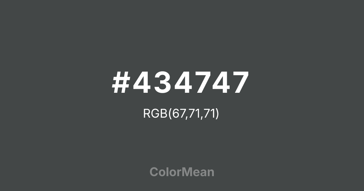
#434747 Color Information
#434747 RGB value is (67, 71, 71). The hex color red value is 67, green is 71, and blue is 71. Its HSL format shows a hue of 180°, saturation of 3 percent, and lightness of 27 percent. The CMYK process values are 6 percent, 0 percent, 0 percent, 72 percent.
#434747 Color Meaning
Color #434747 evokes cosmic neutrality and technological calm. #434747 cool, desaturated gray-green mimics the void between stars—neither warm nor cold, but observant. Color #434747 functions as a modern neutral that avoids the sterility of pure gray while resisting emotional pull. Color #434747 is the backdrop for focus. In UI/UX design, #434747 tone reduces eye strain during prolonged use, especially in data dashboards and control rooms. Its subtle green undertone counters the blue-light fatigue common in digital environments. Unlike warmer greys that feel domestic, color #434747 feels calibrated—like instrument panels or satellite housings. Culturally, #434747 references space exploration, speculative futures, and minimalist tech aesthetics. #434747 doesn’t romanticize the cosmos; #434747 operationalizes #434747. Color #434747 pairs effectively with electric blues or muted oranges to create palettes that feel both advanced and grounded—ideal for SaaS platforms and scientific communication. Color #434747 isn’t empty—#434747’s poised.
Color Conversion
Convert #434747 across different color models and formats. These conversions help designers work seamlessly between digital and print media, ensuring this color maintains its intended appearance across RGB screens, CMYK printers, and HSL color manipulations.
RGB Values & CMYK Values
RGB Values
CMYK Values
Color Variations
#434747 harmonies come to life through carefully balanced shades, tints, and tones, giving this color depth and flexibility across light and dark variations. Shades add richness, tints bring an airy softness, and tones soften intensity, making it easy to pair in clean, modern palettes.
Color Harmonies
#434747 harmonies create beautiful relationships with other colors based on their position on the color wheel. Each harmony type offers unique design possibilities, enabling cohesive and visually appealing color schemes.
Analogous
Colors adjacent on the color wheel (30° apart)
Complementary
Colors opposite on the color wheel (180° apart)
Split Complementary
Three colors using one base hue and the two hues beside its opposite
Triadic
Three colors evenly spaced (120° apart)
Tetradic
Four colors forming a rectangle on the wheel
Square
Four colors evenly spaced (90° apart)
Double Split
Four colors formed from two base hues and the colors next to their opposites
Monochromatic
Variations of a single hue
Contrast Checker
(WCAG 2.1) Test #434747 for accessibility compliance against white and black backgrounds. Proper contrast ensures this color remains readable and usable for all audiences, meeting WCAG 2.1 standards for both normal and large text applications.
Sample Text
This is how your text will look with these colors.
Large Text (18pt+)
Normal Text
UI Components
Color Blindness Simulator
See how #434747 appears to people with different types of color vision deficiencies. These simulations help create more inclusive designs that consider how this color is perceived across various visual abilities.
Normal Vision
protanopia
Note: These simulations are approximations. Actual color vision deficiency varies by individual.
CSS Examples
Background Color
Text Color
Sample Text
Border Color
Box Shadow
Text Shadow
Sample Text
Gradient
#434747 Color FAQs
Frequently asked questions about #434747 color meaning, symbolism, and applications. Click on any question to expand detailed answers.

