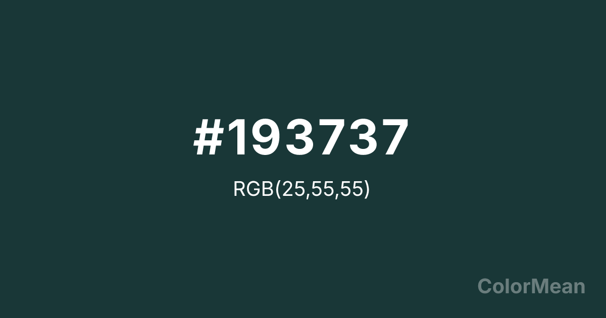
Pearl Opal Green (#193737) Color Information
Pearl Opal Green (#193737) RGB value is (25, 55, 55). The hex color red value is 25, green is 55, and blue is 55. Its HSL format shows a hue of 180°, saturation of 38 percent, and lightness of 16 percent. The CMYK process values are 55 percent, 0 percent, 0 percent, 78 percent.
Pearl Opal Green (#193737) Color Meaning
Pearl Opal Green (#193737) conveys mystical depth, watery illusion, and subterranean glow. This very dark, greenish-blue-black suggests the play of color within a black opal, deep jungle pools, or bioluminescent depths. Psychologically, Pearl Opal Green (#193737) is mysterious and mesmerizing, promoting fascination, deep intuition, and a sense of encountering something rare and magical. It soothes with its depth while simultaneously stimulating curiosity and wonder. This color feels both ancient and alive with hidden light. Symbolically, Pearl Opal Green (#193737) represents the secret fire within darkness, intuition that sees in the deep, and beauty that reveals itself only under certain conditions. It is the color of guarded wisdom and esoteric knowledge. Culturally, it is linked to gemology, fantasy literature, and designs meant to convey luxury, mystery, or a connection to arcane sciences. Pearl Opal Green (#193737) is a color that doesn't simply sit on the surface; it invites the viewer to look deeper and discover its hidden complexities.
Convert Pearl Opal Green (#193737) across different color models and formats. These conversions help designers work seamlessly between digital and print media, ensuring this color maintains its intended appearance across RGB screens, CMYK printers, and HSL color manipulations.
RGB Values
CMYK Values
Pearl Opal Green (#193737) harmonies come to life through carefully balanced shades, tints, and tones, giving this color depth and flexibility across light and dark variations. Shades add richness, tints bring an airy softness, and tones soften intensity, making it easy to pair in clean, modern palettes.
Pearl Opal Green (#193737) harmonies create beautiful relationships with other colors based on their position on the color wheel. Each harmony type offers unique design possibilities, enabling cohesive and visually appealing color schemes.
Analogous
Colors adjacent on the color wheel (30° apart)
Complementary
Colors opposite on the color wheel (180° apart)
Split Complementary
Three colors using one base hue and the two hues beside its opposite
Triadic
Three colors evenly spaced (120° apart)
Tetradic
Four colors forming a rectangle on the wheel
Square
Four colors evenly spaced (90° apart)
Double Split
Four colors formed from two base hues and the colors next to their opposites
Monochromatic
Variations of a single hue
(WCAG 2.1) Test Pearl Opal Green (#193737) for accessibility compliance against white and black backgrounds. Proper contrast ensures this color remains readable and usable for all audiences, meeting WCAG 2.1 standards for both normal and large text applications.
Sample Text
This is how your text will look with these colors.
Large Text (18pt+)
Normal Text
UI Components
See how #193737 appears to people with different types of color vision deficiencies. These simulations help create more inclusive designs that consider how this color is perceived across various visual abilities.
Normal Vision
protanopia
Note: These simulations are approximations. Actual color vision deficiency varies by individual.
Background Color
Text Color
Sample Text
Border Color
Box Shadow
Text Shadow
Sample Text
Gradient
Pearl Opal Green (#193737) Color FAQs
Frequently asked questions about Pearl Opal Green (#193737) color meaning, symbolism, and applications. Click on any question to expand detailed answers.
