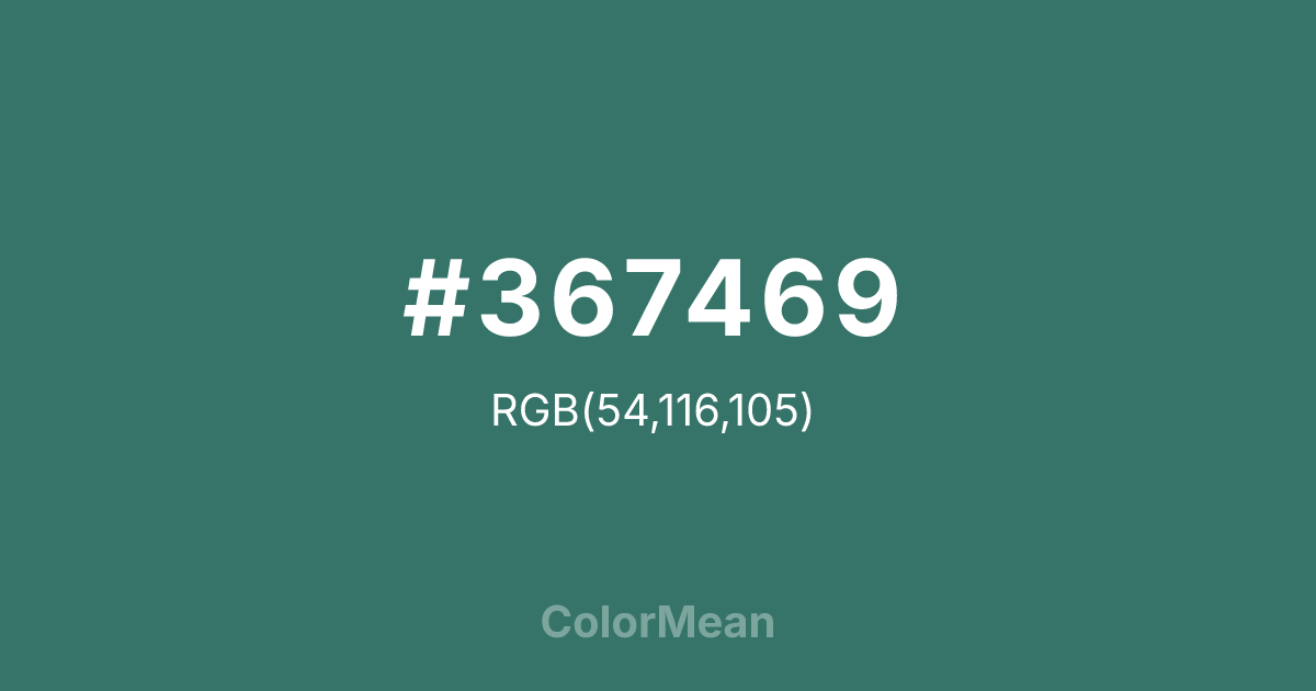
#367469 Color Information
#367469 RGB value is (54, 116, 105). The hex color red value is 54, green is 116, and blue is 105. Its HSL format shows a hue of 169°, saturation of 36 percent, and lightness of 33 percent. The CMYK process values are 53 percent, 0 percent, 9 percent, 55 percent.
#367469 Color Meaning
Color #367469 represents composed vitality, emotional regulation, and intellectual balance rooted in nature. #367469 blue leaning green tone (#367469) feels cooler and more deliberate than standard greens, suggesting growth guided by structure rather than impulse. #367469 carries a sense of cultivated calm, where natural energy is shaped by order and intention instead of wild expansion. From a psychological perspective, color #367469 supports emotional steadiness and cognitive clarity. #367469 helps reduce internal noise while maintaining alert awareness, making #367469 effective in environments that require sustained focus and thoughtful communication. Unlike brighter greens that energize rapidly, color #367469 encourages consistency, patience, and controlled progress. #367469 supports decision making that favors long term stability over short term excitement. In cultural and symbolic contexts, color #367469 has strong associations with tradition, wisdom, and cultivated environments. #367469 frequently appears in academic settings, formal interiors, and heritage design systems where trust and restraint matter. Historically, myrtle plants symbolized peace, fidelity, and intellectual refinement, and #367469 color inherits that legacy through its composed presence and dignified tone. On a spiritual and symbolic level, color #367469 represents emotional maturity, balanced growth, and harmony between thought and feeling. #367469 aligns with heart centered awareness guided by reason rather than impulse. #367469 color encourages inner order, calm confidence, and steady alignment with personal values, acting as a visual reminder that true growth unfolds through discipline, patience, and clarity of intention.
Color Conversion
Convert #367469 across different color models and formats. These conversions help designers work seamlessly between digital and print media, ensuring this color maintains its intended appearance across RGB screens, CMYK printers, and HSL color manipulations.
RGB Values & CMYK Values
RGB Values
CMYK Values
Color Variations
#367469 harmonies come to life through carefully balanced shades, tints, and tones, giving this color depth and flexibility across light and dark variations. Shades add richness, tints bring an airy softness, and tones soften intensity, making it easy to pair in clean, modern palettes.
Color Harmonies
#367469 harmonies create beautiful relationships with other colors based on their position on the color wheel. Each harmony type offers unique design possibilities, enabling cohesive and visually appealing color schemes.
Analogous
Colors adjacent on the color wheel (30° apart)
Complementary
Colors opposite on the color wheel (180° apart)
Split Complementary
Three colors using one base hue and the two hues beside its opposite
Triadic
Three colors evenly spaced (120° apart)
Tetradic
Four colors forming a rectangle on the wheel
Square
Four colors evenly spaced (90° apart)
Double Split
Four colors formed from two base hues and the colors next to their opposites
Monochromatic
Variations of a single hue
Contrast Checker
(WCAG 2.1) Test #367469 for accessibility compliance against white and black backgrounds. Proper contrast ensures this color remains readable and usable for all audiences, meeting WCAG 2.1 standards for both normal and large text applications.
Sample Text
This is how your text will look with these colors.
Large Text (18pt+)
Normal Text
UI Components
Color Blindness Simulator
See how #367469 appears to people with different types of color vision deficiencies. These simulations help create more inclusive designs that consider how this color is perceived across various visual abilities.
Normal Vision
protanopia
Note: These simulations are approximations. Actual color vision deficiency varies by individual.
CSS Examples
Background Color
Text Color
Sample Text
Border Color
Box Shadow
Text Shadow
Sample Text
Gradient
#367469 Color FAQs
Frequently asked questions about #367469 color meaning, symbolism, and applications. Click on any question to expand detailed answers.
