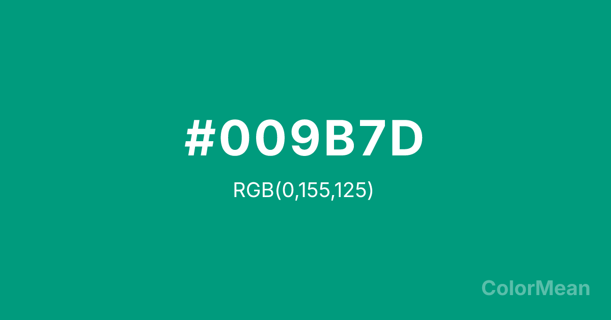
Paolo Veronese Green (#009B7D) Color Information
Paolo Veronese Green (#009B7D) RGB value is (0, 155, 125). The hex color red value is 0, green is 155, and blue is 125. Its HSL format shows a hue of 168°, saturation of 100 percent, and lightness of 30 percent. The CMYK process values are 100 percent, 0 percent, 19 percent, 39 percent.
Paolo Veronese Green (#009B7D) Color Meaning
Paolo Veronese Green (#009B7D) projects luxurious vitality, Renaissance opulence, and balanced vibrancy. This rich, bluish-green is named for the master painter who used it extensively, suggesting artistic mastery, natural wealth, and harmonious grandeur. Psychologically, Paolo Veronese Green (#009B7D) is stimulating yet deeply balanced, combining the calm stability of blue with the lively growth of green in a saturated, luxurious form. It evokes feelings of abundance, refined taste, and a connection to both nature and high art. This color is energetic in a controlled, elegant way. Culturally, Paolo Veronese Green (#009B7D) is intrinsically tied to the history of European art, evoking the lush drapery and landscapes of Venetian painting. Symbolically, it represents the artistic mediation of nature, the wealth of the natural world rendered with human skill, and harmony achieved through mastery. In modern use, Paolo Veronese Green (#009B7D) conveys a sense of confident, timeless elegance and organic luxury, often used in high-end branding and design to signal quality, heritage, and a vibrant, sustainable sophistication.
Color Conversion
Convert Paolo Veronese Green (#009B7D) across different color models and formats. These conversions help designers work seamlessly between digital and print media, ensuring this color maintains its intended appearance across RGB screens, CMYK printers, and HSL color manipulations.
RGB Values & CMYK Values
RGB Values
CMYK Values
Color Variations
Paolo Veronese Green (#009B7D) harmonies come to life through carefully balanced shades, tints, and tones, giving this color depth and flexibility across light and dark variations. Shades add richness, tints bring an airy softness, and tones soften intensity, making it easy to pair in clean, modern palettes.
Color Harmonies
Paolo Veronese Green (#009B7D) harmonies create beautiful relationships with other colors based on their position on the color wheel. Each harmony type offers unique design possibilities, enabling cohesive and visually appealing color schemes.
Analogous
Colors adjacent on the color wheel (30° apart)
Complementary
Colors opposite on the color wheel (180° apart)
Split Complementary
Three colors using one base hue and the two hues beside its opposite
Triadic
Three colors evenly spaced (120° apart)
Tetradic
Four colors forming a rectangle on the wheel
Square
Four colors evenly spaced (90° apart)
Double Split
Four colors formed from two base hues and the colors next to their opposites
Monochromatic
Variations of a single hue
Contrast Checker
(WCAG 2.1) Test Paolo Veronese Green (#009B7D) for accessibility compliance against white and black backgrounds. Proper contrast ensures this color remains readable and usable for all audiences, meeting WCAG 2.1 standards for both normal and large text applications.
Sample Text
This is how your text will look with these colors.
Large Text (18pt+)
Normal Text
UI Components
Color Blindness Simulator
See how #009B7D appears to people with different types of color vision deficiencies. These simulations help create more inclusive designs that consider how this color is perceived across various visual abilities.
Normal Vision
protanopia
Note: These simulations are approximations. Actual color vision deficiency varies by individual.
CSS Examples
Background Color
Text Color
Sample Text
Border Color
Box Shadow
Text Shadow
Sample Text
Gradient
Paolo Veronese Green (#009B7D) Color FAQs
Frequently asked questions about Paolo Veronese Green (#009B7D) color meaning, symbolism, and applications. Click on any question to expand detailed answers.
