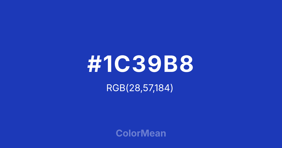
#1C39B8 Color Information
#1C39B8 RGB value is (28, 57, 184). The hex color red value is 28, green is 57, and blue is 184. Its HSL format shows a hue of 229°, saturation of 74 percent, and lightness of 42 percent. The CMYK process values are 85 percent, 69 percent, 0 percent, 28 percent.
#1C39B8 Color Meaning
Color #1C39B8 denotes regal intensity, celestial truth, and profound depth. #1C39B8 rich, saturated azure is historically linked to the art and architecture of Persia, evoking lapis lazuli, deep night skies, and sacred spaces. Psychologically, color #1C39B8 commands respect and introspection, conveying wisdom, stability, and a pursuit of eternal truths. #1C39B8 is a color of majestic serenity and intellectual depth, stimulating profound thought while calming chaotic emotion. #1C39B8 color feels both vast and intensely focused. Symbolically, color #1C39B8 represents divine wisdom, cosmic order, and the infinite as understood through art and science. #1C39B8 is the color of the firmament in miniature, of poetry and astronomy intertwined. Culturally, #1C39B8 carries the weight of a rich artistic heritage, symbolizing craftsmanship, spiritual depth, and a sophisticated understanding of beauty and structure. Color #1C39B8 is a color that connects the human maker to the grandeur of the cosmos.
Color Conversion
Convert #1C39B8 across different color models and formats. These conversions help designers work seamlessly between digital and print media, ensuring this color maintains its intended appearance across RGB screens, CMYK printers, and HSL color manipulations.
RGB Values & CMYK Values
RGB Values
CMYK Values
Color Variations
#1C39B8 harmonies come to life through carefully balanced shades, tints, and tones, giving this color depth and flexibility across light and dark variations. Shades add richness, tints bring an airy softness, and tones soften intensity, making it easy to pair in clean, modern palettes.
Color Harmonies
#1C39B8 harmonies create beautiful relationships with other colors based on their position on the color wheel. Each harmony type offers unique design possibilities, enabling cohesive and visually appealing color schemes.
Analogous
Colors adjacent on the color wheel (30° apart)
Complementary
Colors opposite on the color wheel (180° apart)
Split Complementary
Three colors using one base hue and the two hues beside its opposite
Triadic
Three colors evenly spaced (120° apart)
Tetradic
Four colors forming a rectangle on the wheel
Square
Four colors evenly spaced (90° apart)
Double Split
Four colors formed from two base hues and the colors next to their opposites
Monochromatic
Variations of a single hue
Contrast Checker
(WCAG 2.1) Test #1C39B8 for accessibility compliance against white and black backgrounds. Proper contrast ensures this color remains readable and usable for all audiences, meeting WCAG 2.1 standards for both normal and large text applications.
Sample Text
This is how your text will look with these colors.
Large Text (18pt+)
Normal Text
UI Components
Color Blindness Simulator
See how #1C39B8 appears to people with different types of color vision deficiencies. These simulations help create more inclusive designs that consider how this color is perceived across various visual abilities.
Normal Vision
protanopia
Note: These simulations are approximations. Actual color vision deficiency varies by individual.
CSS Examples
Background Color
Text Color
Sample Text
Border Color
Box Shadow
Text Shadow
Sample Text
Gradient
#1C39B8 Color FAQs
Frequently asked questions about #1C39B8 color meaning, symbolism, and applications. Click on any question to expand detailed answers.
