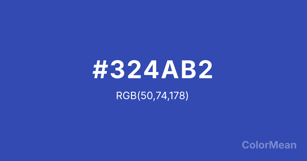
Violet Blue (#324AB2) Color Information
Violet Blue (#324AB2) RGB value is (50, 74, 178). The hex color red value is 50, green is 74, and blue is 178. Its HSL format shows a hue of 229°, saturation of 56 percent, and lightness of 45 percent. The CMYK process values are 72 percent, 58 percent, 0 percent, 30 percent.
Violet Blue (#324AB2) Color Meaning
Violet Blue (#324AB2 / #354D73) represents intellectual depth, calm authority, and focused energy. This medium-dark blue-violet hue balances cool stability with subtle creativity. Psychologically, Violet Blue (#324AB2) enhances concentration, analytical thinking, and emotional stability. Culturally, Violet Blue (#354D73) conveys professionalism, sophistication, and serenity in Western design. Eastern perspectives link it with introspection, wisdom, and meditative energy. Fengshui considers this shade supportive for study, work, and meditation areas, encouraging focused yet creative energy flow. Spiritually, Violet Blue (#324AB2) aligns with the Third Eye chakra, promoting insight, clarity, and calm perception. Its medium-dark blue-violet character makes it effective in artistic works, branding, and interior design that seek sophistication, balance, and calm energy.
Color Conversion
Convert Violet Blue (#324AB2) across different color models and formats. These conversions help designers work seamlessly between digital and print media, ensuring this color maintains its intended appearance across RGB screens, CMYK printers, and HSL color manipulations.
RGB Values & CMYK Values
RGB Values
CMYK Values
Color Variations
Violet Blue (#324AB2) harmonies come to life through carefully balanced shades, tints, and tones, giving this color depth and flexibility across light and dark variations. Shades add richness, tints bring an airy softness, and tones soften intensity, making it easy to pair in clean, modern palettes.
Color Harmonies
Violet Blue (#324AB2) harmonies create beautiful relationships with other colors based on their position on the color wheel. Each harmony type offers unique design possibilities, enabling cohesive and visually appealing color schemes.
Analogous
Colors adjacent on the color wheel (30° apart)
Complementary
Colors opposite on the color wheel (180° apart)
Split Complementary
Three colors using one base hue and the two hues beside its opposite
Triadic
Three colors evenly spaced (120° apart)
Tetradic
Four colors forming a rectangle on the wheel
Square
Four colors evenly spaced (90° apart)
Double Split
Four colors formed from two base hues and the colors next to their opposites
Monochromatic
Variations of a single hue
Contrast Checker
(WCAG 2.1) Test Violet Blue (#324AB2) for accessibility compliance against white and black backgrounds. Proper contrast ensures this color remains readable and usable for all audiences, meeting WCAG 2.1 standards for both normal and large text applications.
Sample Text
This is how your text will look with these colors.
Large Text (18pt+)
Normal Text
UI Components
Color Blindness Simulator
See how #324AB2 appears to people with different types of color vision deficiencies. These simulations help create more inclusive designs that consider how this color is perceived across various visual abilities.
Normal Vision
protanopia
Note: These simulations are approximations. Actual color vision deficiency varies by individual.
CSS Examples
Background Color
Text Color
Sample Text
Border Color
Box Shadow
Text Shadow
Sample Text
Gradient
Violet Blue (#324AB2) Color FAQs
Frequently asked questions about Violet Blue (#324AB2) color meaning, symbolism, and applications. Click on any question to expand detailed answers.
